
Ten easy fixes for the design of your donation form
Beate Sørum shares digital how-tos, things to do and not to do and 10 tips to make your online donation form work much better.
- Written by
- Beate Sørum
- Added
- September 23, 2014
They say the devil is in the detail. And that is most certainly true for donation forms. The commercial world knows this - they’ve been perfecting their check-out processes for decades. We haven’t, so here’s a list of 10 easy best practice things to fix in the design of your form. These have been tried and user tested many, many times and are simply the best ways to design a form. For further reading on this subject, I highly recommend Luke Wroblewski’s book Web Form Design (Rosenfeld Media, USA, 2008), available online. His presentations are also worth a look.
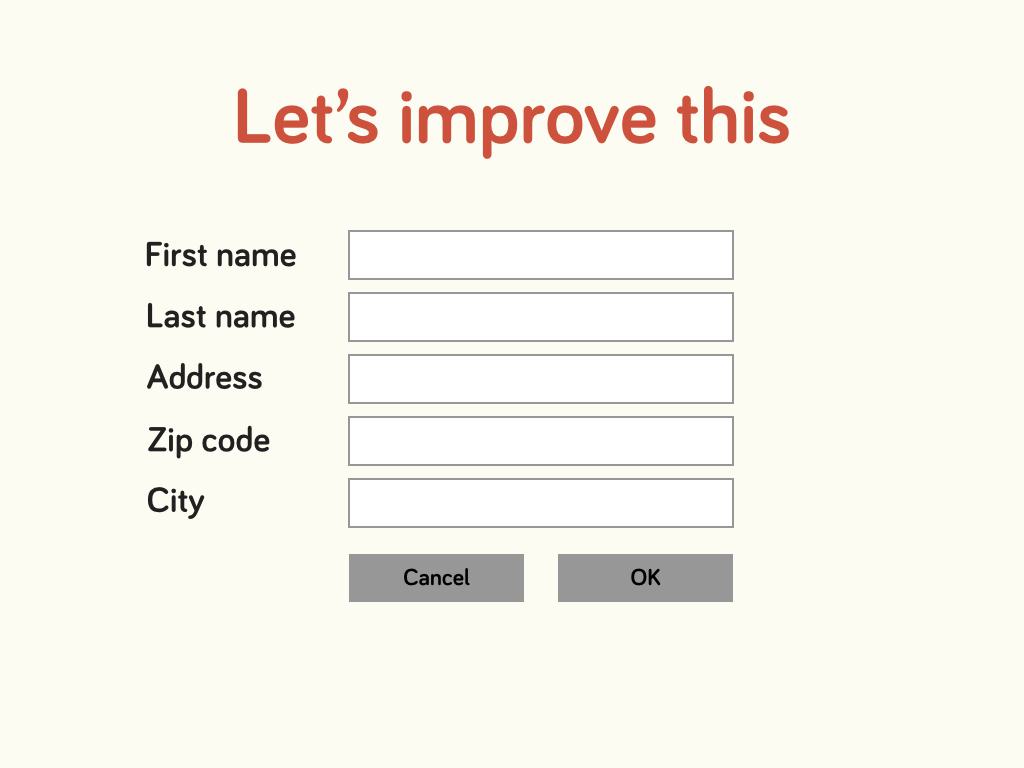
Let’s improve this form
Here’s a fairly good looking form.
But there are a lot of things we can do to make this even better. Studies have shown that people don’t really read labels and help text, so we need to make this form work in a way that lets people fill it out without thinking. Improving these things really will make a difference in your conversion rates.
1. Field lengths.
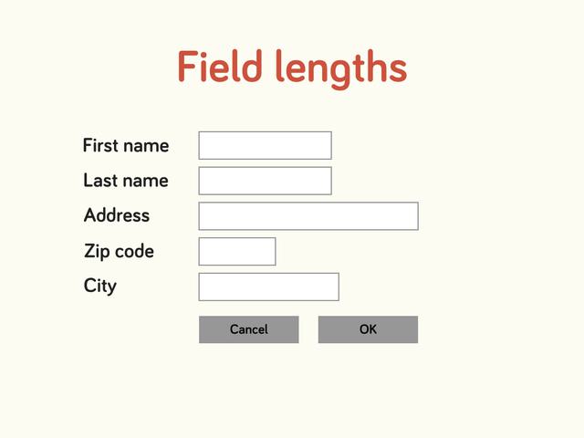
The first thing we do is to adjust the field lengths. This gives your eyes a little hint about what information is supposed to go in the field and so puts less strain on your brain.
The post (Zip) code is usually a short number, so the field length should tell you this visually.
2. Group elements that belong together
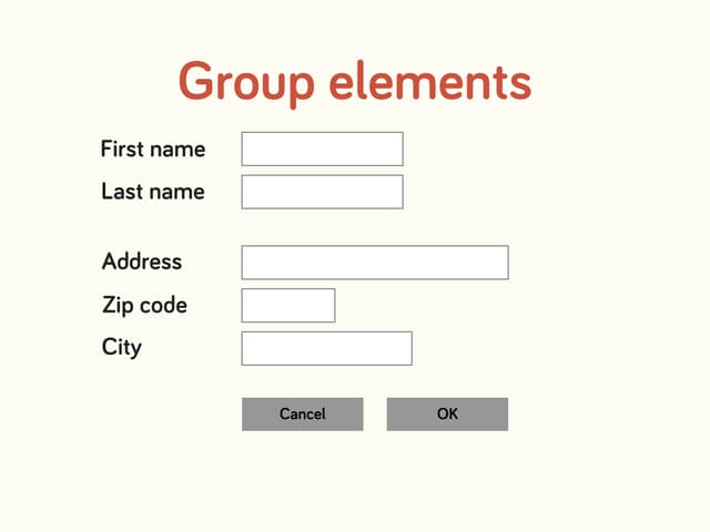
To further help you visually, we should group the elements that go together. For example, first name and last name are a natural group, as are your address fields. If we were asking for an electronic communication, such as mobile or email, that would be a natural group too.
3. Clearly labelled button
There should be absolutely no confusion as to what clicking a button does. What does ‘OK’ mean? Next step? Finish? Register? Give? This needs to be stated very clearly. If people don’t know what clicking a button will do they might just move away from the form all together.
4. Make the preferred option prominent
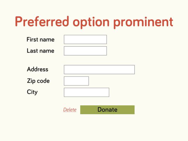
Even after we’ve clearly labelled the buttons with text, we haven’t visually done anything to tell your donor’s brain which button to click. Let’s make sure there is no doubt which one we want her or him to use.
5. Remove buttons that hurt more than help
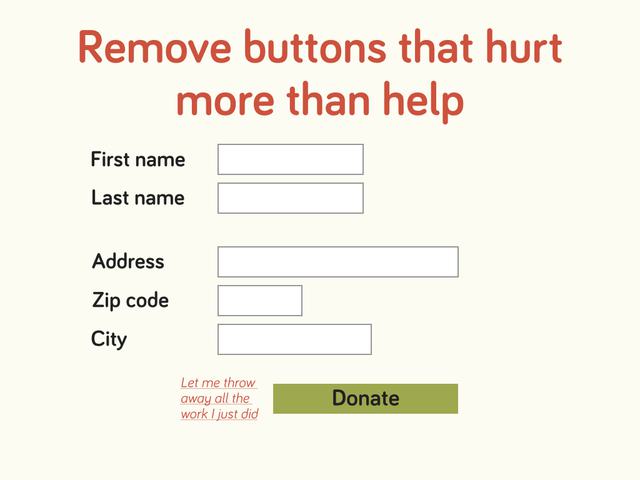
Have you ever really found yourself in a situation where you’re about to buy something and then realised you’ve completed every field incorrectly and had to start again, then the lack of a delete button made you abandon the purchase? No? Me neither. In fact, I cannot think of any reason why a donor might need to delete the information she has inserted and then start again. Chances are that the only people who click that delete button do so by mistake and abandon the donation in frustration. Let’s get rid of the ‘let- me-throw-away-all-the work-I-just-did’ button. If someone wants to stop her donation she can just close the browser. We don’t have to help donors not to give.
6. Right-align the labels for easy scanning and reading
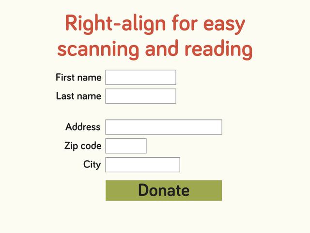
User testing has shown that people take significantly longer to fill out forms when they have to move and refocus their eyes between label and input field. To avoid this make the labels right-aligned. This way it is easy to cast a glance down and get an overview over the information needed and their eyes can stay focused in the same place while filling out each field.
7. Top-align to be ready for mobile
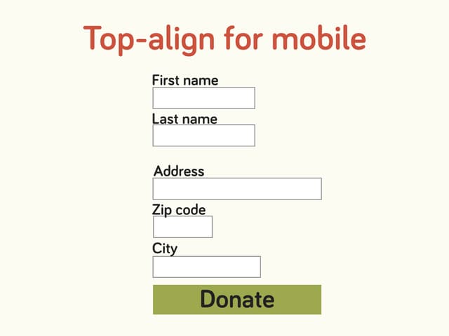
While right-aligning is good for when someone is using a computer, where saving vertical screen real estate (space on a screen) might be preferable, once the user is on a mobile screen this becomes a problem. If labels are before the input fields on a mobile you end up having to do horizontal scrolling. This is, obviously, not good. So in order to make your forms ready for mobile users (which you should) the best solution is to put the labels on top of each input field. This does require a lot more vertical space, but it is the best solution. Make sure that the labels are tacked on to the field below them and increase white space between fields so there is absolutely no room for confusion as to what field the individual labels belong to.
8. Don’t ever do this!
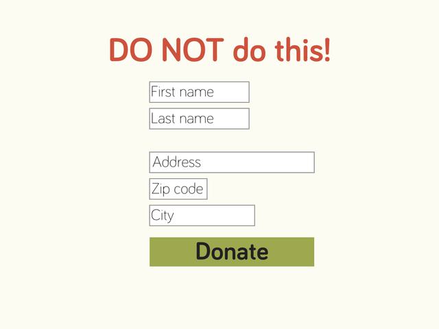
Because top-aligned fields take up a lot of space some times designers will put the labels inside input fields to save space. This is a really bad idea. First of all, it is not in keeping with rules about universal design. People who use screen readers (such as the visually impaired) might not get the label read to them at all. This is because, technically, such text is formatted as ‘placeholder text’ rather than ‘label’. And a screen reader would look for the ‘label’ attached to the input field.
Secondly, it is a really bad idea for people with no disabilities too. Because what happens the minute you place your cursor in one of the fields?
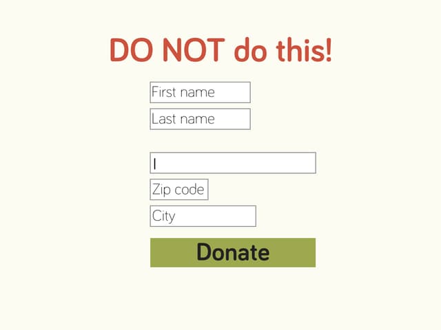
The placeholder text disappears and you no longer have a clue as to what text is supposed to go in the input field. To find the information again, you have to put the cursor in another field to make it reappear – and sometimes it doesn’t even do that. This considerably slows your donor down, meaning the chances of abandoning the donation become higher.
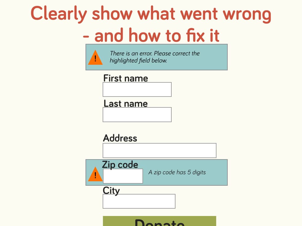
9. Error messages
No matter how great your form is people will still make mistakes. That’s all right – as long as you clearly tell them what went wrong and how to fix it. A good rule of thumb is to make the form reload so the user can see that something happened when she clicked the button. Refocus the page to the top of the form, where an error message is clearly displayed summing up what has gone wrong. And highlight the individual fields that need correcting. Think about the design of this and make sure that it is also available to people who might be colour blind. Include several highlighting methods, such as symbols, colours and frames.
10. Do you really need to know that?
The best way to increase conversions is to reduce the number of fields. Far too often, donation forms look like a replica of our database. Do not let the database be in charge. Every extra piece of information you ask will most likely reduce your conversions. So make sure you only ask the absolute necessary information. Yes, it would be nice to know the age of your donors for statistical reasons, but is it absolutely necessary? Have a good, hard think about that.
Even if you make the extra fields optional it is still going to hurt your conversions.