ActionAid: transparency and readability
- Exhibited by
- SOFII
- Added
- June 12, 2008
- Medium of Communication
- Publications
- Target Audience
- Individuals, corporations, granting organisations
- Type of Charity
- Children, youth and family
- Country of Origin
- UK
- Date of first appearance
- Unknown
SOFII’s view
ActionAid is one of SOFII’s favourite organisations so it seems strange for the site to be critical here. But this is one instance where SOFII can heap great praise, for this exhibit’s simple but effective efforts at transparency and accountability, while at the same time deploring the charity’s cavalier approach to how donors’ read and what they will find comfortable. The result for SOFII users is doubly instructive.
Summary / objectives
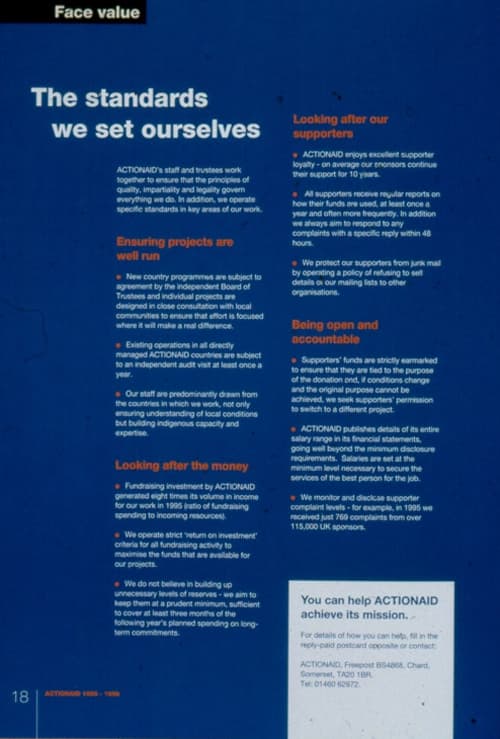
This single page from ActionAid’s annual report shows very effectively the organisation’s commitment to openness and accountability.
Background
ActionAid has won awards in the past for its transparency and accountability, not just to donors but to all stakeholders.
Special characteristics
This is an interesting exhibit in that it shows both best practice and how not to do it, on the same page
Influence / impact
More than might be assumed, as Ken Burnett has shown this example to fundraising audiences around the world.
Costs
Negligible. Any organisation could present similar information in their annual report. But equally, it wouldn’t cost them anything to make the information a lot more accessible and readable than ActionAid did.
Results
Transparency and active accountability bring their own rewards, for donors are demanding them increasingly. But there are few benefits to accountability if people are left unaware of what it is that you are trying to explain. Communication is not about getting horses to water, it’s about enabling them to drink. Good accountability and effective communication need to go hand in hand.
Merits
It should be very instructive for any organisation that wants to be transparent and accountable and that wishes to be an effective communicator.
Other relevant information
Surely by now everyone knows that reversed out text (i.e. in white type on a solid background) is much harder to read than normal text, particularly for older eyes (i.e. most donors). Add to that the increased difficulty most eyes will experience in reading sans serif type, particularly when it’s set small and reversed out of a colour background, and this page becomes a nightmare that most potential readers would surely rather skip than struggle with. We are sure that ActionAid would not be likely to make such basic communications errors nowadays. Indeed, the organisation’s effectiveness in marketing, fundraising and communication can be judged by the huge number of exhibits from ActionAid that fundraisers will find on SOFII.
For more on type and readability from SOFII please see here.
 View original image
Also in Categories
-
- Publications