

Muscular Dystrophy Group: envelope test
- Exhibited by
- SOFII
- Added
- August 24, 2009
- Medium of Communication
- Direct mail.
- Target Audience
- Individuals.
- Type of Charity
- Healthcare.
- Country of Origin
- UK.
- Date of first appearance
- unknown.
SOFII’s view
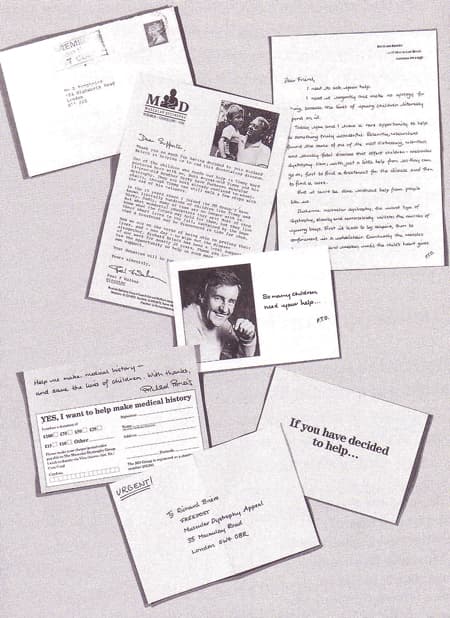
In tests, when groups of fundraisers were asked, ‘which of these five envelopes do you think would provoke the best response?’, they almost invariably opted for the letter that looks most like a letter from a friend. Yet when they have to write to their donors in their working lives, these same fundraisers almost always opt for the conventional commercial approach, the opposite of what they and their donors would prefer. This was a brave test. If fundraisers wish to understand what their donors actually want, it should be revisited from time to time.
Creator / originator
Muscular Dystrophy Group and Burnett Associates Limited.
Summary / objectives
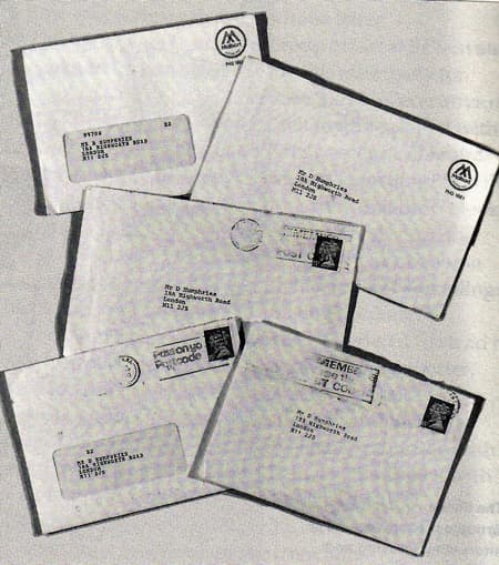
Using well-tried and effective direct mail pack ingredients, the UK’s Muscular Dystrophy Group tested five different envelope formats.
- A closed face (no window) envelope, typed by hand, with a real stamp (the kind of letter you might get from a friend).
- A closed face laser addressed envelope with a real stamp.
- A closed face laser addressed envelope with an overprinted Mailsort symbol (postal frank symbol) instead of a stamp.
- A window envelope with typed address showing through, plus a stamp.
- A window envelope with a Mailsort overprint (the traditional direct mail fundraising letter).
Background
It is often much harder for the so-called ‘difficult’ causes - such as organisations dealing with rare but life-threatening diseases - to make direct mail pay, particularly in acquisition. If a way could be found to encourage many more people to open the mail they receive from charities, perhaps more would go on to read what’s inside and become engaged by it.
In the UK in the 1980s and 1990s a perceived big issue for charities was that fundraising mail was often categorised as junk mail by recipients. Fundraisers didn’t like this one bit. This five-way test from the Muscular Dystrophy Group was designed to show how much difference the look of an envelope makes, when it arrives.
Special characteristics
This was an unusual and very thorough test.
Influence / impact
Less perhaps than it should have been. It was a time-consuming process, so was dropped. With the technology available now, it should be tried again.
Results
The test showed that supporters of the Muscular Dystrophy Group preferred to receive letters that look like real letters. But the difference was not sufficiently great to justify doing this on any large scale, on an ongoing basis. However at the time there was anecdotal evidence that indicated that many donors perceive the Mailsort symbol on the top right of a letter to be the logo of junk mail.
Merits
This is something that fundraisers should continually look at, rather than blindly following the established conventions, which are usually based on cost and convenience – and not always the donors, or the fundraiser’s convenience, at that.
 View original image
 View original image
Also in Categories
-
- Individual donors
Tags
- Testing


