Wikimedia Foundation: how banners can enhance fundraising
- Exhibited by
- Amy Cruse, www.wikimediafoundation.org.
- Added
- June 12, 2012
- Medium of Communication
- Online
- Target Audience
- Type of Charity
- Country of Origin
- USA
- Date of first appearance
- 2004
SOFII’s view
If you haven't already been impressed with Wikimedia's fundraising, then you will be after reading this exhibit. By designing and testing a simple, gimmick-free series of banners with the help of committed volunteers, Wikimedia have managed to achieve huge success and create what looks to be, a sustainable fundraising strategy.
Creator / originator
Jimmy Wales.
Summary / objectives
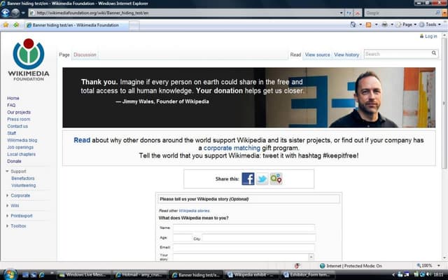
The Wikimedia Foundation was founded in 2001; since 2004 they have organised an annual fundraising appeal to help sustain their different projects. Wikipedia is one such project and, in the past couple of years, appeal banners have been placed at the top of their webpages appealing for donors to help their site grow and to keep it free.
This direct personal approach, from the Wikipedia creators to its users, is proving to be an impressively successful fundraising strategy.
Background
Wikipedia, the free online encyclopaedia, is one of 11 projects developed by the Wikimedia Foundation, committed to providing internet users with free access to a growing, multilingual website. All the Wikimedia Foundation's projects are developed collaboratively by volunteers, who emphasis the central importance of donations if the projects are to continue. As Wikipedia is also free of advertising, donations are even more valuable, so it is vital that the annual appeals achieve the financial target for the next fiscal year.
In December 2008 a direct appeal written by Jimmy Wales, the founder of Wikipedia, resulted in a total of $2 million being donated in eight days, highlighting the influence of a personal appeal to users. This direct initiative was used again in the 2009 appeal, when banners displaying the core principles of the organisation and the need to donate appeared across the top of every Wikipedia page. The creation of the banners was open to all Wikipedia users who felt they could help and all ideas were publicly discussed on the Wikimedia Foundation's website. Banners were tested thoroughly during the year to compare their performances and the most effective were used in the annual appeal. This proved to be highly successful, both in increasing the number of donors by over 100,000 and increasing the total amount raised from $6 million (2008) to $8 million (2009). As a result, the use of banners is quickly becoming the basis for Wikipedia's annual appeal, allowing the creators to appeal to users in a clear, simple and direct manner.
Special characteristics
The personal element of the Wikipedia annual appeal is an innovative approach. The banners with an appeal from Jimmy Wales proved to be the most successful in receiving donations in the 2009 appeal, showing the significance of involving members higher in the organisation's hierarchy when appealing to users for donations. The directness of the appeal was further enhanced through 'localising' the banners via language and cultural translations by volunteers across the world (volunteers are any of the site's users who want to participate).
Also, the Wikimedia Foundation prides itself on the transparency of the organisation and this characteristic is evident in their fundraising. All aspects of the banners, from formulation to testing to implementation, were documented on the Foundation's website and volunteers were encouraged to provide feedback on how to improve the banners. The public availability of all data concerning the appeal from start to finish is an impressive feature which shows the value of providing the public with 'access all areas' when developing a fundraising strategy.
Influence / impact
It is essential to convey to every Wikipedia user that the site is created by users – and supported and maintained by them – to highlight their influence within the organisation. The banners have allowed this to happen, as the appeal reaches out to a global audience while still retaining a sense of direct, personal communication. There are over a thousand users who volunteer to create and test messages, to translate the banners into more than 80 languages and help to create a targeted appeal.
Results
The use of banners continues to be successful, with the results from the recent 2010 appeal demonstrating a great increase in both donors (over 500,000 people) and the total raised (over $16 million). The most successful banner read 'If everyone reading this donated $5, our fundraiser would be over today. Please donate to keep Wikipedia free.' It just shows how simple measures really can be effective.
In keeping with the Foundation's principle of transparency, there are spending plans on their website which categorise how the donations will be spent. For the 2010-2011 spending plan, nearly half of the donations will be invested in improvements to the technology needed to run the site. The remaining half will be split between community projects, fundraising, governance and management, with different aspects of each category listed on the website for further clarification.
Merits
What is so refreshing about the Wikipedia banners strategy is that much consideration is given to making the content gimmick-free. The banners that are used are the product of months of documented hard work and a thorough process of trial and error, to provide a simple and clear message as to why users should donate. Furthermore, although technology is becoming increasingly sophisticated, the message conveyed does not have to become more complex, as the use of the succinct banners displays.
Other relevant information
Research by the Wikimedia Foundation found that graphic banners performed twice as well as text banners, so future appeals are going to focus on developing more graphic banners. These graphic banners have been used to advertise the events organised to celebrate the site's ten year anniversary. There are also plans to create animated fading banners which allow for different messages to be rotated on the same page, highlighting the progressive use of the banners and their potential longevity in Wikipedia promotional and fundraising schemes.


 View original image
 View original image
Also in Categories
-
- Digital fundraising
-


