

The Salvation Army: the ‘for God’s sake care, give us a pound’ campaign
- Exhibited by
- SOFII
- Added
- May 14, 2011
- Medium of Communication
- Posters, press advertising.
- Target Audience
- Regular gift, social change campaign.
- Type of Charity
- Children, youth and family, poverty/social justice, public/society benefit.
- Country of Origin
- UK.
- Date of first appearance
- April, 1967.
SOFII’s view
We at SOFII always think it’s worthwhile to look back to see how fundraising has developed and more often than not the essence of what made a successful campaign then, makes a successful campaign today. To the modern fundraiser this appeal might not seem out of the ordinary, but in 1967 ‘For God’s sake care, give us a pound’ was full of innovative and modern techniques, pushing the boundaries of what could be achieved.
Creator / originator
The Salvation Army and KMP Partnership (advertising agency).
Summary / objectives
In April 1967 the Salvation Army in Britain launched a national campaign to raise £1 million. It was billed as a climax to the centenary appeal, which had been running since 1965 and aimed to raise £3 million for the capital cost of 28 new social projects, but which had only raised two thirds of that amount.
The ambitious programme of new social service promised by the Army was an attempt to make some improvements to the vast area of need revealed by its social survey, ‘Tragedies of Affluence’. This indicated that Britain had 400,000 children suffering from some form of neglect, 675,000 lonely and housebound elderly people and 400,000 social misfits.
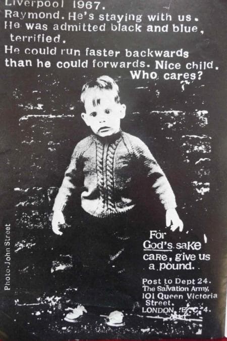
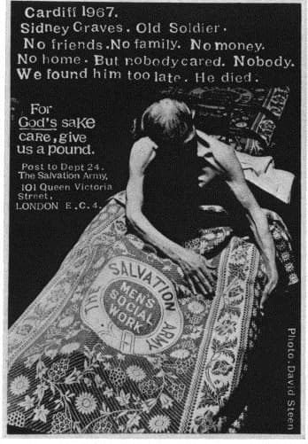
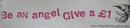
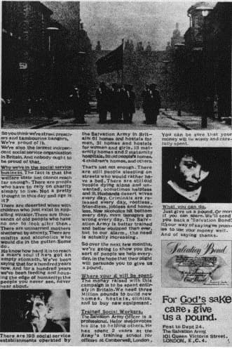
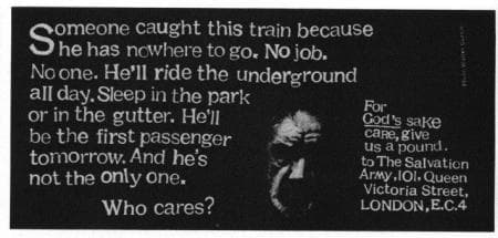
The appeal was launched at London’s Dorchester hotel in April 1967 with the outspoken slogan, ‘For God’s sake care, give us a pound’, and an exhibition dubbed ‘A Royal Academy of Sorrow’. Seventeen of Britain and America’ s most noted photographers displayed alarming pictures which they had taken from across Britain, to illustrate the immediate need.
The Salvation Army enlisted advertising agency KMP Partnership, who brainstormed the project. In their campaign proposal they listed the four key objectives as follows:
1. To carry to a successful conclusion the £3 million centenary appeal launched in April 1965.
2. More particularly to raise £1 million during the month that marks the climax of the appeal.
3. To position the appeal as necessary to create 28 projects in 15 different centres’ to alleviate the ‘social tragedies’ in our society today.
4. To demonstrate the Salvation Army’s willingness and capacity to carry out these projects.
Background
The Salvation Army had already raised almost £2 million from its centenary appeal (launched in 1965) and decided that another £1 million was required before it could meet the capital cost of building 28 new social centres in 16 different cities as part of its centenary celebrations. One of its officers had attended a conference on advertising techniques given by members of the KMP Partnership and, as a result, the Army decided that it would put the business of raising additional funds into the hands of this advertising agency.
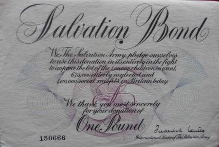
KMP realised that if £1 million were to be raised, it would not be done by dropping pennies into a collecting box. One of the first decisions to be made – and one of the major innovations – was to ask for a pound, offering in return a Salvation Army bond promising to spend the full amount helping the people in its care. The restriction of a small campaign budget (£40,000) meant that TV advertising was impossible, so a poster campaign was agreed instead. Many sites were donated free by the Poster Bureau and additional marketing space was utilised through tube cards, newspaper advertising and travelling exhibitions of the photographs.
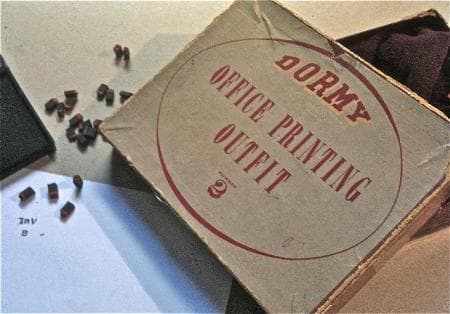
The design of the campaign centred on three major decisions. The first was to avoid drawn images or symbols (though campaign symbols were tried and rejected) and concentrate, instead, on telling the story photographically; the second was to ask both well-known and unknown photographers to take the photographs, assigning each of them to a particular theme; and the third was to stick to black and white reproduction. This decision reinforced the documentary character of the campaign, as well as expressing it in the most economical way. And the feeling of economy was helped by a later decision to use a home printing outfit for setting the captions, so that once again the designers got across the feeling that the whole operation was being done on a shoestring.
Unlike most campaigns, the photographers (who gave their services free in return for expenses and prominent credits) were given a brief but were not directed. The result was that those with the most ‘news sense’ did best of all, coming back with caption material as well as pictures, so that a polish from the copywriter and a carefully designed position for the caption was all that was needed once a shot had been chosen. And there were plenty to choose from; more than 200,000 pictures were taken in all.
Special characteristics
A key element of the campaign was the concept of the ‘salvation bond’, which was given to donors in exchange for their gifts of £1. Designed and printed for the Army by De la Rue, the world-renowned producers of British bank notes, the salvation bond was available in large stores, offices, Army halls and depots, petrol stations, banks and, in some places, when a donation was made over the phone. The Salvation Army office in Reading, Berkshire, organised for a direct line to be set up so that residents could call and request a bond and a Salvationist then delivered the bonds to their homes.
KMP believed that the public would be more willing to give if they received something that made the gift more meaningful. The bond would act not only as a receipt of money received but as a pledge of how the money would be spent. It was hoped it would prove to be a useful tool in the campaign’s aim to collect a million donations of £1, rather than smaller amounts and could serve as an additional piece of publicity. The Salvation Army were so taken with the concept that they considered extending the scheme throughout the world.
Influence / impact
This campaign was amongst the very first to ask for a specific (and relatively substantial) donation from the public. It has since become a popular format for charities that can give donors something concrete and detailed to aim for by specifying a clear overall target, which can be broken down further into smaller identifiable targets.
The innovative style of the campaign had public relations experts declaring that new pinnacles in charity advertising had been reached. Individuals and other charities were also impressed; this letter was sent in to the Salvation Army during the campaign.
‘Congratulations to your advertising department. I work for a ‘rival’ charity but must confess that your ‘Give us a pound’ series is quite brilliant. Anyway, as an ex-prosecutor in the magistrates courts I know well that you catch what the Welfare State misses.’
M S Foreman
Results
It was not possible to locate specific figures for this campaign, though there is documentation suggesting that the Salvation Army fell short of reaching the £1 million target.
However, it is perhaps worthwhile to note that in 1967 £1 was equivalent to almost £13.70 today, pushing their fundraising goal in relative terms close to £14 million. To put this in some perspective the first Children in Need telethon took place in 1980, some 13 years later, and was similarly devoted to raising money exclusively destined for charities working in the UK. Over the year they raised £1 million, equivalent to £3.73 million today. If the Salvation Army only raised 30 per cent of their original target they would have more than matched Children in Need’s achievements.
Today the target seems ambitious, but at the time the Salvation Army believed it was not only achievable but reasonable. In a communication to their officers the charity writes: ‘There are an estimated 17 million families in Britain. To achieve the target therefore, it is necessary to get only one family in seventeen to buy a bond.’ (SOFII’s emphasis.) If charities today thought they could secure even a fraction of that rate of giving, fundraisers everywhere would breathe a sigh of relief.
It has since been suggested that a better follow-up by the Salvation Army of linking the campaign to a door-to-door collection might have improved totals and their decision not to do so may have been influenced by their desire to secure the full pound donation over smaller amounts.
Despite being short of their target, the campaign did garner significant support in the press with many of the photographs widely reproduced in national newspapers, including a three-page photographic supplement in The Sunday Times and a centrespread in the Sunday Mirror telling the story of successful photographer David Bailey’s eagerness to help. The campaign also received support from some notable individuals. David Frost opened the exhibition launch at the Dorchester Hotel, London and politician Tony Benn, the then minister of technology, voiced the government’s approval of the campaign’s aims.
Merits
Although the idea of asking for a fixed amount from your donors to achieve a set goal is standard practise now, campaigns like this one were trying it out for the first time and it wasn’t just the fundraising that was experimental. The style of the campaign in its documentary approach, the stark images taken by successful photographers, the disturbing captions outlining the personal stories and of course the startling slogan which played so well against the traditional perception of the Salvation Army, made for an exciting campaign that caught the attention of the national media and the public alike. Whilst the extremely ambitious £1 million target wasn’t reached, the campaign did succeed in raising the Salvation Army’s profile and credibility amongst people who had previously written them off as hymn singing, tambourine beaters, paving the way for another hundred years of fundraising to come.
Other relevant information
Email from David Holmes who created the visual idea:
‘David Kingsley (director of Benton & Bowles and founder and partner at KMP, famous ad agencies in the 1960s) had the notion of asking for a pound. Terence Griffin penned ‘for God’s sake give us a pound’ and Brigadier Ken Nutty, as I recall, thought we should add the word “care”.
I had the idea to use a child’s rubber printing outfit as a typeface. Each letter was printed by hand to indicate a ‘home-made’ message from the “Sally Army” to avoid the touch of the sophisticated designer. The famous brand was the John Bull but I didn't like the typeface they used so I chose the Dormy. I still have it and tried it out recently: I’m happy to say it still works.’
 View original image
 View original image
 View original image
 View original image
 View original image
 View original image
Also in Categories
-


