

Sorry, but you’re just not my type!
- Written by
- Colin Wheildon
- Added
- June 03, 2009
Book review
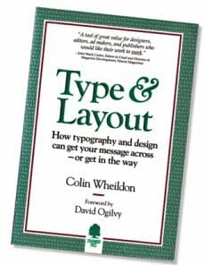
Type & Layout by Colin Wheildon
Reviewed for SOFII by Ken Burnett.

A case for not setting text in sanserif
Typestyle and typefaces may seem unlikely fare for readers of SOFII opinion pieces but not so if you want to communicate effectively with your donors. It has been said that communication is the key to building donors’ trust and confidence*, and also that fundraisers lose at least half of the potential readers of their printed materials simply because they squeeze in too many words and set the type too small**. They probably lose most of the other half because, unknowingly, they set their important messages in the wrong kind of type.
‘Now there is nothing left to argue about. When you break the rules, you can predict how many readers you’ll lose as a result.’
The above is just one of dozens of quotes from the cover and prelim pages of Colin Wheildon’s seminal book Type and Layout: How typography and design can get your message across – or get in the way. Raved over by experts, described as ‘a modern masterpiece’ and ‘required reading before students are allowed to touch a computer’, Wheildon’s book was nevertheless out of print until just recently. Why? Well, fundraising guru and former publisher Mal Warwick gave me several practical reasons why he was not in a position to reissue the book, but despite setbacks he was still hoping that a commercial publisher would come forward, encouraged by the book’s cult following and the clear and obvious need for its findings. While I doubted if there would be enough of a commercial call for it, three years after I first wrote this piece I was proved wrong (see below).
The fact is, sales for such a book will be limited because the designers and so-called communicators who should buy Weildon’s book in droves for the pearls of wisdom therein, quite simply find its lessons too inconvenient, precisely because this book definitively shows what works and what doesn’t. Designers of type matter seem to prefer to keep themselves and their clients in ignorance of what Wheildon uncovered. That way they’ll retain carte blanche to pretty much do as they like. Tragically, their clients and employers allow them to do it.
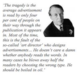 David Ogilvy: A profile of the ‘father of advertising’
In the foreword to Wheildon’s book communications guru David Ogilvy wrote, ‘If you write advertisements for a living, as I do, it is a matter of life and death that what you write should be read by potential customers. It is the headline and the copy that do the selling.’
True enough for the producers of advertising, this is even more vital for those who produce free, unsolicited promotional materials – newsletters, direct mail, magazines and so on. Because they tend to contain more words than advertisements, it’s even more important that they should be welcoming and easy to read. And if this is true for the materials produced by selling organisations to promote their products, how much more true must it be for a charity or nonprofit organisation, which has no goods or service to promote but has to rely on each prospect’s voluntary interest in what the organisation does and has to say?
Ogilvy goes on to say, ‘The tragedy is the average advertisement is read by only four per cent of people on their way through the publication it appears in. Most of the time, this is the fault of the so-called “art director” who designs advertisements… He doesn’t care a damn whether anybody reads the words. In many cases he blows away half the readers by choosing the wrong type. He should be boiled in oil.’
Whatever else he’s been called, Ogilvy is acknowledged to know more than a bit about communication, learned at the sharp end. Why does he have such a low opinion of art directors? Experience, perhaps?
Life or death for the copywriter

I remember as a young lad in the book publishing business that we knew well the vast difference in readability between serif and sans-serif type. Although widely understood, it was a common cause of argument with designers who wanted to use sanserif because they thought it looked better. (Perhaps from a distance, through half-closed eyes. Like Ogilvy we were also well aware that these folk rarely if ever bothered to read the copy). What’s different about Wheildon’s book is that he actually researched the difference, painstakingly over many years in many formats, using lots of subjects in several countries, and he put numbers on it . The methodology of his research is described in his book. He also studied layouts, reading gravity, justification, type size, letter spacing, colours, tints, backgrounds and other facets of communication where readability is a high concern, but which are frequently ignored by designers. And where use and abuse had previously not been quantified.
Sadly for the design business Colin Wheildon found conclusively that would-be communicators pay a massive price whenever they depart from the perhaps conservative standard of serif type of a reasonable size, leading and line width printed in black on a white paper background.
Readers with older eyes
In his book Wheildon describes the problem with sans-serif type as discovered by researchers of the British Medical Council in 1926. It’s detailed so I won’t reproduce it here, but basically they knew back then that to use sans type for body text was bonkers. The common theme, verified by almost all of Wheildon’s tests, was difficulty in maintaining concentration caused by the absence of serifs and all type being too regular. Wheilden found this to be particularly true for readers with older eyes (the kind of folk who support many nonprofits).
Designers claim this is nonsense and that, in time, readers will get used to sans-serif type and even come to love it. Wheildon dismisses this as analogous to claiming that by changing your children’s breakfast cereal from Wheetie Pops to wood shavings, they’ll come to love that too.
If the text is short and of a reasonable size (ie for short headlines, call-outs or standfirsts) Wheildon reckons that very small amounts of sans type are ok, because its use doesn’t much affect readability. So what does Wheildon say about sans-serif type for body copy?
In comprehension studies, whereas roughly two-thirds of a newspaper’s readership will comprehend a given article set in Garamond (serif), that comprehension level will drop to one-eighth when the same text is set in Helvetica (sans-serif).
Ooops! This isn’t a teensy, inconsequential difference we’re talking about here. We’re actually looking at comprehension being five times less, simply because of a change of type style. With that kind of risk there has to be very compelling reasons for setting body text in sans-serif type. ‘It’s the brand style’ certainly wouldn’t qualify, unless your brand values include to be almost unintelligible to just about everyone.
In one of Wheildon’s detailed tests, of 112 readers who read an article without difficulty in serif type, 67 showed poor comprehension after they had read a similar article of direct interest set in sanserif type. Of these, 53 complained strongly about the difficulty of reading the type, 11 said the task caused them discomfort (eye tiredness) and 32 said the type was merely hard to read.
See it in your daily newspaper
Could this perhaps explain why almost no major newspapers choose sans faces for body copy? Many magazines, however, do choose to set their text in sans-serif. These same magazines also frequently set their type in colours other than black on white, reverse their type in great wodges (sometimes out of tint panels and even out of half-tones), run type round pictures and across pictures and other such obvious abominations. Not to be left out, advertisers in these rags regularly commit similar atrocities, showing nakedly in public their designers’ lack of understanding of how to communicate through the printed word. People pay to buy magazines. Who cares whether they actually read them? (Apart, perhaps, from the poor sods who pay to advertise in them.)
There may be some truth in saying that changes in sans typefaces are bringing some of the recently developed fonts closer to serifs and so, perhaps, making them more readable than the traditional ‘older’ sans faces. Perhaps if designers push this particular ‘envelope’ they'll go full circle, and will produce a new sans-serif typeface that actually has serifs, so is every bit as readable as if it were a serif face. Anything is possible. Sorry, I'm being facetious here, largely because I’m still irritated from a recent encounter when someone trying to justify sans body copy said to me that his chosen typface ‘combines the best of being a serif typeface without actually being one’. That sounds like bulls**t to me (perhaps my contact needed to be told what sans actually means in French). Anyway, type may have changed but I am unaware of any recent changes to the functions of the human eye.
Wheildon did write about the hybrids. He said ‘As Caslon openface and Futura are unlikely – one hopes – to be chosen as body types…’ Sadly he is wrong here. Optima and other hybrids are often chosen as body types – and lose readers in droves.
Various reasons have been given why people prefer to read longer tracts in serif type. Some believe the serifs act as tramlines, keeping the eyes on target. Another view is that the modulated thick and thin strokes of serif type provide greater opportunity for individual letters, and hence words, to be distinguished and read.
The simple fact – and Colin Wheildon’s book conclusively proves it – is that serif type is invariably far, far better than sans-serif type if you want your words to be easily read, enjoyed and understood. Fundraisers should not imagine themselves above this basic but so important lesson.
© Ken Burnett 2002
Parts of Colin Wheildon’s book were originally published as a brochure in 1984. Mal Warwick added to it and republished it in 1995, in the jacket illustrated above. The book was subsequently further added to and reissued by the Worsley Press, Hastings, UK in 2005, under ISBN 1-875750 22 3.
*Lee and Sargeant, Henley Management College, Understanding donor trust and confidence, 2000.
**Fowler and Burnett, Burnett Works Limited, How readers read, 1997.

About Ken Burnett
 Ken Burnett is author ofRelationship Fundraising and other books including The Tiny Essentials of an Effective Volunteer Board (The White Lion Press Limited, London, UK) and The Zen of Fundraising, (Jossey-Bass Inc, San Francisco, USA). Ken is also SOFII’s managing trustee.


