MSF warehouse: virtual catalogue and mass marketing campaign
- Exhibited by
- Taslim Somani - Stephen Thomas Ltd.
- Added
- March 03, 2011
- Medium of Communication
- Online
- Target Audience
- Type of Charity
- Country of Origin
- Canada
- Date of first appearance
- November, 2010
SOFII’s view
As with most fundraising methods, digital fundraising can be successful if it is done properly and works with the core values of the charity. Combined with an innovative and unusual marketing campaign, MSF and Stephen Thomas achieved well-deserved success.
Creator / originator
Stephen Thomas Ltd (ST).
Background
After realising the ever-increasing power of digital space and the growing prominence of e-retail, MSF decided to focus its efforts for this campaign online. Stephen Thomas Ltd proposed the idea of a virtual gift catalogue where prospective MSF supporters can view the actual products that MSF uses in its field projects and when they buy an item make a donation for its value to support MSF's work around the world. They can also make a purchase as a virtual gift to a loved one.
Knowing that it is not just enough to ‘build it and they will come’, Stephen Thomas developed an integrated teaser marketing campaign to raise awareness of the catalogue, generate media interest and drive traffic to the website.
Special characteristics
A new brand identity was developed around the MSF warehouse and an e-commerce website was built specially for the MSF warehouse.Together with MSF, Stephen Thomas selected the products and wrote their descriptions. They also added other interesting features such as a wish list, an individual account function, a send-an-e-card option and impulse items to buy at the checkout. This was all supported by a robust content management system.
Products available to buy from the MSF warehouse include items ranging from cholera kits and antiretroviral therapy for HIV/AIDS to Land Cruisers and doctors’ missions.
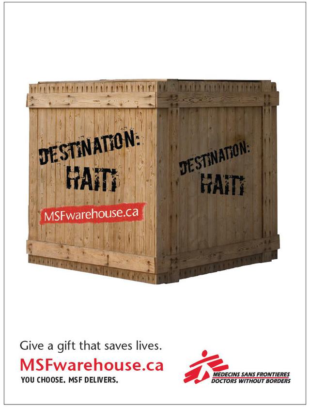
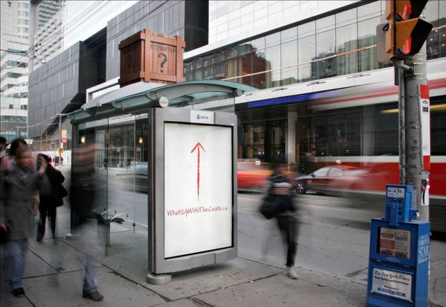
A four-week mass marketing campaign in Toronto, Canada, was conceived to generate media buzz and drive traffic to the MSF warehouse website. Despite a limited budget, a strong and memorable tease-and-reveal campaign was developed. To highlight the delivery of life-saving products to the field, a shipping crate icon was designed and produced. Full size crates were produced and appeared on the top of bus shelters around Toronto. During the first week, the crates were stencilled with the word, ‘Destination?’ During week two, a name of a country in which MSF does their life-saving work was added, such as ‘Destination: Haiti’ or ‘Destination: Congo’.
A bus shelter poster underneath each crate drove traffic to a unique URL link called ‘Whatsupwiththecrate.ca’. This site had a daily updated blog where the crate told the story of its life as a lonely, lost box looking for a purpose. The idea was to encourage people to find a meaning for the crate’s existence.
In the final phase (weeks three and four), the crate was given the words MSFwarehouse.ca and promoted it as the solution to holiday shopping for gifts.
Additional support advertising was purchased in the free commuter newspapers. A social media press release was also issued as well as Google and Facebook campaigns. A series of MSF warehouse branded emails were also sent to all MSF’s existing supporters.
Influence / impact
The MSF warehouse campaign received many positive mentions in traditional media; a prominent call-out in Canada’s Globe and Mail and the international newspaper, Epoch Times; interviews on CBC English and French radio stations plus a television interview on the Business News Network (BNN Canada). Additionally, local bloggers became interested in the story and picked it up. Through this marketing and PR campaign, MSF was able to strengthen its brand and attract donations through the MSF warehouse.
Results
In just six weeks, the MSF warehouse achieved positive return on investment, covering all the costs of the website development and mass marketing campaign, and more. The average donation was over CAD 140, which is approximately double the average received on their regular donation page. A post-campaign survey was conducted and found that 96.5 per cent of respondents found the MSF warehouse site easy to use and more than 95 per cent would recommend the MSF warehouse to their friends. Plans are underway for updates to the MSF warehouse and continued marketing initiatives to raise funds through the online catalogue.
Merits
The MSF warehouse shows that digital fundraising does work when it’s done properly. In this case, the MSF Warehouse website was custom developed based on e-commerce best practices and an understanding of MSF’s core business needs. It is a great example of an online catalogue that has a great user experience, is consistent with the MSF brand and is significantly different from other online catalogues. A gutsy, integrated mass marketing and PR campaign raised awareness and drove traffic to the site – which boosted results and had the side effect of strengthening the MSF brand.
 View original image
 View original image


