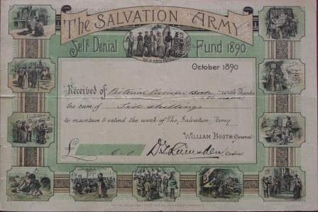
The Salvation Army’s ‘self-denial fund’
The Salvation Army’s archive includes fundraising gems from over 150 years ago. In this article Sarah Bond shares an original draft appeal letter from The Salvation Army’s founder General William Booth. She also takes a look the evolution of their ‘self-denial fund’ donation envelopes.
- Written by
- Sarah Bond
- Added
- June 25, 2012
When SOFII was given the privilege of exploring The Salvation Army’s archives, we came across this fantastic assortment of donation envelopes from their long-standing ‘self-denial’ annual appeal. It is an appeal that has been running since the charity’s conception. At the time of writing, this collection spans nearly 100 years, giving a rare insight into the ways in which a charity’s fundraising mechanism has evolved through the ages.
The self-denial fund is their most established fundraising appeal and still runs today (2012). Much like charities currently send out appeals on a regular basis to their ‘warm’ donors, The Salvation Army’s self-denial fund was an annual appeal sent to their committed supporters. They were encouraged to give up an item of food or clothing that they would usually buy over the course of a week and instead donate that money to the appeal. To maximise the number of donations and extend the appeal beyond existing supporters of The Salvation Army, collections were also encouraged in church services and officers were encouraged to involve their friends and family.
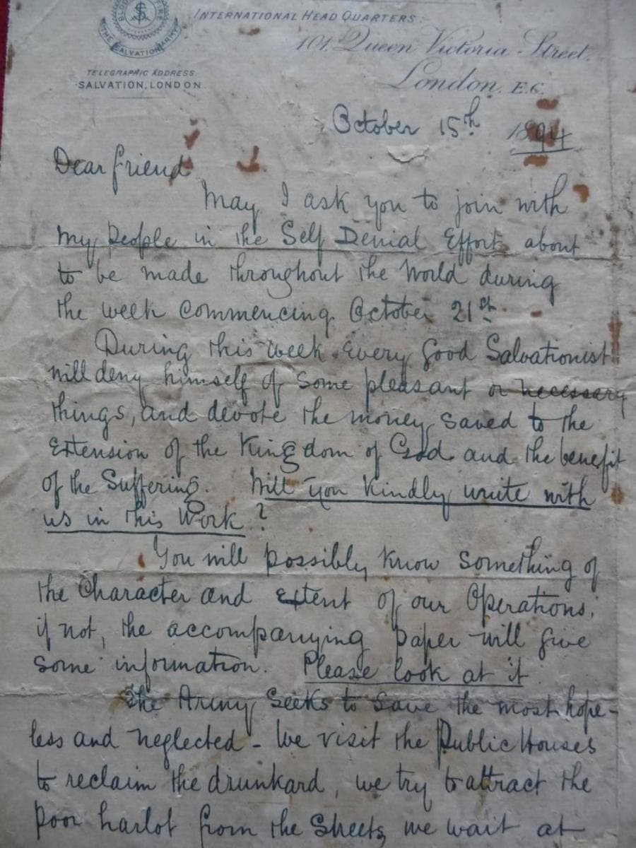
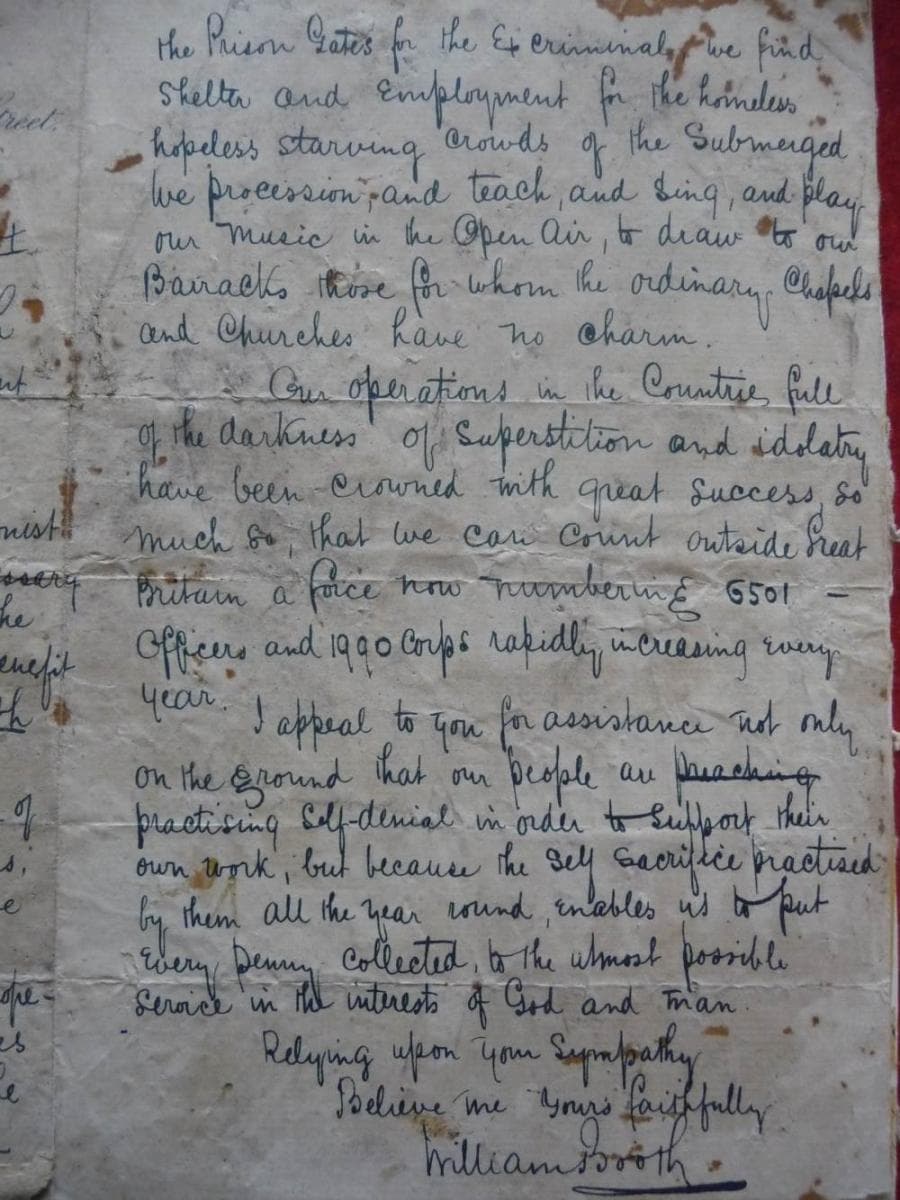
Amongst the archives we also found this original draft appeal letter from The Salvation Army’s founder General William Booth, written in 1894. Just as charities’ today often include a strategic personal letter from their chief executive for a large appeal or in their annual review, The Salvation Army also understood the importance and impact a personal appeal from a key member of the organisation could have on supporters. Also interesting to note is the use of underlining, drawing the donor’s attention to what they can do to help. It would seem that the essence of good donor communications has been practised for longer than we sometimes give credit for.
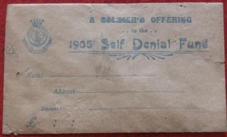
A donation envelope from 1905, this is a strictly no frills affair, which may be indicative of the era. Prior to 1845 all envelopes were made by hand and it wasn’t until 50 years later that a commercially successful machine which pre-gummed the envelopes appeared on the market. Whilst this made the production of envelopes a much easier and more cost effective matter, the design is likely to have been limited by both the technology and the costs.
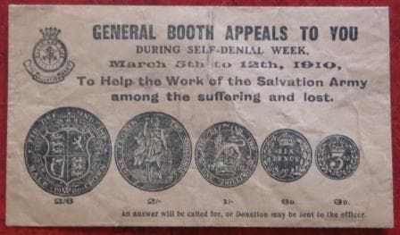
Only five years later, the design has already become bolder both in look and content. The direct appeal from General Booth gives gravitas to each donation and here too another familiar fundraising technique, providing suggested donation amounts, in this case ranging from the equivalent of around £11 to £1.
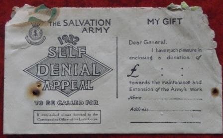
This example from 1932 is again more sophisticated than previously. The provision for donors to complete their name and address was used by The Salvation Army in their annual reviews, in which they listed every donation collected from individuals and the amount donated.
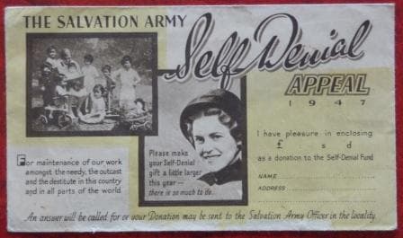
This 1947 donation envelope sees colour introduced. With printing technologies advancing, the cost of production fell in equal measure, allowing far more freedom with design. The inclusion of a photographic image allows every donor to see why their money is needed and what it can help achieve and as with fundraising today, using children in appeals was known to improve people’s willingness to give.
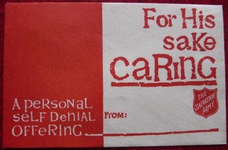
We don’t have the exact date for when this donation envelope was used but it’s safe to assume it was soon after their 1967 ‘For God’s sake care, give us a pound’ campaign. Using the same lettering, the same language and sticking to the simple red and white brand colours, this envelope made the most of linking this appeal with their recent high profile success.
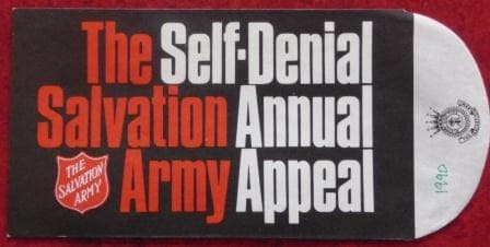
A donation envelope from the 1990s illustrates a simple and clear message, while also enforcing the brand image using The Salvation Army’s red and white.

This 21st century envelope shows just how far marketing and print techniques have come. Whilst it may be bolder and brighter than the early envelopes, who’s to say its better?
