Help the Aged ‘…little piece of plastic’ direct mail acquisition pack
- Exhibited by
- SOFII
- Added
- May 22, 2010
- Medium of Communication
- Direct mail
- Target Audience
- Individuals
- Type of Charity
- Healthcare, seniors
- Country of Origin
- UK
- Date of first appearance
- 1988
SOFII’s view
A breakthrough!
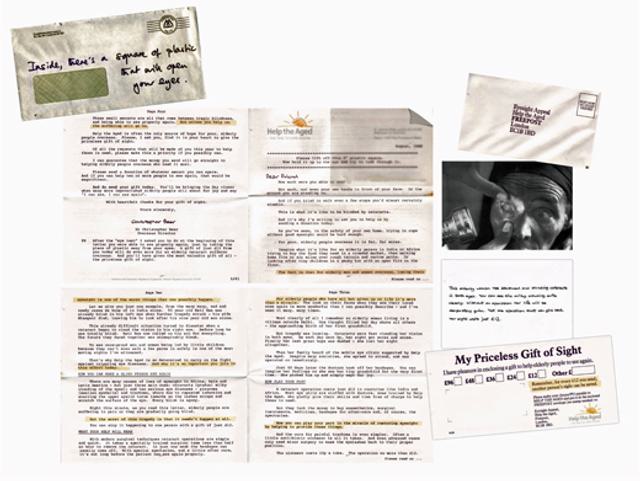
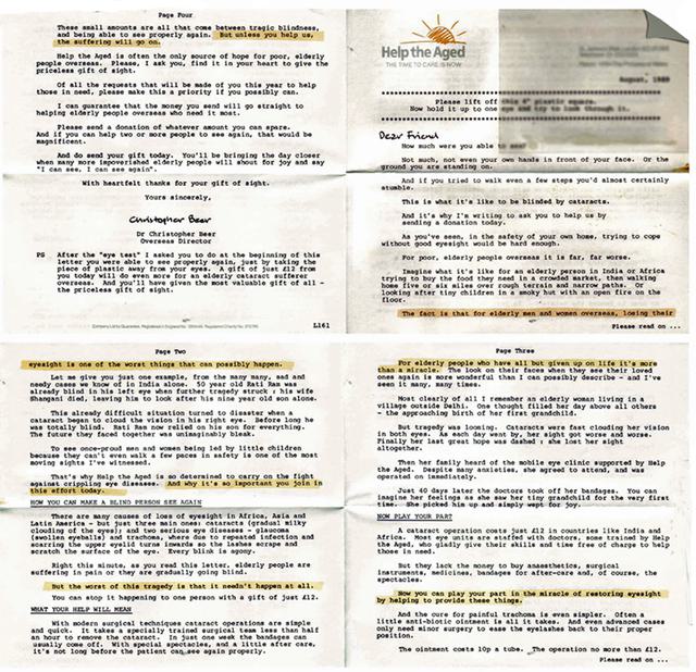
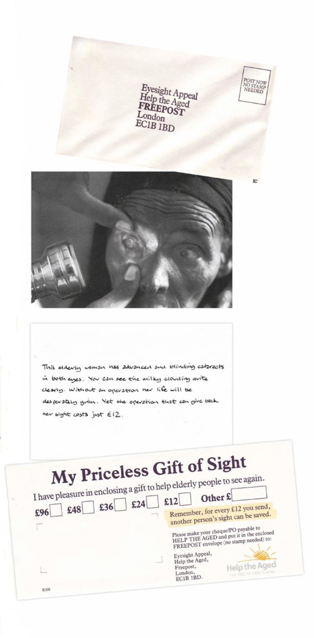
More than a year after this classic pack originally appeared on SOFII, its originator, Chris Stoddard, has come forward with the full story of how it was created. It turns out that the summary we put up shows the second version of the pack. The scans displayed here and in the related page show the original, with all copy for the four-page letter, leaflet and reply device. So, thanks to Chris, SOFII can now showcase this classic pack in its entirety, and we present it proudly for you, here.
The story behind one of SOFII's 'Best of the Best' – when Chris Stoddard first contacted SOFII he commented,
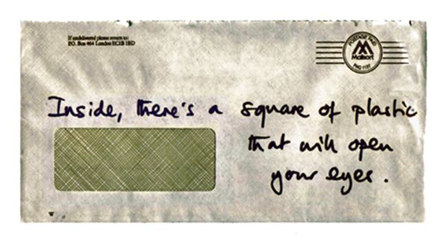
'...the package you have on the site is not the original one. It is the second version. The first version was identical except the envelope message said ''Inside there's a square of plastic that will open your eyes''. It worked incredibly well, but had to be changed after a member of the aristocracy received the pack, put it in a bucket and covered it with sand thinking the 'plastic' might be a bomb. He then contacted the Metropolitan Police! This was in the late 1980s, of course, during the IRA troubles. The second version still worked well and was used unchanged for about 15 years. HTA have even recently used a pack that is clearly based on the original concept'.
Creator / originator
Written and created by Chris Stoddard when at the Direct Results agency (Chris is now at CSDM Ltd). Direct Results had just won the HTA account. The idea for the pack came about when he was taking the opaque plastic lid off a takeaway cup of coffee on the train from Bristol to London. He says, 'Seeing the palm of my hand through the opaque plastic made me think what it might be like to have cataracts.'
Background
When the pack was first created Brian Wright was head of marketing at HTA and Sue Pepper was direct mail manager. Sue briefed Chris to come up with a more successful acquisition pack.
Influence / impact
Help the Aged told Chris Stoddard that some 200,000 elderly people in India had been treated for cataracts as a result of money raised from donors recruited by the pack.
Details
After the plastic explosives incident we had to find an alternative envelope message and came up with the one currently on the site. The new one was used for many years.
Costs
The pack was very cheap to produce as the plastic squares were imported from South Africa.
Results
The pack helped to recruit many thousands of donors very cost-effectively.
Merits
Relevant involvement devices like this one still work, usually doubling results when compared with the same pack without the involvement device.
Other relevant information
The pack was used consistently as Help the Aged's control acquisition pack for at least 10 years, unchanged. Variations of it have been used by HTA regularly ever since.
Further information from another SOFII user:
'It's not quite correct to say that this pack continued unchanged for ten years. In 1994 or 95 HTA's then agency, Target Direct, tested male and female versions of the text and the male version was so successful for men, with little impact on response from women, that HtA adopted that as their control. So the copy was shortened considerably (the shorter copy led to a 70+ per cent increase from male donors and a decrease of around nine per cent from women).'
SOFII will try to get hold of the different copy versions. This is one of a number of copy tests that agencies in the UK, notably Target and Burnett Associates, introduced at this time for different clients. The purpose was to see if it was worthwhile to segment donor databases into men and women and write differently to each. The concept (based we suppose on men coming from Mars and women coming from Venus) is that direct mail copy, being long, discursive and generally emotional, is usually directed at women, whereas men might prefer (and therefore respond better to) copy that is short, factual and to the point.
These tests showed that there is some validity in this hypothesis, but it is expensive to implement consistently.
Watch SOFII's updates for more information.
 View original image
 View original image
 View original image
 View original image


