
St Michael’s Hospital Foundation: the 2010⁄11 annual report to donors
- Exhibited by
- David Gates, manager, marketing and communications, St Michael’s Hospital Foundation.
- Added
- April 24, 2012
- Medium of Communication
- Publications
- Target Audience
- Individuals
- Type of Charity
- Healthcare
- Country of Origin
- Canada
- Date of first appearance
- 2010
SOFII’s view
St Michael’s make their annual reports to donors work hard, they have a wide and varied audience and are always packed with the usual ‘must-have’ information, which could make them dull, yet they have built up a reputation for always producing powerful annual reports. This latest is no exception. It uses bold colours combined with lots of white space, the photography is dynamic and they tell the stories well. St Michael’s donors loved it and they managed to please their board members as well. The senior medical staff were so impressed that they copied the concept for some of their own publications. Well done fundraisers at Toronto’s ‘urban angel’.
Creator / originator
The St Michael Foundation’s marketing and communications team worked with Macmillan Marketing Group on design.
Summary / objectives
- To thank donors to St Michael’s Hospital for their support over the past year.
- To show the impact and the successes made possible by donor support.
- To highlight how philanthropy enhances care.
- To demonstrate transparency in interactions with donors.
- To inspire current stakeholders to continue their support and motivate potential donors to become involved with St Michael’s.
- To freshen the look of the annual report, make it more eye-catching and something that recipients would actually pick up and read.
Background
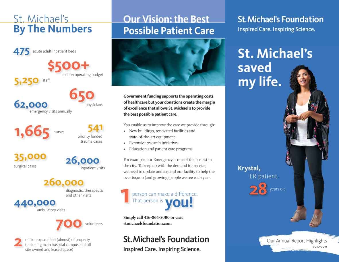
Founded in 1892 by the Sisters of St Joseph to care for the sick and poor, St Michael’s Hospital specialises in the treatment of heart and vascular disease, trauma, neurosurgery, diabetes, specialised complex care, inner city health and mobility. The hospital is affectionately known as ‘Toronto’s urban angel’, which recognises not only the name of the hospital but also its reputation for excellent and compassionate care, particularly for the disadvantaged of the inner city. However, in recent years, we have been emphasising innovation and the hospital is recognised in the health community for our leadership in research and education – as well for our tradition, history and reputation for providing compassionate care.
The annual report to donors is not just an ethical responsibility and a legal obligation for the St Michael’s Foundation, but an opportunity to showcase the accomplishments of the past year and honour our generous donors. It must speak to all stakeholders, but especially to current donors to let them know their donations have been wisely spent and have made a real difference in patient care at St. Michael’s.
There are multiple target audiences for the annual report: current donors, potential donors, patients and their families, volunteers and hospital staff, as well as hospital and foundation leadership. In addition to being distributed to both the foundation and hospital boards and executive team, the report is mailed to active donors who gave $250 and up, along with a letter asking for a donation and business-reply envelope.
Special characteristics
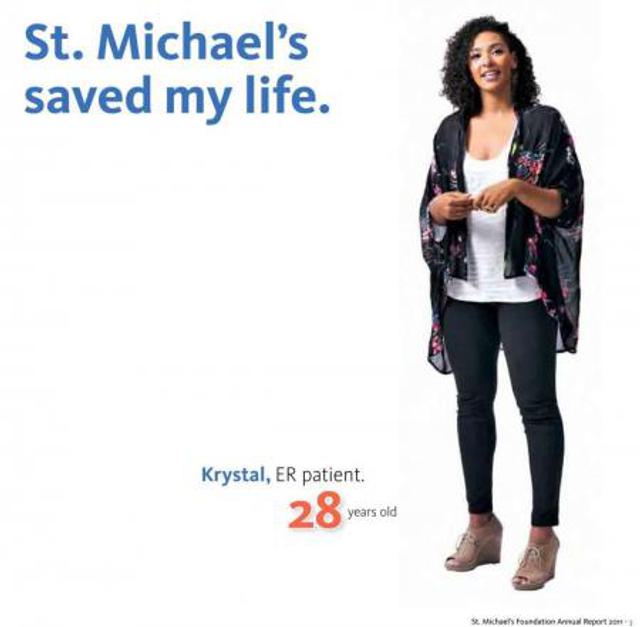
St Michael’s has a history of creating powerful annual reports and the strategy this year was to produce a piece that emphasised innovation and compassionate care with a clean and clear format. We wanted it to be something that intrigued people enough to pick it up and read it, so we made it visual through the bold use of colour, abundant white space, powerful photography and a more dramatic presentation. The emphasis is on images, rather than text, which tell stories that readers can relate to emotionally. We used a young female patient’s story and image to make it clear that we might all need medical care, whether we expect it or not.
The shape and printing also needed to be different to stand out so the piece was square rather than rectangular, with rounded corners and we used four fold-out pages to create large spreads for maximum impact. The fold-out pages, when opened, subtly echo the image of an angel spreading his wings.
Another group of readers – major donors, board members and senior staff – received copies with a full financial report, which was inserted as a separate document, to supplement the financial overview provided in the report.
To keep costs down, the concept was used again in a three-panel brochure that listed the required financial information as well as hospital facts and figures. This mini version of the report with key highlights and ‘fast facts’ was distributed in waiting rooms and other public areas of the hospital to increase awareness and drive donations. The report is also always an important element in any package that we use when talking to potential major gift donors.
We also created a response device that mirrored the report, a business-reply envelope, customised to match the other components with an innovative and easy-to-detach return slip.
The report was also posted on the foundation’s website as a flipbook in Treesaver, to make it readable across as many different programmes and devices as possible (including mobile devices), in both MAC and PC. It was also posted in PDF format.
Influence / impact
The first way to measure the effectiveness of our 2011 report to donors is anecdotal, from comments received from both within and outside the hospital. Comments were extremely positive and foundation board members in particular were delighted with the new look of the piece, with its emphasis on cropped images on a white backdrop, simple and easy ways to absorb numbers and facts, and visual narrative rather than dense text. Leading staff members were also impressed with the new direction and have subsequently mirrored some of the qualities in their own publications.
Second, a questionnaire that was sent to a selection of readers elicited positive feedback. Clearly they picked up on the emphasis on visual storytelling, less clutter and more white space. Here are some responses.
I love the annual report. Here’s why:
The layout is great. Very different from typical. Much more accessible and it lends itself to being reviewed.
The colour is gorgeous, and the white space is the perfect ratio.
The overall tone and matter are in keeping with the health industry.
There was the perfect blend of the ‘business’ stuff and the humanity.
I think it looks fantastic. Clean, great photos, lots of white space.
I just read the annual report and I think it is excellent – very effective use of stories and stats.
I’ve seen a lot of annual reports. This is a good one. Interesting layout & stories and easy to read. I'm usually not keen on foldouts but yours worked.
It made me feel that if I went to SMH I would be looked after well.
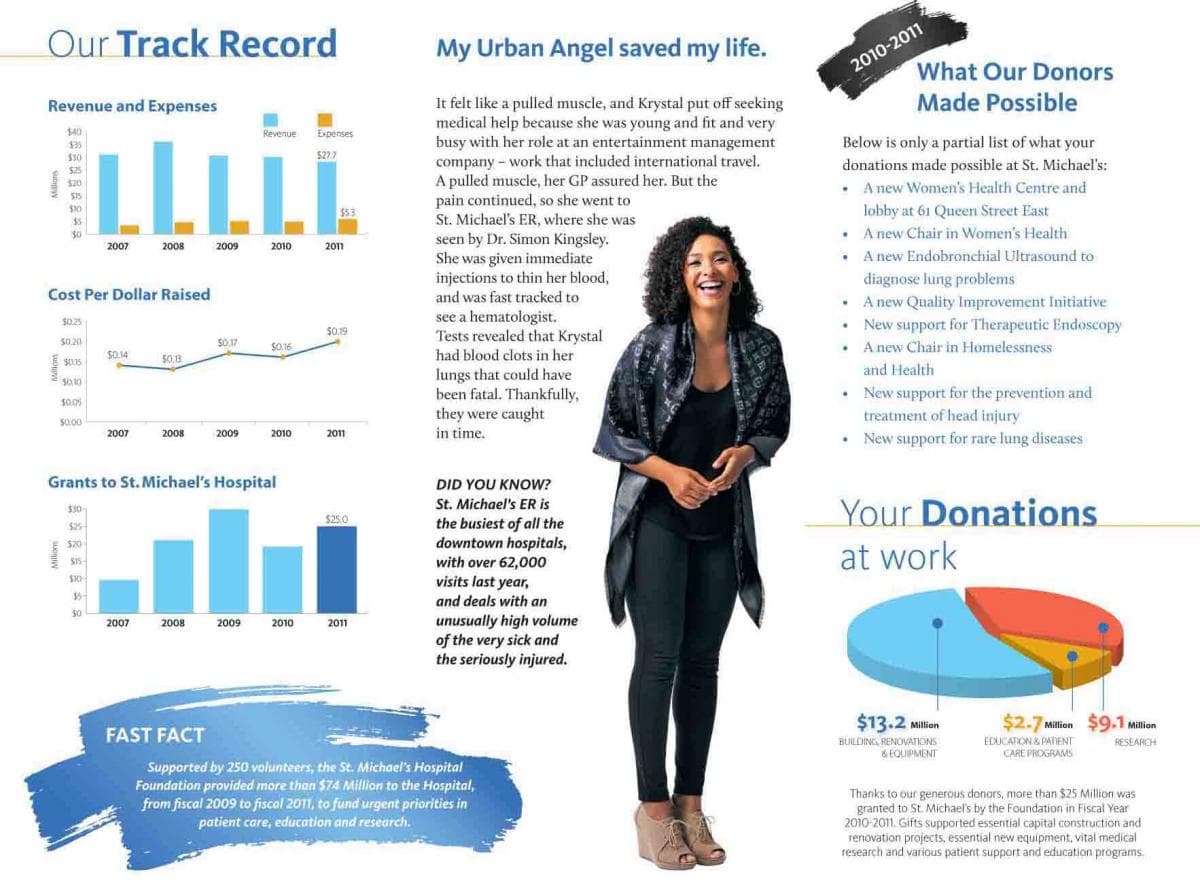
The use of Krystal’s story ‘does not reinforce the image of the sick senior or ill person, but says St Mike’s looks after everyone.’
Merits
There are certain elements that have to be in an annual report – donor names, messages from senior leadership, testimonials, financial transparency. While doing what we had to do, we also wanted to ‘shake things up’ with a more vibrant and dramatic approach.
From the response the report generated, both verbal and financial, we believe that this fresh approach worked very effectively.
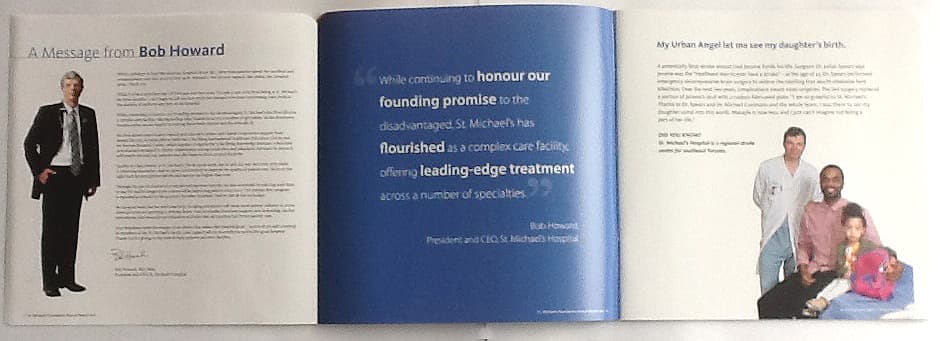
Please note that the PDF version does not show the fold-out pages. There are three at the front of the book, which include the messages from the chair of the foundation’s board and the presidents of the foundation and hospital. The back cover, which features all the members of the foundation’s board, was also a fold-out.
People commented that the foldouts actually work as bookmarks when reading the report.
 View original image
 View original image
 View original image
Also in Categories
-
- Publications
- Individual donors


