

Five acquisition tests: you choose the winner
Each test was designed to examine a popular bit of fundraising conventional wisdom.
- Written by
- Willis Turner
- Added
- May 21, 2012
Sometimes when we test packages we’re actually testing theories.
Because direct mail fundraising is such a curious blend of art and science, we rely a lot on theories and suppositions to develop our creative strategies. The problem is that sometimes we rely on them for so long that we begin to think of them not as theories but as rules.
And as one of the old greats said to me years ago, ‘Rules? What rules? There are no rules in fundraising. There’s only what worked for one organisation in one set of circumstances – and might work again.’
Can someone else’s success really be your success too? We’d all like to think so. That’s why we pore over case studies and flock to conference seminars that lay out success stories as if they were blueprints.
But if experience teaches us anything, it’s that direct mail is counter-intuitive. Except when it’s not. So put on your best direct mail thinking cap and see if you can guess the winners in the following head-to-head tests:
The test: two-colour versus four-colour acquisition carrier

Four colour gets attention. It gets you noticed and gets your package opened. That’s what everyone says, right? We wanted to be sure, so we tested a four-colour version of this environmental group’s two-colour control.
The winner
Yes, four colour does lift response. Sort of. Sometimes. In this case the more elaborate carrier did show a slight lift in response. Unfortunately, it was not enough to overcome the additional printing cost. The two-colour version may not have been as handsome, but it remained the control for several years.
The test: short versus long acquisition letter
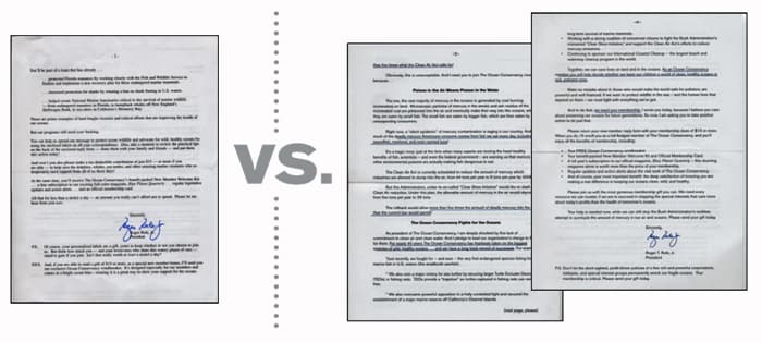
Letter length is one of those issues about which everybody seems to have a strong opinion. Many old-school fundraisers insist that longer letters give you credibility and room to give more details about your programmes. Younger experts say that nobody reads long letters anymore. The old guys counter that it doesn’t matter whether anyone reads the letter. It’s the appearance of having a lot to say that matters. And back and forth they go. We put the argument to the test with this national organisation.
The winner
Prospects responded better to the long letter. But it’s important to note that, while this client was a large organisation, they are not a household name. So the extra copy was needed to fully explain their mission and programmes. You need to test this yourself because we also see shorter letters winning in some categories – especially for well-known organisations.
The test: labels versus invoice
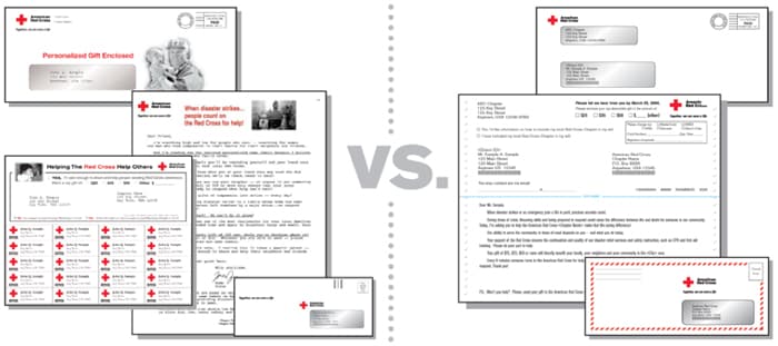
How many times have you heard someone say, ‘Mailing labels are like negative political ads. Everyone hates them, but everyone uses them because they always work.’ Well, maybe not always. This well-known organisation tested labels head-to-head with an invoice-style package. The latter is a very simple, very low cost package that is designed to look more like a bill than an appeal. Instead of the conventional strong emotional ask, the invoice package treats making a gift as a straightforward piece of business; something the donor is expected to take care of as a matter of routine. Obviously copy has to be written very carefully, but, done well and mailed strategically, it’s often quite effective.
The winner
The simple, straightforward, low-cost invoice. It won hands-down, in response, in average gift, and in cost to raise a dollar.
The test: labels versus lunch bag
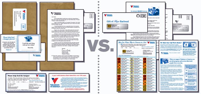
Another label test, but where the earlier example tested labels against a simple, low cost package, this one pitted them against something more elaborate: the organisation’s breakthrough ‘paper bag’ control. This is an actual paper lunch bag, with copy printed on one side, describing the organisation and its programmes for feeding the hungry. Inside the bag are a short letter that emphasises the urgency of the need, the reply device, reply envelope and, very importantly, a ‘bounce-back’ card which the donor can sign and return and which will be given to a hungry person along with a meal.
The winner
While the specialty paper bag may seem like an expensive luxury, the results were clear: response was nearly double that of the labels. Average gift was 32 per cent higher than the labels. And the cost to raise a dollar? Not even close. The labels’ cost was more than three times the ‘expensive’ paper bag.
The test: plain and simple versus ‘fancy schmancy’
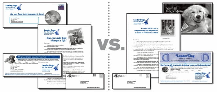
Think your control package is too dull? Or maybe someone thinks you just need to spruce it up. That was the case when we were challenged to find out how this animal rights group’s short and simple control (left) would do against a ‘nicer’ (and more expensive) package. The test on the right featured a smartly designed bookmark in an attractive six inch by nine inch print-and-convert carrier, which was carefully crafted to stand out in the mail and touch the hearts of dog lovers.
The winner
The test got attention all right. The response and average gift were almost as good as the control. But at more than triple the cost to raise a dollar, this so-called high-end package went straight to the doghouse.
Lessons learned?
Labels, long letters, short letters, expensive and low-cost packages. If there’s one thing you can rely on, it’s that conventional wisdom is unreliable. Except, that is, for the one piece of conventional wisdom that really has stood the test of time: When in doubt… TEST!
‘In theory, theory and practice are the same thing.
In practice, they are not.’
- Yogi Berra.
- Or Albert Einstein.
- Or someone else.
© 2006 Huntsinger & Jeffer
This article was published inFundraising Success magazine in March, 2007. It should be read in conjunction with the wonderful Huntsinger Tutorials, which are a complete collection of established direct mail wisdom for beginners and experienced fundraisers alike.


