

Graphic design style guide with examples
It’s not unusual that as your organisation grows, your communication materials are created by various people. Before you know it, there are five different versions of letterhead circulating around the office and your blue logo varies in shade from green to purple.
- Written by
- Julia Reich
- Added
- May 23, 2013
Consistency is key
Inconsistency can be a problem. It is crucial for a charity to not only communicate their message clearly – what they do, how they do it and who they do it for – but also to represent themselves visually in a consistent manner. Donors and other stakeholders need to be able to easily understand your case for support and also need to be able to recognise your good work and achievements. If you don’t effectively communicate what your nonprofit organisation stands for then you risk confusing your audience.
Create your style guide rules
Whenever my firm works on a branding project, our final delivery is always a graphic design style guide (alternately referred to as brand standards or brand guidelines). The overarching need for such a manual is so that, internally, your organisation has a set of rules by which to create consistent communication. The rules apply similarly to print and web usage – and PowerPoint, a branded mug, an advertisement on the side of a truck and any other media you can think of. In essence, the style guide protects your organisation’s message and your image.
Training ensures buy-in
Staff may need some instruction and help on how to implement their new style rules. For instance, along with the style guide, our clients receive a CD with their new logo in every possible file format necessary for use with the above media. And while the manual explains when and where it’s appropriate to use each file, some explanation could be helpful for those not familiar with print production processes, or web standards. Training will also help to get everyone on board, ensuring buy-in throughout the organisation for your new, or newly revised, visual identity.
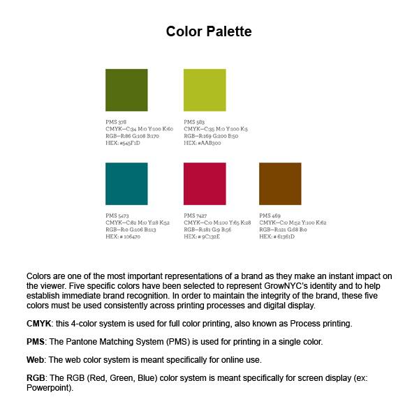
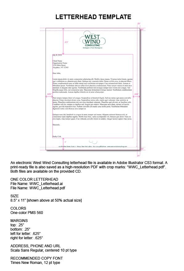
Real life examples
Here are a few examples of colour palettes, letterhead templates, typefaces and logo placement photography to give you an idea.
This article originally appeared on Nonprofit Marketing Guide.


