
Secrets of direct mail 3: how people read letters
In the third entry in the SOFII series on Siegfried Vögele’s direct mail approach, Chris Keating explores how potential donors read letters and how this could improve your campaigns.
- Written by
- Chris Keating
- Added
- June 27, 2019
Most good practice in direct marketing builds on work done by Prof. Siegfried Vögele who literally wrote the book on this subject in the 1970s. Sadly he has died and the book is long out of print. This post is part of a series summarising his work. With thanks to Chris Keating for allowing SOFII to feature this important series.
Previously in this series: the dialogue method, envelopes.
This article first appeared on Chris' Medium blog here.

When someone reads a direct mail letter, in their head they are asking themselves a long list of ‘unspoken questions’. The more they’re able to answer those questions, the more likely they are to read your letter in full and then to act on whatever it is you’re asking them to do.
To recap the last couple of posts in this series: Before someone gets to your letter, they have probably spent several seconds looking at your envelope. During this time they are trying to answer questions like’Who is this from?’ and’What are they writing about?’ and’Am I interested in reading this?’
If they have found good answers to those questions, then after opening the envelope, the first thing they will look at is the letter.
Why is the letter most important?
Letters are personal communications from one person to another. Receiving a letter creates the hope that someone knows about you and cares about you. (And if you’re writing marketing direct mail, your role is to make sure your letter follows through on this promise!)
The other parts of a mail pack — inserts, response forms, incentives — don’t give the reader any personal interest or validation. That’s why the letter itself is always the most important element.
This also means that the first questions the reader looks to answer with the letter are personal ones.’Who is writing to me?’,’Have they got my name right?’ and’Who has signed the letter?’
How do people read letters?
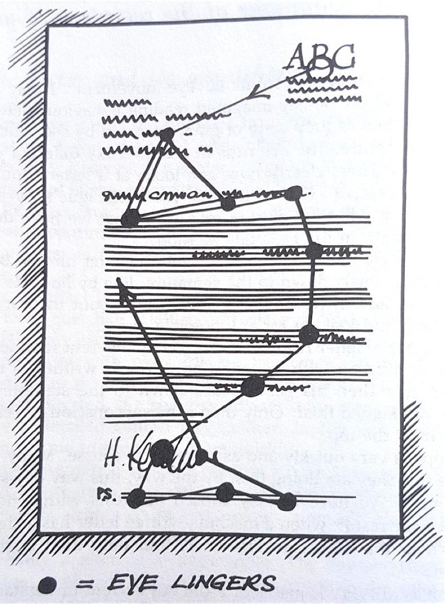
‘The Reading Curve – when the reader looks for personal details then skips to the end, before deciding whether to read the letter properly.’
Siegfried Vögele, Handbook of Direct Mail
People look for answers to the personal questions first — questions such as ‘Who is writing to me?’ and ’How are they addressing me’.
They glance at logo and date, the address block and salutation first, and then skip straight to the end of the letter to look at the signature and signatory.
This path is called the ’Reading curve.’
On the way, their eye will catch on some parts of the letter. The opening words, and elements that are in bold, underlined, indented, sentences, or single-line paragraphs. They probably don’t stop to actually read full sentences (they’re on their way to the end of the letter to find out who’s written to them!) but the words they see will help them start to fill in their answers to other questions like ’What is this about?’, ’What do they want?’ and ’Is it worth me reading this now?’
They then reach the signature, hoping that an actual person has gone to the trouble to actually sign the letter, or as close as possible.
If there is a PS, then they will read it at this point, probably in full. Then they will make a decision about whether or not to go back and read the letter from the beginning.
That’s right: People will only read your wonderfully-crafted letter through from the beginning if you have already persuaded them it’s worth reading.
I’ll now take each of these elements in turn and think about how we can use them most effectively.
The logo or letterhead
Most letterheads have a logo in the top-right corner. This gets the reader’s first glance, to help answer the question, ’Who is this from?’
Vögele suggests that if you are a little-known organisation writing to people who don’t know you, then actually you shouldn’t use this space for a logo. After all, seeing the ABC Goods Ltd logo doesn’t help you answer any questions if you have never heard of ABC Goods. Instead, consider putting a picture or some text highlighting the benefits of the offer you are making.
Otherwise, my advice would be to keep the logo area fairly clean and simple. Often under the logo there is some letterhead text with the name and contact details of the person writing, which is great so long as it matches the actual signature on the letter. Sometimes, organisations feel they have to add other ‘essential information’, maybe your list of Patrons and Vice-Presidents, which is an irrelevance best removed from the letter.
The date
Vögele recommends either a specific date (eg 16 March 2019), or no date at all.
If there is a date on the letter, it will almost certainly be read. If it’s a specific date, that supports the idea that it’s a genuine letter. However an open date like ’November 2018’ or ’Spring 2019’ creates the impression that it’s not a real letter after all, so could reduce response.
Address block and salutation
It goes without saying that people are more likely to respond to a letter that has their preferred form of their name and title.
This is why high quality address, name and salutation data is important. And it’s even more important that when a donor or customer goes to the effort of telling you how they want to be addressed, that you make use of that information, even if you have a million records on your database.
I could go on at length, but Siegfried Vögele didn’t so I won’t.
Catching attention along the reading curve
People skip from their name (the important bit!) down to the signature. However, as they go, they glance at bits of text on the page.
Of course, your letter should be laid out in paragraphs, preferably of 3–6 lines each. Otherwise the letter looks like an unreadable mass of text and will probably be thrown away. Vögele compares that kind of layout to a salesperson who knocks on the door and says, ’Can I have two hours of your time?’ — it creates the impression the whole thing is long, difficult and boring, so the reader might as well decide now not to engage with the whole thing.
But paying attention to layout is even more important than that!
Not only does the layout make it look easy to read, it also provides hints to the content of the letter before the reader actually starts reading it properly. The reader’s eye will fall on:
- Single-line paragraphs or subheadings (Vögele observes that a single-line paragraph is read as a subheading, even if it’s not, e.g. in a different font).
- Underlined or bolded sentences, parts of sentences or words.
- Paragraphs that are indented.
- The endings of paragraphs, particularly words that spill over onto the next line.
The reader will glance at a few words in these elements, not stop to read them properly. While they do, they will try to answer unspoken questions like, ’What’s this about?’ and, ’Do I actually want to read this?’. So it’s important that these elements reinforce your overall message and overall offer.
Vögele wasn’t a fan of using bold type, thinking that bold text stops something being read as an ‘original letter’. However, he notes that’s because he was mainly working with people who would write their letters on typewriters, which had underline buttons but not bold buttons! That’s probably changed a lot in the last 40 years.
Signatory and signature
When someone looks at the signature, they’re looking for reassurance that the letter is from a real person (maybe even someone they know!) Vögele found that the biggest ‘filter’ when someone looks at the signature was a lack of clarity or legibility. If the letter is from an illegible scribble, or a generic department, it’s more likely to get thrown in the bin.
It’s worth going to the effort of making sure the signature looks something like the signatory name. The reader is actively looking to make sure that the signature and the name match, so you want to help them. If they don’t match, the reader spends an extra moment thinking, ’Does that squiggle really mean Jane Smith?’ and during that extra moment, may get fed up and throw your letter away. (Vögele cites a time when someone tested illegible vs legible signatures on a mailing; the legible version received a 13% greater response. I’m not going to be in a hurry to retest it myself!).
The signature should be printed in a bright shade of blue, to match what you would expect to see in a personal letter, 70 per cent of which are signed in blue ink.
The signatory’s name is there in the way they would normally use it. ’Bob Jones’ is more friendly and personal than ’B Jones’. Vögele also advises you should add a job title or role, if it is relevant to the reader — which all depends on you and your audience.
If I’m reading a letter at my desk and it’s selling me something, it’s useful to know whether it’s from the ’Sales Manager, London’ or the ’Client Services Director’. If I’m at home looking to be talked into supporting the capybaras yet again, I’d like to know the letter’s from the ’Head Keeper, Capybaras’ because they probably know a lot about how I can help the capybaras.
I’d note that titles and letters after the name have the same kind of effect. Spelling out Rear-Admiral Robert Jones MC RN (Rtd) or Mrs Roberta Jones FRCS would be relevant to some audiences (naval types, and surgeons, respectively) but not to buyers of printers or to capybara fans.
Using a PS
If you’ve been on any training about direct mail at all, you’ve probably heard, ’Put a PS on your letter, because people are likely to read it’. This is one of Vögele’s original insights (thought it makes way more sense in the context of his entire method).
Vögele found that 90% of readers stopped to read a PS on a letter, and that when they did, they read it word for word.
This means that the PS is very likely the first thing in your letter the reader has actually paid attention to, and they read it in full before making the decision to engage with the actual letter. In a sense it’s a point of transition between glancing at stuff while you’re working out what’s going on, and deciding to actually engage with something properly.
The questions on the reader’s mind are now, ’What’s this about?’ and ’How much do I want to read this?’. They’re finished with ’Who’s this from?’ and so on, because they’ve just seen the signature.
According to Vögele:
- The PS should be 2–3 lines long, though should be longer if the letter is very long. If the letter goes over 4 sides of A4 don’t be shy to use a several-paragraph PS.
- The PS should talk about the benefits of your letter to the reader. Whatever the discount, offer, or emotional reward of taking action is, it needs to be apparent in the PS.
- Only omit a PS if your letter is already so personal and important to the recipient that you are sure it will be read in full.
There you go — that’s almost all the advice you need! Almost… but not quite.
What not to do with the PS
I often see letters where someone has clearly been told, ’Add a PS, it’s important!’ but not understood why.
If you’ve followed all of the above, you’ll realise it’s important that the PS summarises the benefits of the letter. This means: don’t introduce a new thought. Don’t say, ’thank you for all your wonderful support’ unless you link it immediately to what you are asking them to do this time. Don’t use this as the place to drop in your customer service contact details, unless the action you really want is for the reader to call you. Don’t talk about another campaign or product they might be interested in. Focus single-mindedly on what your reader can get out of going back to the top and actually reading the letter in full.
Reading through the letter
If someone picks up your mailing, opens the envelope, takes out the letter and enclosures, checks the address and signature block and then reads the PS, then and only then will they go back to the beginning of your letter and start to read it from top to bottom.
Someone who actually reads your letter is already in a very good place. They have already worked out who you are and what you’re probably about to ask them to do. They saw the message on the outer envelope, they noticed what kind of response form is enclosed, they saw your logo and then they read your carefully crated PS to answer all of those questions.
They have already formed the judgement that they’re interested enough to spend some time and effort paying attention to what you’re doing, and they will only make that investment if they can see themselves saying yes.
This is why I laugh (inwardly… ok outwardly too) when I hear fundraisers saying, ’It’s important to make the ask in the first paragraph!’ In a well-constructed charity appeal mailing, by the time someone gets to your first paragraph they are expecting to be asked for something and have invited you to state your case. So start telling them what they can achieve, not telling them what they already know, which is that you want them to open their wallets.
The purpose of the body of the letter is to answer the recipient’s remaining questions. The questions that remain will probably depend on your specific sector and relationships. Vögele’s book includes several lists of ’unspoken questions’, but I don’t find most of them that useful in thinking about the charity fundraising I work on. So I won’t try to include the full lists, but rather talk about the approach and how it might work for you.
The key questions seem to be:
- What are the benefits of taking the action you want?
- How can I see evidence of these benefits if I still need convincing?
- What steps do you want me to take next?
What are the benefits of taking the action you want?
Benefits might be stated in terms of product characteristics (faster! better! more reliable!), promotions (cheaper! on sale now! guaranteed!) or less tangible rewards (be more popular with your friends! Build a better society! Stop the Tories! Save the cuddly animals!) Vögele doesn’t spend much time on talking about what your benefits are and how to talk about them — after all, his book is about tactics, not bigger-scale things like positioning and branding. But you, the person writing or briefing the letter, need to have a clear grasp of what those benefits are.
How can I see the evidence?
Similarly, evidence can take many forms, and Siegfried Vögele doesn’t try to tell you what evidence you should include for your audience and your product. If you’re selling office printers then you might be looking to include product specifications, guarantees, or testimonials. If you’re raising money for the capybaras then you might include details of the new sanctuary you’re trying to build, or a storybook about a baby capybara. (Or both. I’d do both.)
However, he does say that if you want to include a lot of supporting material, then do it in inserts and enclosures is to provide supporting evidence, and don’t try to include all of that in your letter. Not everyone will want or need to look at that extra material, so give them something they can look at if they want. If you’re selling things in person you probably have a binder full of documents you can pull out if you need to refer to them — think of the inserts as fulfilling that role.
What should I do next?
The call to action (buy now! donate! sign the petition!) is what you’ve been building up to. You’ve been dropping hints about this from the moment they picked up your envelope. If they’ve got this far, your reader already knows that you are going to ask them to do something, give something or buy something. They’ve already gone to the effort of reading why you think this is something they want to do. So now, towards the end of the letter, you should ask them directly and clearly to do it. And you should make it as easy as possible.
Vögele believes you should always include a dedicated response device. It might be attached (but easily separated from) to the letter, or it might be a separate sheet of paper, possibly a response card or self-mailer. Vögele talks a lot about postcards with detachable guarantee sections, mainly because that’s a route that happened to work particularly well in the German postal system.
The response item must be clearly identifiable and should make it as easy as possible to return to you. If you can preprint their details, do. Avoid having too many tick-boxes or places where they need to sign.
Wrapping up…
In this series I’ve already covered Siegfried Vögele’s approach to direct marketing, and also dived into the details of how to make your envelope as effective as you can. Now we’ve also covered how people read the letter itself. There will be one more post after this dealing with some thoughts about storytelling, unspoken questions, and some of the even more detailed points that Vögele discusses in his book.
I hope you find these insights useful — I know I have!
© Chris Keating 2019. Reproduced with permission.