

Blue Cross: a brand refresh
- Exhibited by
- Reuben Turner, Creative Director, The Good Agency.
- Added
- May 04, 2012
- Medium of Communication
- Target Audience
- Type of Charity
- Environment & animals
- Country of Origin
- UK
- Date of first appearance
- March, 2012
SOFII’s view
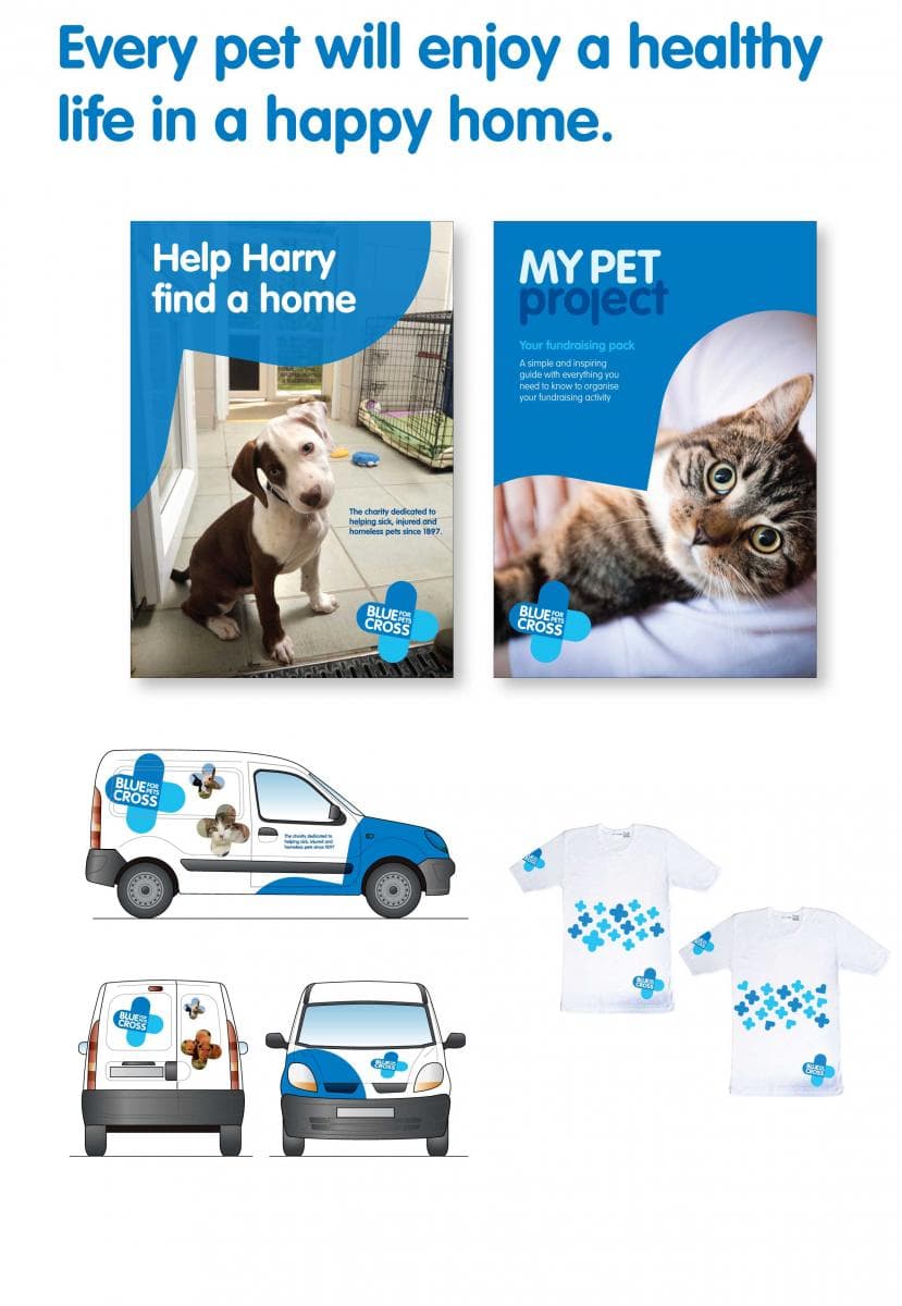
When the Blue Cross decided that their brand needed refreshing they carried out some very detailed research first. They gathered some useful information, not least that their supporters didn't understand the charity’s terminology. Quite a revelation – they had been using it for very many years. Now instead of ‘companion animals’ their vision is ‘every pet will enjoy a healthy life in a happy home’ and a brand essence of ‘healthy happy pets’.
The beauty of this brand refresh is that it reflects the love and concern for pets that is core to the values, beliefs and motivations of supporters of Blue Cross.
Creator / originator
A team from the Blue Cross and The Good Agency.
Summary / objectives
One-hundred-year old animal charity the Blue Cross wanted to rebrand to attract a wider audience and gain a bigger share of voice in the animal charity sector – among donors and supporters, volunteers and staff, government and other influencers, and the public at large.
Background
The Blue Cross has an amazing history. Originally founded in 1897 as Our Dumb Friends League, it established the first hospital for animals in 1906 and helped injured animals in the Balkan, First and Second World Wars. The Blue Cross started the world’s first animal hospital in 1906.
Despite helping pets for 115 years the charity has low brand awareness, especially when compared to the Red Cross, which is well known for helping people. Sadly for many people the Blue Cross is a symbol that represents a shop – like Selfridges or Bloomingdales – not help for pets. Until now. The charity has updated its brand identity for the first time in 60 years to put the Blue Cross back on the map.
Perceptions-based research with the charity’s main audiences – staff and volunteers, service users and supporters was carried out to inform the future brand direction. Importantly the process also focused on the views of prospective future supporters. The charity has quite an old donor base, which is not atypical for charities, but has aspirations to broaden its appeal to pet lovers everywhere, including families and young professionals. Some fundraisers think this is a much harder proposition.
The charity had prided itself on championing the relationship between people and their ‘companion animals’, terminology that it has used for many years. However, the research found that supporters’ didn’t really understand the phrase ‘companion animal’ and wanted a clearer focus on helping pets. This led to a new vision of ‘every pet will enjoy a healthy life in a happy home’ and a brand essence of ‘healthy happy pets’.
Research explored whether a change of name was needed to inspire and acquire new supporters. This established that the name was not a barrier to involvement and that knowledge of the charity’s heritage helped to build trust, a crucial element in building and encouraging support. The short and simple strapline ‘for pets’ was added alongside the name to add greater clarity as to what the Blue Cross symbol stands for.
Three concepts for a new visual identity and tone of voice were tested across all the audience segments, with particular attention paid to the views of the future potential supporters.
One creative route came out as a clear preference across all audiences, including new audiences.
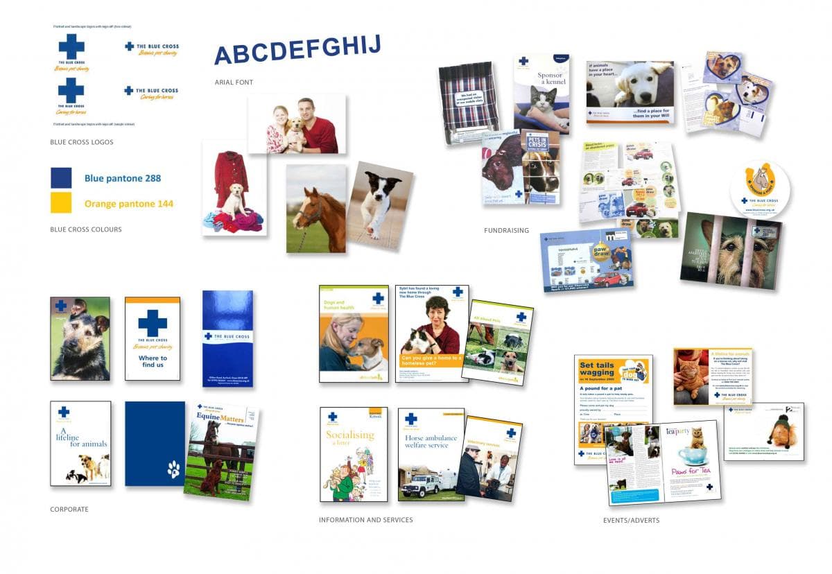
The new Blue Cross logo is softer and friendlier than before to reflect Blue Cross’ caring nature and to differentiate it from other pet welfare charities. The shape of the logo is used throughout designs to ensure the identity becomes instantly recognisable, even if the logo is covered up – a good test of a strong identity. There are three styles of photography within the guidelines to allow effective storytelling and fundraising – pets in need, Blue Cross in action, and healthy happy pets. The focus always being on the pet for emotion and to establish the important ‘aahh factor’.
Special characteristics
That rare beast – a brand refresh that puts fundraising at the heart of the process. Designed to mirror the love and concern for pets that is core to the values, beliefs and motivations of its supporters.
Influence / impact
It’s too early to know, but the brand has been well received all round with little of the backlash that charity rebrands often attract from supporters and volunteers.
Merits
Charity rebrands are often greeted by fundraisers with a wistful sigh and a knowing roll of the eyes. So often they seem to have been carried out to meet the needs of everyone but supporters. This one is different, because it puts supporters and their deep love and concern for pets first. It’s designed to meet fundraising objectives as well as brand/awareness.
 View original image
 View original image


