St Michael’s Hospital Foundation: personalised website
- Exhibited by
- Lara Banks, vice president, marketing and communications, St Michael’s Foundation
- Added
- March 29, 2013
- Medium of Communication
- Online.
- Target Audience
- Individuals, in memoriam, regular gift, single gift, volunteering.
- Type of Charity
- Healthcare.
- Country of Origin
- Canada.
- Date of first appearance
- October, 2012.
SOFII’s view
SOFII’s thanks go to St Michael’s for this wonderfully detailed account of how they changed their website to a much more donor-friendly way of communicating with their donors online. The emphasis was on making the site very personal to each donor and to make it easy for them not to just donate money, but to share their stories and experiences of St Michael’s. Not surprisigly they exceeded their target of increasing online donations by 20 per cent.
Creator / originator
St Michael’s Foundation, marketing and communications team.
Summary / objectives
The St Michael’s Foundation marketing and communications team’s goal was to create a new website that would increase online giving by 20 per cent.
Our strategy was to create a donor-centric experience online and make it easy for visitors to give, connect and personalise their giving. To achieve this we:
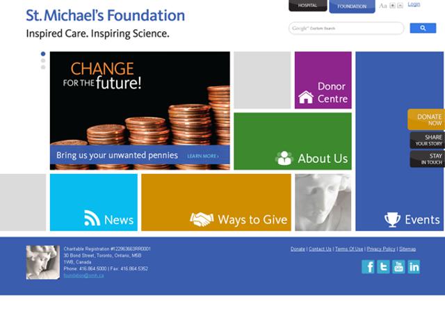
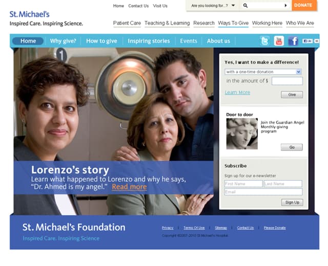
- Profiled key actions on all pages: stay in touch, share your story, donate.
- Created a donation page that customised fields suited to each donor’s needs.
- Encourage donors to personalise their giving and support around their St Michael’s stories; and to share their stories with friends and family
Background
Adapting our existing website to improve donor experience and raise more funds for St Michael’s wasn’t an option for us. With our existing online tools, our staff couldn’t even accomplish simple tasks, like adding videos to pages, without the support of a web developer. Today when most people can easily post to websites from their mobile phones, it was clear to visitors that our site was in need of upgrades. And, it became clear to us that people like to share their stories with friends and family online and we needed to tap into this with our new site.
Our plans for technical upgrades included meeting Web Content Accessibility Standards (WCAG) 2.0, supporting mobile devices and social sharing, and eventually integrating the website with our database to give staff access to accurate and up-to-the minute reports on donor support.
New site architecture was informed by traffic statistics on our previous website. We removed the hospital navigation from our header and replaced it with file tabs to allow visitors to easily switch (toggle) between our sites. We revised, repositioned, or removed pages that weren’t engaging visitors and reduced the number of site sections from seven to five. To raise the profile of our key calls to action, we displayed them as tabs on every page of our website.
For design, we looked to icons on our mobile devices that represent applications for inspiration. We found icons to represent the sections of our site and shared them with a focus group to test their effectiveness. We liked the clean lines and dynamic arrangement of coloured squares and rectangles of sites by the Museum of Modern Art in New York and
Above all, we wanted to give our visitors a great experience. We collected a list of links to sites with great user experiences. We found these sites had three things in common: ease of use, a keen understanding of their users and ways for users to share their personal experiences.
Our previous website didn’t deliver a great experience and, thankfully, donors called to tell us. We had a file of feedback on our website with requests, suggestions and compliments about what they liked and complaints about what they didn’t. But when donors called, they also told us why they wanted to give something back to St Michael's. Why couldn’t we get those stories through our website?
We also learned that most donors are willing to do more than just make a donation. We reasoned that the best way for us to raise more funds to support St. Michael’s was to inspire visitors to connect with us, personalise their giving and support us by sharing their stories and encouraging their own friends and family to donate to St Michael’s, too.
Special characteristics
Customised donation form
We wanted to simplify our donation form to make it as easy as possible to fill in and to give donors lots of options to personalise their gifts.
On our previous website we had four different donation forms and donors were often confused about which they should complete. For example, donors making in memory gifts would often fill in the form called, ‘one-time donation’ and phone us later, when they realised they hadn’t named the person they wanted to make the gift in memory of and to request a card be sent to the family. An online donation should be quick and easy but, in cases like this, it could become time-consuming and stressful for our donors. This wasn’t the positive customer service we wanted to provide for our donors and this wasn’t an efficient way for our staff to process the donations either.
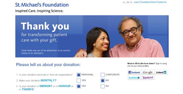
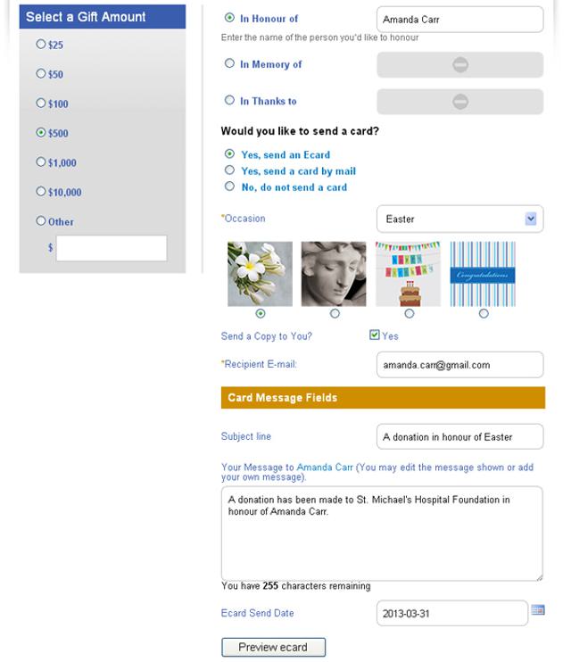
Now, donors simply answer three short questions and a customised donation form appears, showing only fields and instructions relevant to the donor’s specifications. Our new donation form supports one-time, recurring and tribute donations from individuals and organisations.
To make it easy for donors to personalise their donation by sending a card, we included a drop-down list of occasions and sentiments for the card. Then, we programmed the form to use the donors’ entries and selections in previous fields to include a customised subject line and a sentence to begin the card message. For example, a donor making a donation in memory with a card might choose ‘our thoughts are with you’ and this appears in the subject line for ecards, or at the top of their printed card that we send on their behalf. The first sentence of the card reads, ‘a donation has been made to St Michael’s Hospital Foundation in memory of [name of deceased as entered by donor]’.
Filling in forms can be tiresome, so our visitors can now use social login, which allows them to sign in to our site using one of their existing online profiles, such as Facebook or Gmail, to fill in donation form fields automatically. After signing in, all a donor needs to do is enter the gift amount and payment details and a message, if they’re sending a card with their donation.
Personalised giving
On our donation pages, we show donors how they can personalise their donations to thank their doctor, celebrate their family member’s return to health, or make a donation in memory of a loved one.
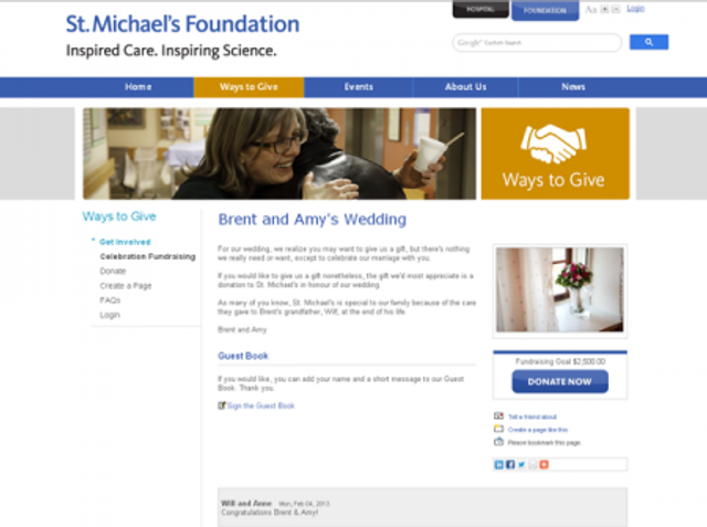
Celebratory donations
Cards to mark holidays, special occasions, or a return to health help to make donors’ gifts of support more meaningful.
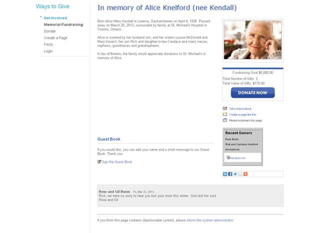
Memorial gifts
Donations in memory include a choice of a card sent throught the post or an ecard to the next of kin with a message and suggested condolences.
In thanks gifts
Include an option for a donor to send an ecard with message to a caregiver or staff member – without needing to enter recipient(s’) address(es).
Personalised support
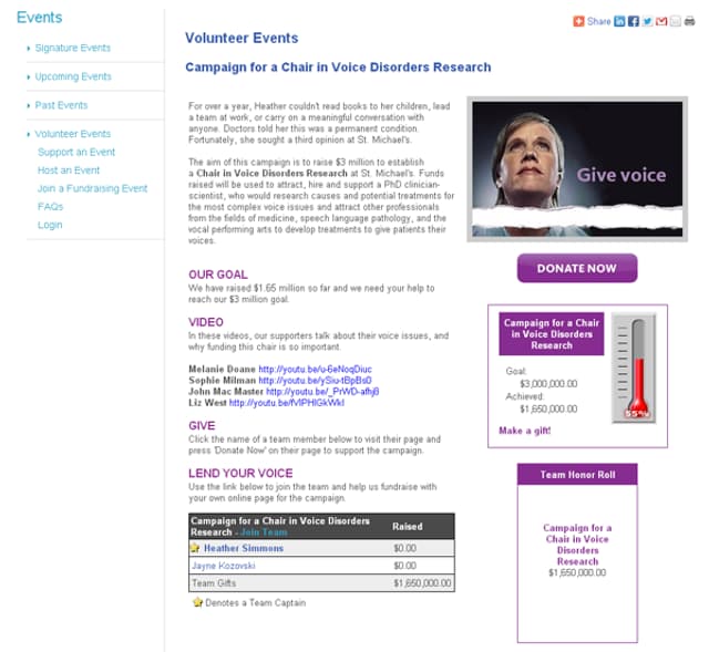
On our site, we encourage donors to get involved and help us to fundraise. We offer three types of personal fundraising pages that extend the options we offer donors on our donation form: celebrations (in honour), memorial and campaigns (in thanks). On these fundraising pages, we encourage volunteers to personalise their support by sharing their story, posting a photo and inviting friends and family to support their campaigns.
Celebration fundraising pages
Site visitors may create their own fundraising pages and offer friends and family the opportunity to give and send an ecard to the person (or couple) of honour. Pages may be further personalised with an optional blog for the page creator and visitors can write in a guest book.
Memorial fundraising pages
Families may personalise the page with a picture and memories of their loved one. The pages support an optional photo album, guest book and invite family and friends to make memorial donations to St. Michael‘s.
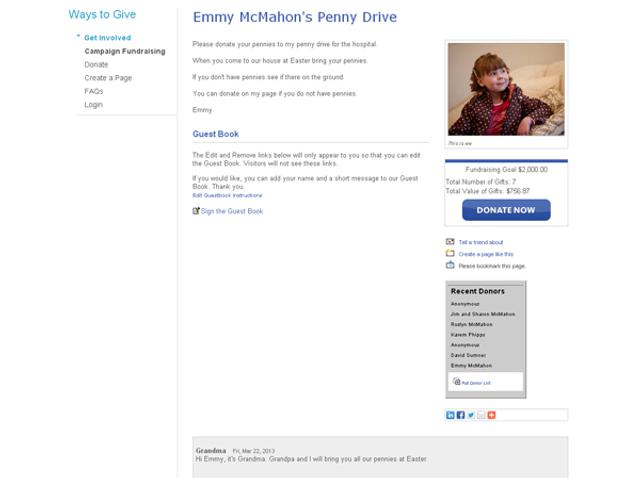
Campaign fundraising pages
Patients and families are invited to tell their own St Michael’s story and invite friends and family to pledge their support.
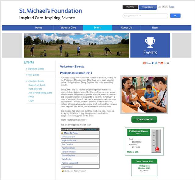
In addition, we offer customised pages for volunteers to host their own events and team fundraising challenges to benefit St Michael’s.
Event and team fundraising pages
Event hosts and fundraising challenge organisers may personalise their pages with their story and a video or photo in a choice of two colour schemes.
Donor centre
We created the donor centre to give donors a place on our website where they have access to their subscriptions, giving history and online fundraising pages. Donors can:
- Login using an existing online profile or site login to auto-fill fields in registration and donation forms.
- Manage their contact information and subscriptions.
- View online giving history.
- Request tax receipts.
- Access fundraising pages.
- Update preferences.
Costs
Due to confidentiality agreements signed, we can’t disclose the budget for the project. Costs included all design fees, custom development of fundraising tools, a content management system, email marketing tools, social sharing integration, including software license fees and maintenance for five years.
Merits
St. Michael‘s is recognised as a leader in continuous quality improvement and we want to give our website visitors and donors an excellent experience every time they visit. We’re pleased with the responses and stories we’ve received from donors and volunteers so far. We look forward to hearing more from visitors to the site, donors and fundraising volunteers on how we can continue to improve donor services online.
Other relevant information
hjc provided consulting, development and design.
Blackbaud provided Luminate Online and CMS products
Follow up
We developed goals for our website and fundraising tools to focus our efforts on the most important objective of the project: to raise more funds for the hospital.
To measure our success we outlined metrics we wanted to track before we developed our website and fundraising tools. This allowed us to integrate Google Analytics tracking code across our website, microsites and fundraising tools.
Offering a customised donation form and a mobile-optimised version of the form on our website contributed to increased visitor-to-donor conversion. And our emphasis on the ways patients and families could personalise their support lead to improved visitor engagement. Evidence of greater engagement is clear when we look at increases in time spent, pages viewed, the number of visitors creating fundraising pages, sharing stories, hosting events and asking friends and family to support St Michael’s.
Overall, our donor-centric approach in developing our new website helped us acquire new supporters and exceed our goal to increase online donations by 20 per cent.
Final notes
Quotes from ‘share your story’ submissions and responses
‘I just opened your email expressing such gratitude for sharing our story. The gratitude is really ours.’
‘St Michael’s has been so wonderful, beyond words to both of us in so many different ways… All the staff that we dealt with were not only kind and caring but do this every day in a very unassuming way.’
‘All experiences such as the ones we or anyone else had, truly do give a new perspective on life.’
 View original image
 View original image
 View original image
 View original image
 View original image
 View original image
 View original image
 View original image
 View original image
Also in Categories
-


