Walk the Walk: a website that puts the donor at the centre
- Exhibited by
- Addition by WPN Chameleon
- Added
- January 11, 2018
- Medium of Communication
- Website
- Target Audience
- Type of Charity
- Medical
- Country of Origin
- UK
- Date of first appearance
- 2017
SOFII’s view
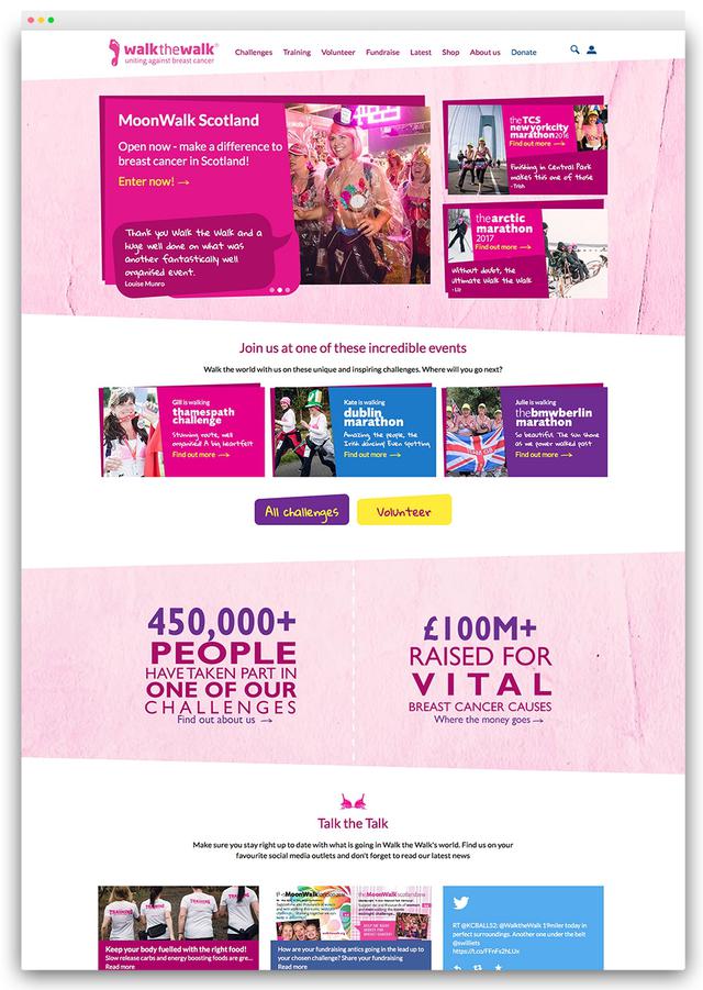
As Walk the Walk have developed into one of the largest organisations fighting breast cancer in the UK, a new website was needed that pulled together existing strands. By focusing on the user experience and sounding out how users interacted with Walk the Walk's existing systems, the organisation and Addition were able to come up with a future-facing website that put donors and participants in Walk the Walk activities at the centre of the experience.
Summary / objectives
More than half a million people have ‘Walked the Walk’ to support research into breast cancer but until now they had to use different sites and systems to participate, to volunteer, to register, to raise money, or just to donate. With the growth of Walk the Walk – now the largest grant-making breast cancer charity in the country – a single 360-degree site was needed.
Background
Walk the Walk were looking for a new website to reflect their unique nature; the supporters who take part in its events – the MoonWalks and other events around the world – are the lifeblood of the charity.
Addition understood this right from the start, pitching a design that put the walkers at the heart of the website, not just in terms of the functionality but also the design. The breast cancer sector is a crowded one, so creating a distinctive look and feel was essential. The website covers the life cycle of engagement: for example people may register and participate in events as a walker, they may volunteer to help, they may fundraise, they may just donate; they can do all of those things through the website. Walk the Walk have a 360 degree view of those individuals and all that they do, from a user point of view they can do all the things mentioned above and the website knows who they are.
‘We wanted to design a site to set Walk the Walk apart in their market and reflect the unique nature of their very active supporter base – the walkers themselves. From the early stage designs at pitch, right through to the final look, we worked really hard with the Walk the Walk team to produce stand-out creative that is modern, fun and approachable, with a handmade feel, to reflect the character of the brand.’
– Stewart Sear, Creative Director, Addition
Special characteristics
Addition undertook an extensive user-experience phase to ensure the delivery of the new system would meet their needs. This involved activities such as stakeholder interviews and workshops, analytics & data reviews and user research, including online surveys, persona creation, card sorts, goals matrix, wireframing, prototyping and user testing.
Influence / impact
With over £100 million raised to date and nearly half a million people having taken part in one of the charity’s challenges, the scale of managing the supporter experience had become an administrative challenge. The website technical strategy tackled this head on.
Taking a ‘hub-and-spoke’ approach to the technical model for the site allowed it to integrate with existing third party services such as email and event registration services, whilst enabling it to be flexible enough to change services in future while maintaining the core technology. This means the site’s future has been safeguarded so that Walk the Walk will realise greater return on their investment over time.
Results
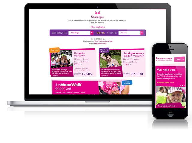
Whereas previously users needed to use many different sites and systems to interact with Walk the Walk and participate in events, raise money, or donate, now they have a single consolidated experience. This allows supporters to find and register for any type of event, view their event history in their account and use a number of community features such as the buddy system to help ‘walkers’ find a training partner.
‘As a dynamic charity brand with a growing supporter base, we wanted to ensure the digital experience of our organisation and our events were involving, inspiring and a joy to use. And the time was right to put in place a single view of how people engage with us to allow our supporter communications to be much more relevant, targeted and personal.’
– Guy Aubertin, Commercial Director, Walk the Walk
Other relevant information
Walk the Walk: https://www.walkthewalk.org/


-


