British Heart Foundation: the poster series
- Exhibited by
- SOFII
- Added
- April 19, 2014
- Medium of Communication
- Posters
- Target Audience
- Type of Charity
- Healthcare
- Country of Origin
- UK
- Date of first appearance
- Unknown
SOFII’s view
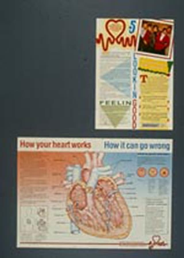
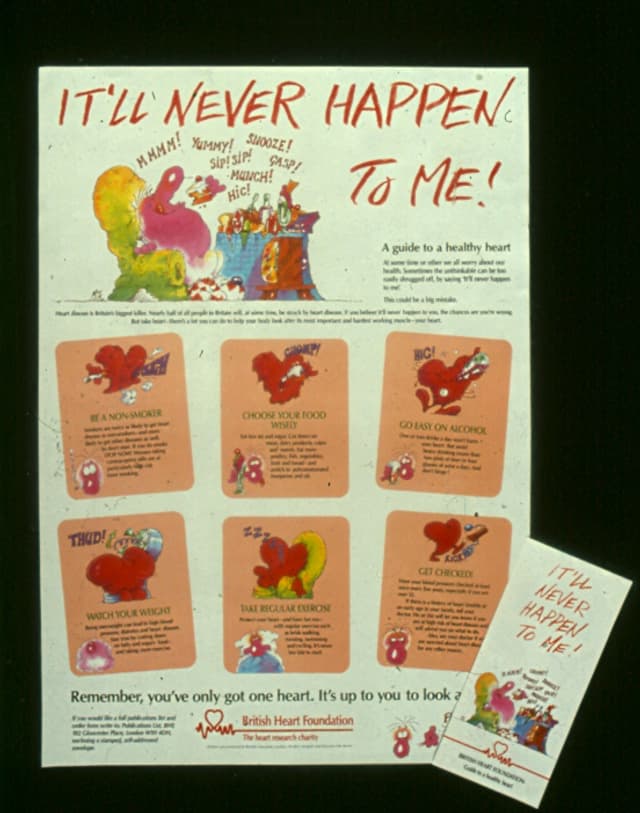
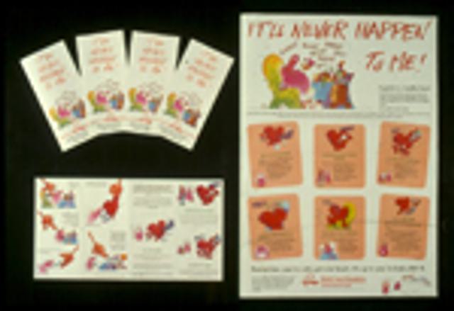
Not one of these four posters was primarily produced for a fundraising reason. Instead, their role was initially seen as educational, they were aimed at a range of audiences and their production was paid for by BHF’s education department. But their role in awareness and brand promotion is easy to recognise. We’re sorry that the quality of these images is so poor. Unfortunately the originals are lost. If you can help us to get sharper, better pictures, please contact Carolina at carolina@sofii.org.
Burnett Associates Limited, with BHF
Each poster has its own clear educational objective. Each had to look interesting, striking and attractive while explain a complex message forcefully but in a manner to which each audience might respond.
Background
Everyone has a heart. Everyone has a vested interest in ensuring that their heart keeps on working (and those of their loved ones, too). These were fun and colourful ways of getting across a varied range of important and potentially complex messages.
Special Characteristics
Each poster had to be sufficiently colourful, attractive, powerful and informative for people to want to put it up on their wall. Each poster was conceived individually with a specific audience in mind. A different illustrator was chosen for each poster though the main illustrator for ‘How your heart works’ and “Don’t follow the crowd…’ was a talented young man called John Lucas.
Influence/Impact
Demand for these posters, particularly from schools, was very high and they were being reprinted regularly into the new millennium.
Merits
Because they are quirky, pretty, clever and they show a range of ways in which a research organisation can use its mission constructively to provide valuable public education resources.


