CAFOD: Digital Advent campaign with ethical, authentic creative
- Exhibited by
- CAFOD and Blue State
- Added
- March 13, 2024
- Medium of Communication
- Social, email and web
- Target Audience
- Individual donors
- Type of Charity
- International aid
- Country of Origin
- UK
- Date of first appearance
- December 2023
SOFII’s view
The discussion around how charities use imagery and storytelling in their fundraising has gained momentum, with many organisations looking at their own work with a much-needed, more critical lens.
Over the 2023 festive period, CAFOD (the Catholic Agency for Overseas Development) wanted to create a new campaign, supporting their work in Afghanistan. They took time to work with agency Blue State on getting the right creative. So, not only was this digital fundraising appeal successful – it was ethical and authentic too.
Summary / objectives
CAFOD (Catholic Agency for Overseas Development) were keen to take a new approach for their 2023 Advent campaign. There was an urgent need to generate funds for the organisation’s work supporting women in Afghanistan. CAFOD wanted to put creativity at the centre, but with an ethical, authentic approach that focussed on those the donor would be supporting.
Creator / originator
Background
Advent is a key fundraising moment for CAFOD, and the charity wanted to create something that would engage new donors over Christmas 2023. Their goal was to consider how CAFOD could create a concept that would speak to new supporters, centre ethical creative and remain in step with their programmatic teams who were on the ground assisting in delivering aid in Afghanistan to promote women’s empowerment.
CAFOD approached Blue State, to see how we could bolden their creative and ensure inclusivity was front and centre. We both knew we wanted to feature individuals involved in the campaign but had to protect their identities and ensure faces could not be revealed.
Special characteristics
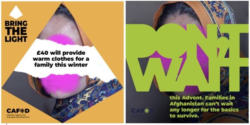
Blue State and CAFOD ran a series of co-creation workshops and developed a proposition, as well as two potential routes to explore for the campaign. Both used photography of the women at the heart of the work in Afghanistan, but with creative ways of obscuring their faces.
The two potential routes for the campaign were:
- Share The Light. This concept was built around the central symbol of Advent, the candle. Designed to spotlight stories and create compassion, this route represented a build on previous campaigns, giving it a design lift and a refreshed focus.
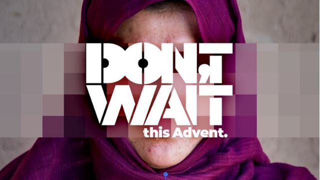
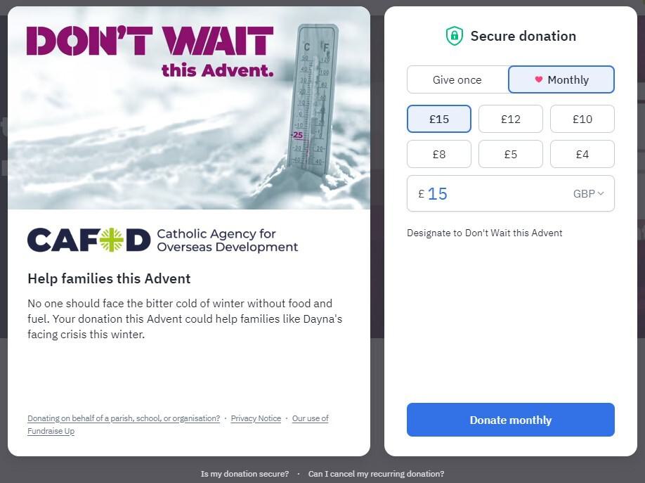
- Don’t Wait. This concept was more subversive in tone. For those not familiar with Advent, it is a time of reflection and consideration. This route placed that moment in the context of these crises where immediate action was needed. Waiting was not an option.
The resulting creative allowed CAFOD to use assets supplied by teams on the ground, but to add a layer of creativity that both elevated the campaign, centred those being supported, and maintained authenticity.
However, the second, more provocative route proved popular with the CAFOD team and, inspired by their openness to take risks and pursue new approaches, Blue State moved into campaign design.
Don’t Wait allowed us to put the women we were seeking to support as the ‘face’ of our appeal whilst protecting who they were.
Reviewing the assets from the programmatic teams it was the B Roll (video) footage that caught our eye versus the photography. It captured individuals as they were sharing their stories and in the places of impact. We took screenshots of this to allow us to bring their voices to life authentically.
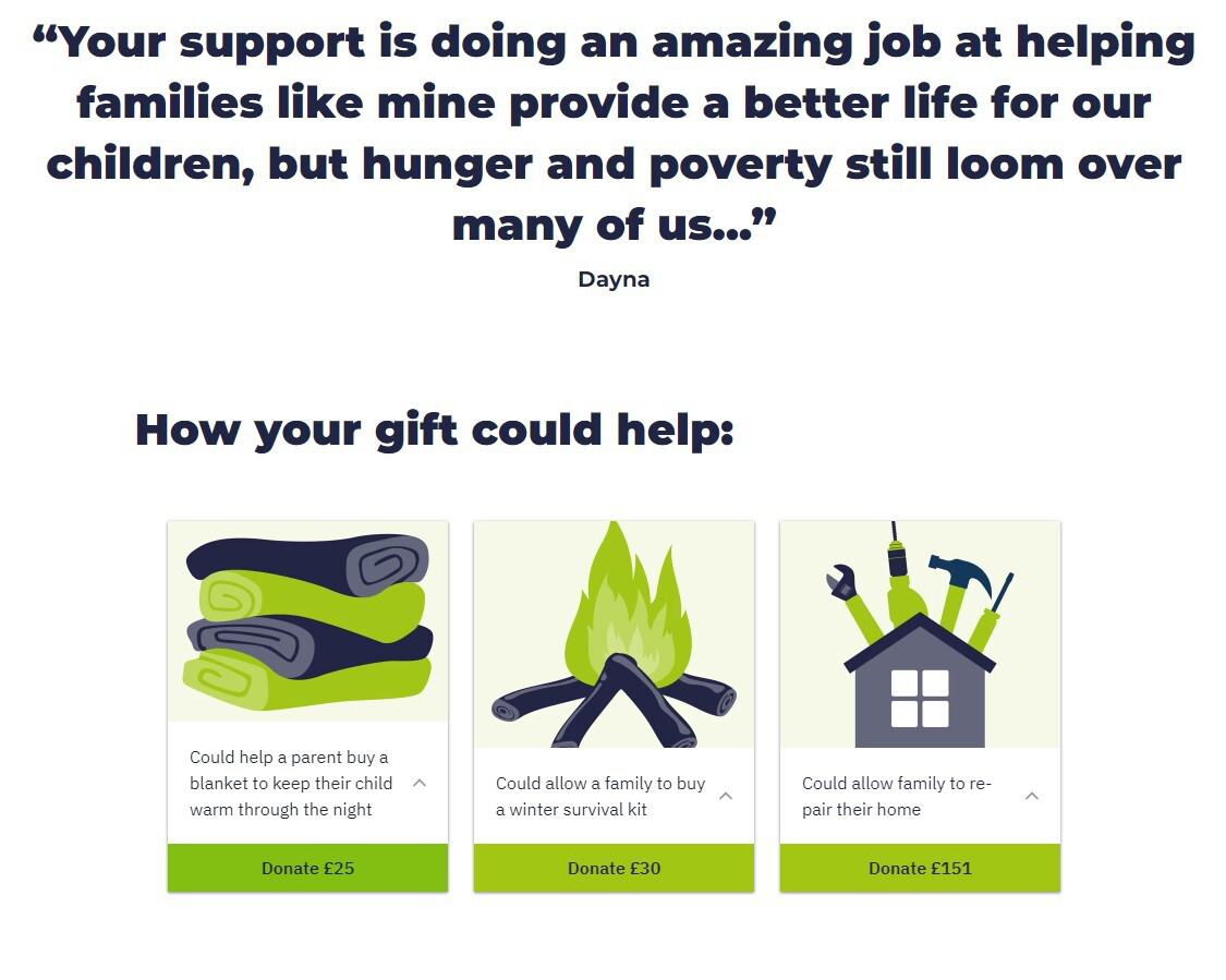
We then created three core campaign themes: winter, livelihoods and food to bring together key messages and stories from teams working with those impacted on the ground.
Will Crowne, Communications Lead at Blue State, said:
‘The inspiration underpinning the creative for our campaign was based on the insight that waiting is fundamental to Advent. But some things can’t wait. Women in Afghanistan are lacking the basics to survive the harsh winter. So we needed to provide a sense of urgency for the audience not to wait to act and to donate today.’
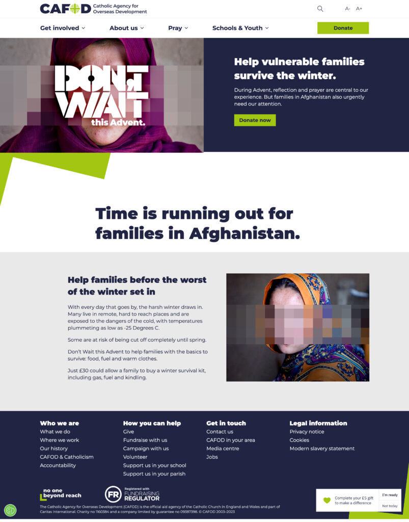
For the chosen campaign concept, ‘Don’t Wait’, the typography used was intentionally dominant, almost imposing on the image so that it couldn’t be ignored.
The pixellation of faces, at first designed to be a protective measure, became the creative. This was stylised it from smaller modules we’re used to seeing on television screens to block identities, building it out and enlarging it to make it more of a graphical component – crafted so it could also act as a grid for the typography.
A lot of what Blue State was working with were materials that existed, with a creative lens applied to embolden it.
The font that formed the centre of the campaign was from CAFOD’s guidelines, which helped to bring brand consistency. We compacted it and selected a stencil style designed to act as a call to action to their supporters and wider potential audience.
With the creative route in place, we were keen to consider how it could act as a platform to connect to new audiences with our research showing the opportunity to build out amongst educators and those working in Catholic institutions.
After reviewing their audiences, data and previous campaigns, it was clear Meta was best placed to be the primary channel for the digital campaign with paid search playing a supporting role in capturing and converting engagement.
Blue State created a test and learn approach and creative toolkit that offered examples for social statics, video treatment with key messaging areas and examples. The outputs were designed to inform but also live on outside of this campaign allowing the team to reach more people and raise more funds as a result.
Results
The ‘Don’t Wait’ appeal ran across social, email and web. CAFOD achieved the following results from the campaign:
5:1 ROAS (return on ad spend) on Google Ads
3.6 million potential new donors reached
Influence / impact
Vanessa Chang, Head of Individual Giving at CAFOD said:
‘Blue State helped us to level up our work for our end-of-year Advent campaign, bringing clarity and creativity to a challenging brief and working with us collaboratively on all aspects of campaign; media, creative and strategy. The resulting creative is a strong concept which also gives us renewed confidence in how we reach new audiences online. It felt like we were one team and it was a great experience.’
© IMAGES: Courtesy of CAFOD and Blue State
 View original image
 View original image
 View original image
 View original image


