Camp Rising Sun: the impact of an infographic
- Exhibited by
- Ruthellen S Rubin, CFRE, director of development, Louis August Jonas Foundation.
- Added
- July 30, 2013
- Medium of Communication
- Online
- Target Audience
- Individuals
- Type of Charity
- Education
- Country of Origin
- USA
- Date of first appearance
- May, 2013
SOFII’s view
There is so much valuable advice here on communicating online with your donors that it would be impossible to highlight just one aspect. This organisation has studied its donors, gives them wonderful feedback, never forgets to ask and carries out rigorous research. Read this and learn.
Creator / originator
Created by Ruthellen S Rubin, CFRE with support from Christina Busso. Design by Jenni Schwartz.
Summary / objectives
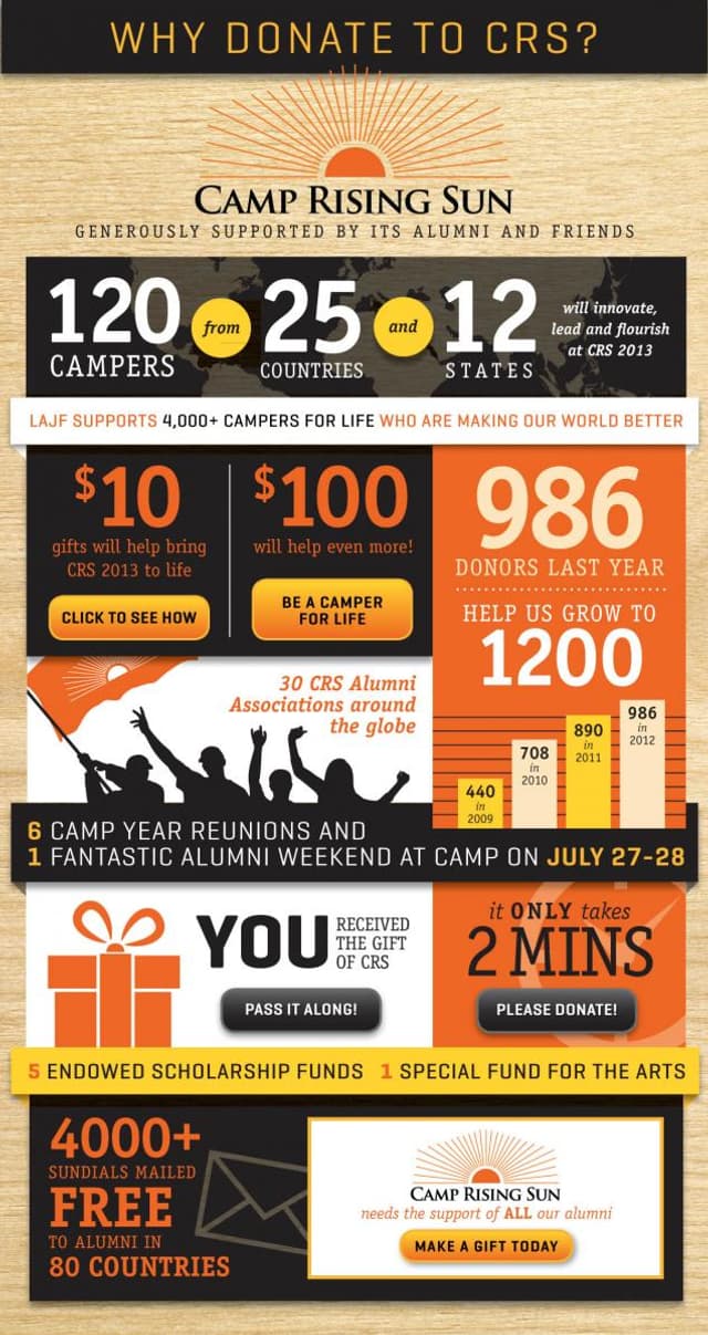
Our spring email appeal to the 3,000+ alumni of our 83-year-old international leadership programme, Camp Rising Sun, is ancillary to our November direct mail annual appeal. We use this opportunity in the spring to make a second ask for a gift and also to show the impact of their gifts to those who have already donated. This year we created an ‘infographic’ – a graphic representation of information – that is well suited to an email platform.
Background
It is exciting to be raising money in this digital age. I love to work with the fundamental concepts of donor-centred fundraising and consider how digital design and dissemination can be used to reach thousands in an economical and professional way. No matter how good our fundraising appeal may be, it is useless unless it reaches the donor prospect. Without a doubt, the best way to reach most people (of all ages and nationalities) today is on their smartphones – preferably in pictures, rather than sentences. And the best thing to tell them is how/why their donation will make an impact – in our case, on a programme they love. Voila – the infographic!
Special characteristics
Our infographic served the dual purpose of soliciting donations and making current donors feel extra good about ‘being counted’.The design follows our branding and looks like our other marketing materials. Although this infographic is sent to our alumni who know well what we do, it emphasises the connection between the programme and the donors. It highlights the donation you made earlier this year as well as the donation we hope you’ll make when you see this.
There are five specific buttons to click to donate and learn more about the impact of your gift, however the whole infographic was hyperlinked. Anywhere you clicked brought you to our donation page. A shout-out to our 30 alumni associations is included, as well as a reminder about reunions and the annual yearbook, The Sundial, that we send free to all alumni. Since ours is a full-scholarship programme (all our alumni attended for free) there is a reminder included about how ‘you received the gift of CRS (Camp Rising Sun) – pass it on!’ We make a point of saying a gift of $10 will help and that $100 will help even more. Our talented designer, Jenni Schwartz (www.jennischwartz.com), took all this information (and more) and made it bold, uncluttered and fun to read.
Influence / impact
One thing about fundraising – it’s pretty simple to measure impact. The return on investment of this appeal was excellent. We received several second gifts (within the same year) and dozens of first time gifts from new donors. There was a 69 per cent increase in number of donors and 71 per cent increase in total amount raised over the prior year’s spring email appeal. We also measure the number of our alumni who ‘open’ the email. Since our primary appeal is in November, this spring email appeal also acts as a cultivation tool. It’s helpful to us to know who is seeing it. This email to 3,343 alumni had a record 39 per cent open rate. (Those of you who follow your email analytics know this is huge!) Of course, the open rate is credited to the subject line, which read: ‘Feel the Love, See the Impact.’ All records were smashed three weeks later when we re-sent the email infographic with the subject line: ‘Open this Email to be an Important Part of CRS 2013’ and had a 43 per cent open rate.
Details
Our biggest concern with email appeals is to be assured that the content of the email opens up completely and quickly on all devices. Our designer, Jenni, created the infographic at 600px width which is the standard size for emails so it will fill the screen width-wise with vertical scrolling. (The amount of vertical scrolling depends on the device and screen size of the viewer.) Jenni optimised the final infographic jpg for web at 306K. As is the case with all emails of this type, first we sent it to everyone in the office and asked them open it up on a variety of devices: desktops, laptops, iPads, iPhones, Droids, BlackBerries, etc. It looked great everywhere.
Costs
We have a subscription to Constant Contact and so there was no additional fee incurred to disseminate our infographic via email. The designer’s fee was less than USD 1,000. Jenni does all of our design work (brochures, annual appeal, yearbook, etc) and so the look and branding was already established. If you are a small or medium-sized organisation, find a designer who can get to know and respect your mission, your budget, your case for support and your donors.
Merits
This infographic is visually appealing, uses technology available to organisations of all sizes and demonstrates the key fundamentals of fundraising – make a compelling case for support and demonstrate to your donors the impact of their gifts.
Other relevant information
Prospective donors are bombarded with messages all day long. To get through this deluge of information, we have to find a way to stand out in the crowd with our appeals. We not only need to capture our prospects’ attention, we also need to engage their senses and convey our message quickly. The infographic is a fabulous tool for communication in this fast-paced world.
Final notes
In any email appeal to our donor prospects, we need to keep in mind the importance of a compelling subject line. Take the time to brainstorm ideas with your team. The first hurdle will be to get the email opened. Once opened, an infographic of this type will not disappoint the reader. Good luck!


