Macmillan Cancer Support: eCards platform update
- Exhibited by
- Addition by WPN Chameleon
- Added
- July 19, 2017
- Medium of Communication
- Online Giving
- Target Audience
- Indviduals, Supporters, Donors
- Type of Charity
- Healthcare
- Country of Origin
- UK
- Date of first appearance
- November 2014
SOFII’s view
Nowadays fewer people are sending cards through the post but it’s still a joy to mark a special occasion and in the process support your favourite charity and increasingly this can be done with a virtual card. Macmillan Cancer Support re-energised their eCards platform, making it more user-friendly and usable on all mobile devices and tablets. And by ensuring that the platform was easier to interact with for donors, they multiplied the number of donations they received via eCards.
Summary / objectives
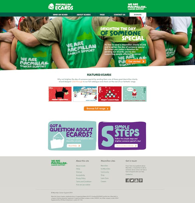
Macmillan Cancer Support wanted to update their outdated eCards platform, which was too dependent on Adobe Flash software, with a modern platform that could be optimised for mobiles and tablets. They wanted an improved user experience that was on brand and consistent with their main website.
Background
For Macmillan Cancer Support, eCards had historically been a successful tool, driving supporter engagement and generating income through donations. However, usage and income had been in decline due to the reliance on the cards’ Flash animations – not supported on Apple’s mobile and tablet devices and riddled with security issues.
User journeys across all devices were generally difficult so digital product studio Addition (part of WPN Chameleon) worked with the team at Macmillan to define, design and build a new platform along with a range of new HTML5 animated eCards aimed at engaging new and existing supporters, both consumer and corporate. (HTML5 is the current version of HTM which structures and presents content on the World Wide Web.)
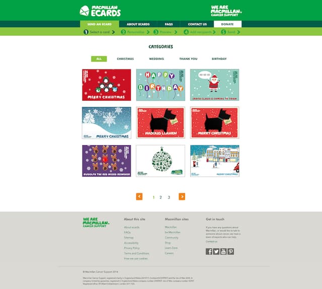
Working collaboratively with Macmillan, Addition ran various activities to define the optimum product, both from the users’ point of view and the charity’s, culminating in a responsive prototype which allowed key user journeys to be tested across devices, including the card-opening mechanism and personalisation processes.
Once the definition phase was complete the Addition creative team then looked at the design of both the platform and the eCards themselves. The platform needed to be on brand and having worked on a number of Macmillan projects as one of their digital agency partners, the team were well placed to deliver this effectively and efficiently.
This then left the most exciting part: the eCards themselves. The creative team were supplied images and files based around a number of themes – Christmas initially, but then expanding to include Easter, birthdays and a few others – and responded with a selection of concepts.
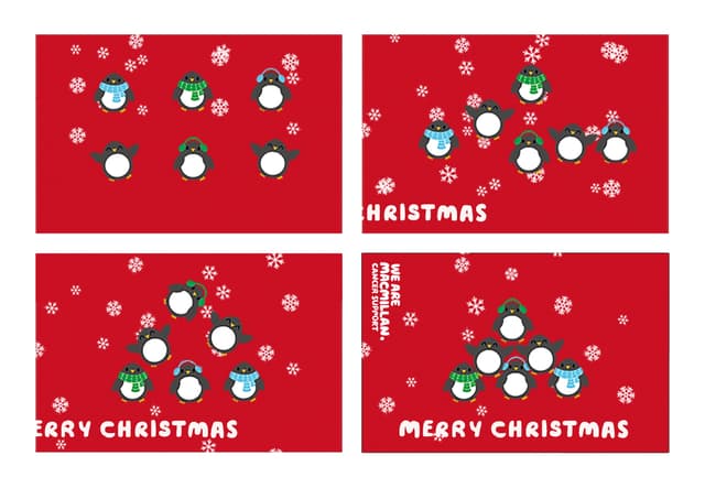
Storyboards were then created showing chosen ideas before being brought alive through two of the three major core technologies of World Wide Web content production, HTML5 and CSS, and launched, along with the new platform in time for Christmas.
Special characteristics
The eCards concept was popular, so to revamp the experience itself and make it consistent with a modern web experience, it was important to recognise the key journeys and features each audience would need.
For senders, they need to be able to easily select, personalise, preview and send eCards regardless of the device they prefer to use. Additionally, corporate users were given the ability to upload a large number of email addresses and add their logo to the cards – great for sending Christmas cards to clients and suppliers.
Recipients needed to be able to receive, open and view the animated cards easily – again, regardless of their chosen device. From Macmillan’s point of view, the reporting and requirements of admin and support staff needed to be handled in a friendly way.
Influence / impact
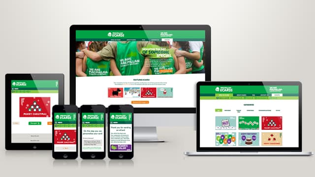
The success of the project was dependent on creating a great user experience regardless of the supporter’s preferred device and with the huge range of different browsers and devices available, Addition had to make the best use of their sector experience and technical knowhow to ensure an optimal user journey.
Mobile was important to the users, so the team focused on delivering a top-class experience. Flash doesn’t work on all mobiles and the new one we created has animated cards that work well on all different types of devices.
Results
The new eCards product has exceeded expectations and MacMillan has now sent hundreds of thousands of eCards since launch. The cards are free to send and users can add an optional donation resulting in an income of six figures a year for Macmillan. When it was launched for Christmas there was an 100 per cent uplift on total donations from the previous Christmas when on their old ecards platform.
