Charity e‑commerce – learning from the best online shops in the sector
Delivering a memorable supporter experience is crucial for all fundraising teams. But a great user experience is also key to success in charity e‑commerce. So, if you’re trying to reach new audiences and raise funds via trading or an online shop, then read on to find out more from Matt Smith’s insights, observations and tips.
- Written by
- Matt Smith
- Added
- January 12, 2023
In recent years, fundraising has been tougher than ever. So, it’s no surprise that many charities are looking at other ways to raise money.
Lots of organisations are making significant investment in trading and e-commerce, seeing it as a key tool to reach new and different audiences. Online shops that used to be an afterthought, are now central to many organisations’ income generation and engagement plans.
In this piece I’ll highlight a few of my favourite third sector e-commerce operations and share some useful statistics from a recent piece of work that benchmarked charities’ e-commerce operations*. I’ll also single out the five keys areas that need consideration for any organisation looking to generate more revenue through online retail.
Spoiler alert, while supporter experience is key to all our other traditional fundraising methods – creating a great user/supporter experience is also crucial to your success in e-commerce.
Let’s take a look.
1) Product Unique Selling Point (USP)
Much like other sectors that use e-commerce to generate income (e.g., fashion, food and drink, tech), every charity online shop should be built around a USP. This product or range of products needs to help a charity stand out in a crowded marketplace.
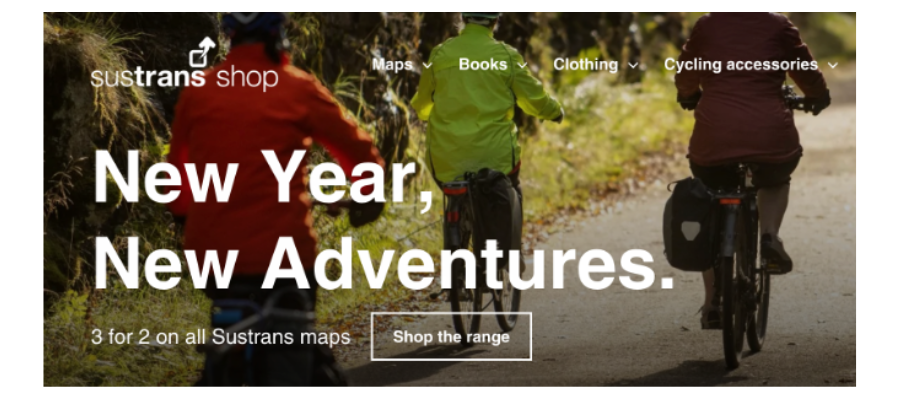
Some great examples include the Sustrans online shop, which specialises in selling cycling and walking maps to their supporters and customers. By focusing on selling one specific product line to a dedicated audience, the charity has built a strong relationship with this committed audience.

Similarly, Diabetes UK has built their online shop around a range of products to help people manage their diabetes. From blood glucose meters and test strips to insulin pouches – Diabetes UK have created a one-stop online shop centred on its core audience and their needs.
A clear USP helps to drive a better conversion rate (the percentage of shop visitors that go on to purchase something). From the benchmarking THINK undertook in late 2022, the average conversion rate was 4.75 per cent – and anything around the five per cent mark is considered excellent.
However, a charity’s e-commerce USP does not need to be cause-specific. Other online shops use merchandise and second-hand goods as their centrepiece. But this e-commerce USP does need to set the shop apart from the hundreds of other e-commerce operations in the sector.
2) Impactful online shop user experience (UX)
Each online purchase starts with a search for product or compelling advert, but just as crucial is the next step on the journey – a clear and straightforward product layout. Every online shop needs a well thought out product layout, an intelligent search function and navigational menu to ensure shop visitors find what they are looking for.
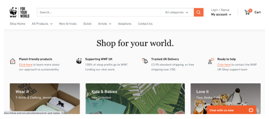
A good example of a powerful search functionality and clear, straightforward product layout is WWF UK’s online shop, as this image shows.

WWF present the compelling reasons to purchase from their shop, alongside clear product categories and a powerful search functionality. The landing page is broken down into sections that include main product categories first, then top sellers, new arrivals and their adoption products. The search functionality includes a helpful category filter and uses a comprehensive list of keywords to return accurate and helpful results.
By improving an online shop’s UX, a seller can keep the cost per acquisition (CPA) of each customer down. From our recent study, the average CPA for online shop customers was between £16.97 per customer. This CPA can vary wildly depending on the channel and products offered. So, if a charity is selling higher-end items such as furniture or unique memorabilia than a much higher CPA can be accommodated.
Ensuring an online shop has great UX is arguably the most important step in building an effective e-commerce operation. Measuring this through purchase conversion and visitor drop off rates will help a charity better understand which of its UX tweaks are having the desired outcome.
3) Surfacing social proof
Another important factor in the early e-commerce customer journey is surfacing social proof. Online customers now expect to see reviews, star ratings and some form of evidence that other customers are purchasing and enjoying the products on offer.
This relatively straightforward on platforms such as Amazon that have the functionality built-in, but there are also clever ways for charities to introduce this social proof onto their own e-commerce sites.
Using services such as Feefo (which allow a seller to measure and collect customer reviews and star ratings) should be considered. The below image shows how the Feefo integration is helping Diabetes UK surface reviews and star ratings on each product in their online shop.

Whilst it may seem like a small requirement, adding customer reviews and star ratings to products will increase click throughs and encourage repeat purchases through improved social proof. Social proof can help reduce an online shop’s abandonment rate (the percentage of customers who leave the shop having placed items in the checkout). From our recent benchmarking, the average abandonment rate was 22.7 per cent.
4) Thanking and email journey
As any good fundraiser will know, supporter experience is key. And when it comes to e-commerce, immediate improvements can be made to most operations through a simple review of your thanking and ongoing email journey. Firstly, purchase confirmation pages should have information about the charity, how it delivers services and what other actions customers can take to support the organisation. It should also show what other products a customer could purchase next.

Similarly, the initial emails customers receive should inspire brand loyalty and connection to the cause. With most charity e-commerce transactions, the first email received is a receipt. This should be informative and reassuring, but it also needs to inspire emotional connection back to the cause. The receipt email should be paired with a separate thank you email from the charity that explains what the organisation does, how purchasing products will ensure the charity’s work continues and a few suggested products to purchase next.
Charities also have a huge opportunity to improve ongoing email journeys. All online sellers should look to activate automated email journeys with segmentation and personalisation based on what customers have previously purchased, their location in the UK and other personalisation based on their customer persona.
5) Improving the physical product mailings
Alongside developing an impactful digital supporter journey, charities should not forget that the physical mailing of the products should be as emotive and powerful. Introducing cause messaging, information on additional products to purchase or other ways to support the charity are simple ways to maximise connection to the organisation and increase lifetime value.
As part of some recent mystery shopping, I bought a turtle keyring from WWF UK which was sent with a simple note of thanks and how to get in touch with the retail team and a flyer promoting the WWF weekly fundraising lottery. Despite these very simple inserts, the WWF UK package felt connected to the charity and made the recipient feel supported as a customer.

Improving the physical mailing and ongoing journey can help to drive up the average order value, as great customer service increases both loyalty and customer value. From our recent benchmarking exercise, the average order value was £28.49.
Conclusions
By focusing on these five simple areas: product USP, impactful site UX, social proof, ongoing email journeys and thoughtful product mailings, fundraising, marketing and digital teams can work together to improve e-commerce operations. And crucially, it doesn’t always have to cost a lot to do that.
By studying and mystery shopping other online shops in the sector, smaller organisations can learn a great deal about how to carve out a unique audience and serve them with compelling and emotive products. Then, by delivering great customer support and ongoing communication, this initial transactional relationship can become a much more meaningful and long-term relationship.
*Results and figures in this article are drawn from THINK’s most recent benchmarking of charity e-commerce sites. The benchmarking was undertaken by members of THINK’s Digital Forum in November 2022, a group of twelve medium/large UK charities.


