How to write for your most generous eyes and hands
Want to make sure your best givers can physically read what you write? Need to defend why you make some of the copy and design choices you do? This article on older donor accessibility, from fundraising copywriter and Thankology author Lisa Sargent, is just for you… and FYI (for your information), that ‘older’ part happens sooner than you think.
- Written by
- Lisa Sargent
- Added
- October 16, 2024
Maybe they need to read your appeal letter from a little further away. Maybe they’re finding some of your blocks of copy hard to follow.
By the time your donors turn 40, their eyes are already ageing.
And by the time they ‘age into’ becoming your most generous givers (around 65+), the vast majority of fundraising and retention communications out there almost completely disregard accessibility for older donors.
Today we’re going to make sure that inaccessible fundraising communications never happen to your nonprofit.
First let’s unpack some physical science behind your ageing donors:
- Starting at around age 40, proteins start to break down in the lenses of the eye
- At 50+ years old, bone density in the hands can decline, decreasing a donor’s manual dexterity (prevalence greater after 65, most apparent after 75)
- Between 65 and 69, one out every four of your donors can have cataracts that cause vision problems
- After age 70, more than half of your female donors are likely to have arthritis in their thumb (estrogen/menopause related)
- By around age 79, almost half of your supporters could be reading your content with cataracts
If those statistics give you pause for thought, that’s a good thing.
Because the physical science of ageing is already affecting how your older givers interact with both your direct mail and digital communications.
In what ways do those physical changes affect your older givers?
For starters:
- Arthritic and older hands can be stiffer and less dexterous
- Seeing contrast and subtle color differences is less clear
- Older eyes have trouble seeing fine or smaller print
- Older eyes have increased sensitivity to glare/sheen
- In eyes with cataracts, colors can seem faded
This isn’t a doom and gloom treatise on getting older, mind you.
As a fundraising copywriter my job is to understand what it takes to connect with older givers so they want to engage with and respond to what I write (and my design colleague Sandie’s too, for accessible design).
Here’s how designer Sandie and I do it:
1) Nice big type
Black font on white background is best (or if you use colour background, watch the strength – and please use a busy background sparingly or – my preference – not at all). Large type applies to both digital and print, for the record (don’t write off your older givers online).
2) Watch your folds and fit
No, this isn’t a new diet plan :-) I’m talking about how your reader will physically interact with your direct mail pack.
If you have to fold the reply slip like origami to get it into your reply envelope, this could cause a problem for older hands.
Common sense pro tip: print every piece of your pack at full size, then try and interact with it yourself – I do.
3) Aim for generous reply (donation) forms
This means: regular matte paper [NOT the kind that requires a felt tip pen and smears ink everywhere, glossy paper I’m looking at you again!]
AND it means ample form fields so I don’t need microscopic printing to fill in my credit card details. Think bigger boxes, and longer lines, for printing.
4) Strong contrast over subtle
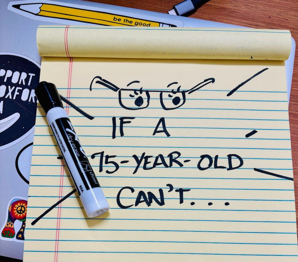
If you’re in your 20s and 30s, that grey ten point font on a darker grey background might look fine to you, but I can assure you: a 75-year-old can’t read (and won’t want to engage with) what you’re writing.
5) Resist font trickery
IMTALKINGABOUTLOTSOFALLCAPSHEADLINES or endless fields of italics that older eyes (and let’s face it, ANY eyes) will struggle to track.
6) Keep your directions, and all your copy, clear and easy to follow
As a SOFII reader, you might already know that I write all the time about writing with emotion, compelling examples, clear calls to action, and evocative, sensory words – but let this be a reminder: you absolutely should be doing this for every-age giver.
7) Don’t write off digital
Just because your donor is over 60, this does not mean they are digitally challenged. Yes, kids, lots of folks 60+ are quite capable online.
BUT, you do want to be generous here too: Smashing Magazine (see source list at end of article) recommends watching actions that require a lot of precision (dexterity, remember), adding a back link, and avoiding disappearing messages, among other tips.
To wrap it up, a true story...
At a huge international fundraising conference, I stopped at the booth of an agency that specialises in legacy giving.
They had loads of samples on display, free for the taking... and after the first legacy brochure I picked up, I knew there was trouble.
The legacy guide, designed by so-called experts in the field and specifically aimed at older givers, was:
- On glossy paper :(
- In pale gray sans serif font, about 11-point :(
- With loads of places where copy was printed over photos or busy backgrounds. :(
I could have cried. What a wasted opportunity to touch hearts and bring meaning!
So please, my smart, caring, world-changing, fundraising friends:
As generous as your older givers want to be to your nonprofit, you need to be generous with your copy and design in return.
And that means you need to write and design for older eyes and older hands, and help them read, interact with, and respond to, what you send.
Sources:
Cataracts/Eyes:
- https://www.nei.nih.gov/learn-about-eye-health/eye-health-data-and-statistics/cataract-data-and-statistics/cataract-tables
- https://www.nei.nih.gov/learn-about-eye-health/eye-conditions-and-diseases/cataracts
Hands/Arthritis:
- https://pubmed.ncbi.nlm.nih.gov/12586852/
- https://www.uchicagomedicine.org/forefront/orthopaedics-articles/2021/may/how-to-treat-arthritis-in-the-hands
Smashing Magazine:
https://www.smashingmagazine.com/2024/02/guide-designing-older-adults/
Editor’s note: : This article first appeared on Lisa Sargent’s biweekly newsletter on donor communications done right, The Loyalty Letter.
IMAGE © courtesy of Lisa Sargent