Camp Oochigeas: Mid-value direct mail appeal
- Exhibited by
- John Lepp
- Added
- January 15, 2025
- Medium of Communication
- Direct mail
- Target Audience
- Warm mid value donors
- Type of Charity
- Children’s charity
- Country of Origin
- Canada
- Date of first appearance
- Spring 2018
SOFII’s view
Contrary to what some believe, direct mail is not dead. It is still a hugely effective way to talk to your donors and raise vital funds for your cause.
In this detailed exhibit, Agents of Good and Camp Oochigeas share how they achieved fantastic results from a mid-value appeal. You’ll discover how they got the fundraising basics right while also beautifully illustrating why camp life is so important to the children who attend. Keep reading to find loads of tips and hints that will help you craft your next appeal.
Background
In the context of real human relationships, remember that you are having an emotional conversation with your donors. Just like in real life, if you are having a coffee or lunch with a friend or colleague, you might share the challenges and successes that you’re facing and you may ask for help with a particular challenge.
Throughout the conversation, you might keep mentioning what you need help with and what you need your friend to do. At the end of the lunch you may say, ‘Will you help me with this?’
The person on the other side of the conversation has a single decision to make. Will I help or will I not help. Effective mailings work in the same way – and this mid-value appeal is one example of how you can replicate these emotional conversations in your own fundraising.
Summary / objectives
Camp Oochiegeas is a camp in northern Ontario, Canada where children who have or have had cancer can go to ‘just be a kid’ and enjoy camp life.
The goal of this ‘Camp Ooch’ mid-value donor appeal was to raise funds to send as many kids to camp as possible.
But we also wanted to immerse a donor into the ‘ask’ of sending a child to camp.
So, we decided to ‘show’ the donor around camp so they could see all of the different activities that were possible. It would help them to understand the ways the camp was structured for fun, yet with the care and safety of those precious kids always front of mind.
Creator / originator
Agents of Good
Special characteristics
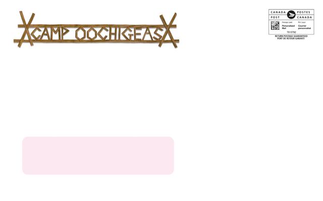
This mail pack went out in a nine by six inch envelope (roughly C5 size, UK). We didn’t want it to get missed in the stack of number ten envelopes (roughly DL size, UK) that the donor was probably getting in the post.
The envelope was designed to be playful and fun. Just like camp. The envelope was also designed to make the donor ask questions.
In fact, it was different than the typical pack that the donor normally received from the organisation that they love so much. It didn’t use the Camp Ooch logo. It was larger than usual. It was heavier than usual, and the back had a teaser line that read ‘Camp is right this way’.
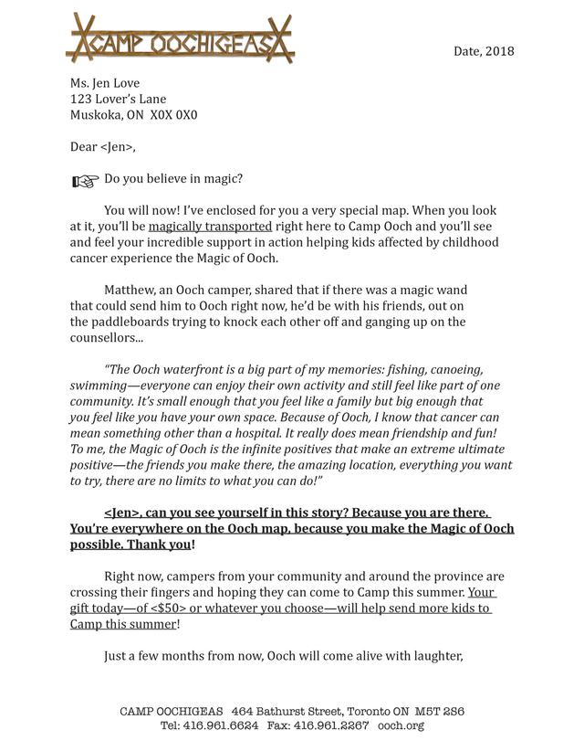
The two-page letter was personalised and came from Alex, the Executive Director (ED). So, let’s take a closer look at the ask in the letter.
The letter was about a camper named Matthew and how every gift will help send more kids like him to camp this summer.
A key to great storytelling is to change the perspective. Sometimes a story that’s been told over and over again can seem completely fresh and new when you change the voice or angle. This is the case for this appeal. Ultimately, every Camp Ooch appeal is about sending kids to camp – but we are always looking for ways to make it interesting to interact with, and to give the donor a fresh perspective on their potential impact.
Historically, the organisation used lots of nice photos of kids having fun at camp, which was perfect, but over time it meant that all their appeals started to look the same. The images began to lose their emotional impact.
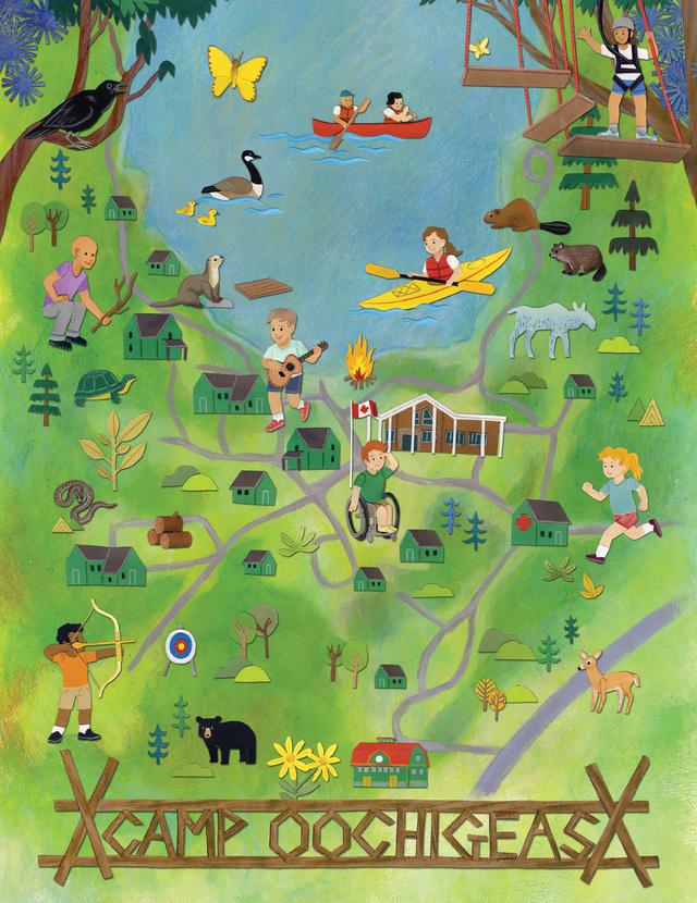
So, for this pack we chose to work with illustrator Jessica Rae Gordon to create the art for the appeal – including an oversize map of Camp Ooch itself.
The map insert was set on an 11 by 17 inch piece of paper, which you can see (along with the other elements of the pack) at left if viewing on a laptop or desktop – or below if you’re reading this on your phone.
It included detail about the camp layout showing places where the kids could sing and do art, as well as how the campground was organised to accommodate kids who might still be undergoing cancer treatment. More importantly, the map showed donors on a more granular level, how their gifts were helpful and needed.
For the mid to high-value donors, we also created two more inserts.
The first was made to look like a diary entry from Matthew’s mother, Ana. It included plenty of human touches: paperclips, handwriting, and smiley faces. We interviewed Ana as part of the appeal and her words and thoughts about the importance of Camp, especially as it related to her son Matthew, really informed so much of the appeal.
The final insert was from Matthew. It was written in his own words and shared what going to camp meant to him.
These extra pieces may seem like overkill, but it allowed Camp Ooch’s amazing donors to hear many different perspectives on why their giving mattered.
Finally, the reply form.
The front of the coupon was personalised and the gift prompts were tailored to be relevant to the donor’s previous giving. We also included some space for a heartfelt message if the donor wanted to share one (see more on this below).
On the back, we included examples of what a CA$50 or CA$4,000 gift could do. Being specific around what a donor’s gift will do increases response rates and average gifts because so often donors don’t actually know what impact their giving will make. Yes, this can be hard work, and sometimes it isn’t possible to do. But the more you can provide donor-sized problems, the more a donor will want to help and be part of the solution.
Results
This appeal generated a 30 per cent increase in gifts and a jump of 40 per cent in revenue. The average gift went up over 200 per cent! Yes, that is extraordinary and speaks to both the generosity of the Camp Oochigeas donors and the impact of asking for something quite specific, in a creative way.
Influence / impact
Another thing I want to highlight is the idea of including space for the donor share a ‘heartfelt’ message. This is something that Agents of Good tries to include as often as possible in our reply forms. You can see the reply form from this appeal in the images.
Direct response is a conversation between you and your donor. How can that happen if you aren’t creating moments for your donor to talk to you? You want them to tell you things about themselves, their giving and their lives. And when they do, you’ll get to read beautiful things like this:
‘Dear Camp Oochers,
As you enter the magical realm of Camp Oochigeas this summer, may your bodies experience the aches of ‘too much’. Bellyaches from laughing too much, face aches from smiling so much and arms ache from hugging all of your new and old friends. Have a super fun-tastic adventure at Camp Ooch!’
How beautiful is that? This donor is giving with love in her heart and a large smile on her face. This is obviously not a transactional moment for her. And unbelievably, about 65 per cent of donations to this campaign came back with feelings like this – which speaks to the high level of engagement the donors felt with their organisation.
This mailing touched donors in a way that others hadn’t, mostly since we creatively showed the impact of their giving in a way they had never seen before.
Other relevant information
It is worth noting that there was also a lower value version of this appeal. It had a small version of the map, on eight and half by 11 inch paper (similar to UK A4 size), whereas the mid-value pack had a bigger 17 by 11 inch (similar to UK A3) map. Also while the mid-value version had the two lift pieces mentioned above (from Matthew and Ana), the low-value pack only had one insert from Ana.
When it comes to the illustrations in this appeal, you really need to see Jessica’s work up close to appreciate the artistry that goes into every detail. I’ve had clients ask if the cost of working with illustrators is worth it. To be honest, it’s a core cost that we absorb and don’t charge extra for – because it makes the work outstanding. And more importantly, it makes for more effective direct response. How can any human (or any donor) not engage with it? It’s imaginative and fun, giving the donor a fresh look and a new perspective into the impact of their giving.
EDITOR’S NOTE: This case study has been adapted from content found in John Lepp’s essential book, Creative Deviations. You can find it in ‘Deviation Five – Getting A Reply’. We are very grateful to John and Camp Oochigeas for allowing SOFII to include it in our archive.
Since this appeal mailed, Camp Oochigeas has merged with another organisation and is now called Campfire Circle.
IMAGES: © All images courtesy of Camp Oochigeas and Agents of Good
 View original image
 View original image
 View original image


