
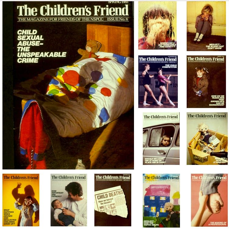
An earlier incarnation of NSPCC’s The Children’s Friend
- Written by
- Ken Burnett
- Added
- May 21, 2011
 View original image
Early in 1982, as I was starting the advertising, marketing and communications agency that would eventually become the Burnett Associates Group, I was invited to a meeting with Giles Pegram at NSPCC headquarters in Riding House Street, London, just behind the BBC. Though he’d only recently been appointed as director of appeals at the National Society for the Prevention of Cruelty to Children, Giles was already making a name for himself in charity circles on account of the ambitious plans he was putting together for a major transformational appeal at what was then one of Britain’s most respected charities, but also one of its most conservative (See SOFII). Our meeting was the first step in an agency/client relationship that lasted unbroken for more than 20 years and a close personal and business friendship that still endures.
Giles and I had known of each other in our previous roles, when he was a fundraiser at Help the Aged and I was a fundraiser at ActionAid but though we’d been in the same room together we hadn’t actually met. I didn’t get the role that I’d come to that first meeting to pitch for, but must have made a reasonable impression for as he was letting me down gently after the pitch Giles said, ‘We’re planning to launch a higher level supporter scheme which we want to call Friends of the NSPCC. Would you be interested in putting together a regular magazine that will become our main communication with our most important supporters?’
I jumped at the chance. It was for me a dream job, as prior to working in fundraising I’d spent seven years in publishing. My first objective when starting an agency had been to help charities produce effective printed communications; newsletters, magazines and annual reports.
 View original image
One of the first things we were asked to do was to come up with an appropriate name for this new journal. I’d always been an admirer of the Scottish weekly The People’s Friend. It was written for the donor age group (then perceived as 50 plus, well educated, middle class) and had a homely, interesting mix of serious and light-hearted articles, as well as news, letters and useful information. Our magazine was for a ‘Friends’ scheme. And for people who cared for children. What could be better as a title thanThe Children’s Friend?
No one at the NSPCC liked it. It was thought to be old-fashioned and a bit yucky. But Giles, with characteristic fairness, circulated the suggestion along with a few alternative contenders. Word came back from on high that the director actually liked The Children’s Friend. Then a startling discovery was made. It turns out that the descriptive words inscribed on the headstone of Benjamin Waugh, the philanthropic Victorian who had founded the NSPCC in 1884, are ‘The Children’s Friend’. That settled it.The Children’s Friend it would be. We had our name.
We started to plan the contents and structure. Our purpose was to create a responsible, serious and uncompromising journal that, through regular features, would expose and address the realities of child abuse in Britain. TheChildren’s Friend would be a high quality quarterly magazine produced for members of a special club, the ‘Friends of the NSPCC’. Its members wanted to get closer to the charity’s childcare work. The Children’s Friend was the perfect vehicle.
Each issue we felt should have one major in-depth feature in the style of high quality investigative journalism. This would be balanced by interviews and real case histories showing the NSPCC at work. The subject matter would be lightened by news of fundraising activities and helpful hints on how do fundraising. There would be two appeals in every issue.
The magazine would be a 16-page self-cover with full colour only on the outside covers. A typical structure was evolved which we followed for each issue.
Page 1 – A strong masthead, a full colour single image specially created to link with the main feature and a single cover line.
Page 2 – Inside front cover cash or membership appeal, designed as an advertisement to raise funds off the page.
Page 3 – The director’s message.
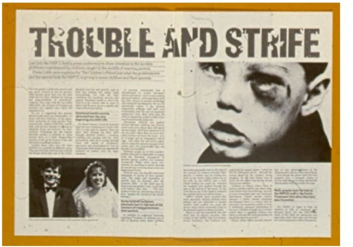
Pages 4/7 – The main feature article, with illustrations, panel stories as appropriate and several call-out quotes.
Pages 8/9 – InterviewPages 10/11 – Case histories, usually three or four short descriptive accounts from the NSPCC’s case files.
Pages 12/13 – Letters page, NSPCC in the news, questions and answers (questions from the public/readers, answers by the NSPCC’s legal panel).
Pages 14/15 – Fundraising round up, short snippets on fundraising successes around the country.
Page 16 – Outside back cover main emotional appeal, also designed as an ad.
Roy Williams art-directed the cover shots and in so doing created a legacy of photojournalistic excellence – an extreme rarity in charity publications at that time. Marie Burnett was the editor from the first issue. From the NSPCC there was consistently enthusiastic and high quality input from various people, particularly Elaine Smethurst, Keith Bradbrook, Phillip Dilks and Jane Rose.
The Burnett Associates team particularly loved working onThe Children’s Friend – especially Marie and me. Our children too played their part as both Joe and Charlie were regularly deployed as models, though not always without protest. For one particularly harrowing appeal we needed a shot of a distressed, crying child. I’m not sure the NSPCC would have approved of our method of achieving the required realism on that occasion, but it was all very professionally done and Joe forgave us, eventually. It’s his teddy bear, Bobbo, who looks so startled in the cover image (see opposite) that first introduced NSPCC supporters to the controversial subject of child sexual abuse. To achieve the effect of the ominous shadow Roy had to cut out a cardboard figure then shine a light behind it to get the right kind of silhouette falling across the figure in the bed. This time we used a dummy. Joe and Charlie opted out of that one.
Sometimes, telling fundraising stories comes almost too close to home.
© Ken Burnett 2011.