Dis­as­ter fundrais­ing at its worst

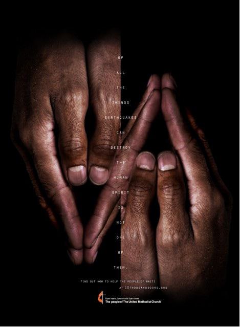
After the earth­quake in Haiti, it didn’t take long for the bad fundrais­ing mes­sages to crawl out of the wood­work. Here’s an exam­ple of run-amok abstrac­tion­ism, from the Peo­ple of The Unit­ed Methodist Church. I’m guess­ing that they had some help from an ad agency on this one. Who else could have screwed up such a sim­ple and com­pelling message?

Written by
Jeff Brooks
Added
May 14, 2013

First, you will notice the astoundingly unreadable design. It’s as if they have deliberately thought of all of the things that reduce the readability of a text: all caps, sans serif font, reverse type, typing over an image, extra-wide leading… And decided to use them all in one layout.

But the stupidity doesn’t stop there.

While most normal humans understand and interact with other humans by looking at their faces, this ad seems to think connection happens when you put your face five inches away from somebody's hands.

‘Pores, wrinkles. They'll make people feel the connection.’

Furthermore, the clever splicing of the two photos makes it seem like we’re looking at some creepy, double-ended, free-floating fingers. Are they trying to startle us into action?

Of course, the poor design isn’t the worst thing. When you actually manage to interpret the copy, it reads like a bad haiku:

Of all the things earthquakes can destroy the human spirit is not one of them.

Never before have philosophical abstractions moved people into action. I wonder why they thought it would work this time. And why have they hidden the second call to action (which actually does make sense) at the very bottom of the page? Then, when you follow their suggested URL,10thousanddoors.org, you arrive at a webpage that is about lots of things, not just the disaster in Haiti. Their message doesn’t get any clearer or more concrete in their video either.

About the author: Jeff Brooks

Jeff Brooks has served the nonprofit community for more than 30 years, working as a writer and creative director on behalf of a variety of organisations including CARE, World Vision, Feeding America, St. Jude Children’s Research Hospital, National Wildlife Federation, and many more. He blogs at Future Fundraising Now and Moceanic. In previous careers, he’s been an English teacher and a classical musician. He lives in Seattle in the USA.

Recent Articles

Six essential steps to improving your supporter experience

Creating an excellent supporter experience is a marathon, not a sprint. In this article, you will find some useful top tips for giving supporters the best experience possible.

Read more

The key to a successful corporate partnership – finding the ‘sweet spot’

What can you do to connect with corporate partners and ensure a long and healthy relationship? In this article, Keith Kibirango celebrates a partnership he admires, and explains why it took a bit of time (and a lot of careful collaboration) to get it just right.  

Read more

How to write for your most generous eyes and hands

Want to make sure your best givers can physically read what you write? Need to defend why you make some of the copy and design choices you do? Then don’t miss Lisa Sargent’s latest tips on making your fundraising communications accessible to older donors. 

Read more

SolarAid: Lighting the way

Richard Turner, director of fundraising at SolarAid, highlights how the charity took a strategic phased approach to raising £1 million over three years. He also includes useful top tips to help you secure funding for your next new idea.

Read more

Five key findings from Blackbaud’s 2024 ‘The Status of UK Fundraising’ report

Are you looking for views on the current state of charity fundraising in the UK? Well, look no further. Over 850 fundraisers shared their recent fundraising performance and experience with Blackbaud to help generate this useful benchmarking report. 

Read more

Also in Categories