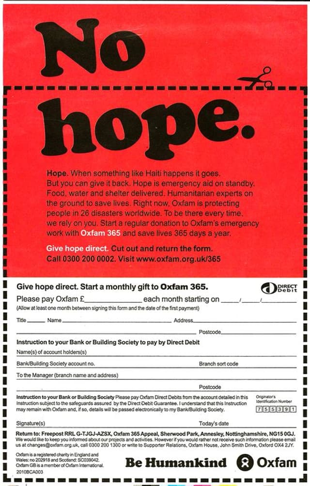
Brand cops mandate stupid Haiti ad
- Written by
- Jeff Brooks
- Added
- October 08, 2015
File this one under ‘brand cops out of control’. That's the best explanation I can come up with.
This winner was uncovered by BlueFrog Creative, in a post that takes it and another Haiti print ad to task: Fundraiser's Friday quiz question: the answer(s).
BlueFrog noted the problematic positioning of the coupon edges: not easy for donors to clip and thus less effective. So I’ll comment on some other problems.
1. The headline is glib, clever and abstract. It depends on the reader completing the mind puzzle and applying it to the situation at hand. That's two assumptions you simply can't make, yet the whole thing hinges on both.
2. The whole thing is virtually unreadable, with a dark background behind the type.
3. The copy reads like an intern's first draft. It starts: ‘Hope. When something like Haiti happens it goes’. Something like Haiti?
4. Worse, the copy is about almost nothing. Like so many fundraisers, it attempts to put everything under one banner and that banner is ‘hope’. Which is a wonderful thing, but it's not specific.
Why would you create an ad like this? Well, it seems to have the fingerprints of brand cops all over it: the focus on cleverness over specificity; the unreadable graphic standards; the ‘look-at-me’ messaging.


