CDE project 6 section 4.7: Negative or positive images in fundraising? Some straight talk.
- Written by
- Jeff Brooks
- Added
- March 01, 2017
The use and misuse of emotion. Section 4: emotions and donors.
4.7.
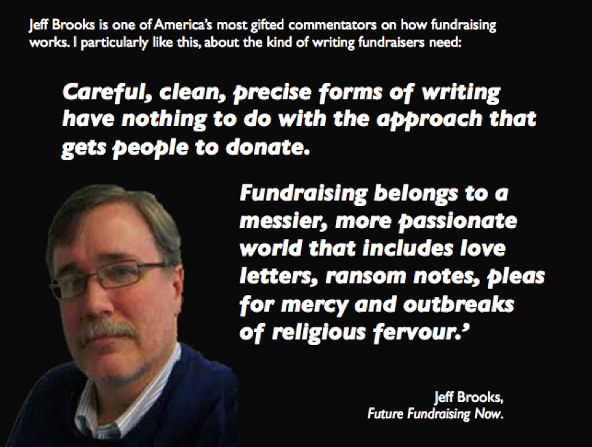
From Future Fundraising Now
Negative or positive images in fundraising?
Some straight talk.
by Jeff Brooks
Do negative images work in fundraising?
There really isn’t a meaningful answer to that question, because it’s not a meaningful question by itself. It’s a lot like asking ‘Do colours work in fundraising?’
The Cause Marketing blog raised the issue in an article called Don’t Use Exploitive Images in Charitable Appeals, Real World Results Suggest. The post is about the Austin Humane Society, which used the image of a happy dog in fundraising, different from the typical sad animal imagery, and saw a significant increase in fundraising results.
Does this prove that positive images are better for fundraising than negative?
Not even close.
It shows that one positive image in one particular situation (and time and place) did well. That’s all we know from this information.
It would be nuts for anyone to respond by making a wholesale switch to happy images. On the other hand, it would be a mistake to ignore the information and not look into using positive images if you believe they never work.
The truth is, some positive images work. Some don’t. Same with negative images. In fact, positive and negative aren't really meaningful categories when it comes to fundraising.
The only categories that matter are ‘compelling’ and ‘not compelling.’
Here’s how to pick winning fundraising images, positive or negative:
- Remove I like and I dislike from your criteria. Those are not relevant considerations, and they’re very likely to lead you astray.
- Ask yourself if the image tells the same story as the words. So often, there's a vast disconnect between the words and the images in fundraising.
- Ask yourself, What will a non-expert see? This is very hard to do. It can help to ask an actual non-expert to tell you what they see in the photo. Don’t ask for a critique of its quality or correctness; just have them tell you what they see.
- Is it real? This is a subjective question, but it’s important. Does the photo seem to be of a real situation, or does it look staged or fake?
I’ve found the following usually (but not always) to be true of the most compelling fundraising images:
- Colour is often better than black and white. But not always.
- Eye contact with the subject is good.
- One person is better than lots of people.
- People work better than things.
- Stock photography seldom works well.
(This post first appeared on the Future Fundraising Now website on June 21, 2011. © Jeff Brooks 2016.)