Why your charity (still) needs better thank-you letters
- Written by
- Lisa Sargent
- Added
- June 26, 2011
Exhibit one: letters from Lee Saunders.
So you’ve heard that, thanks to Lee Saunders, SOFII will champion the renaissance of the charity thank-you letter.
Renaissance, you say? A lofty word, that, for the humble thank-you letter.
But if you aim to raise money for good causes, the thank-you letter is still among your mightiest tools.
To illustrate, I’ve swiped a few paragraphs from Ken Burnett’s blog:
‘…it’s rude not to acknowledge every gift. And while at it to reassure the donor that it’s been put to the use intended. Only a fool is persistently rude, particularly as our business is building relationships for profit. But it’s a real fool who throws away money. The simple fact is that an appropriate thank-you letter is perhaps the best fundraising opportunity of all. If you would convert a donor to regular giving, it’s a no-brainer. Prompt response properly acknowledging the gift gets a new relationship off to its best possible start. And it cements existing relationships. Imagine if, as a child, you never acknowledged to granny and your aunties the socks or diaries they unfailingly provided, year in, year out.
No more socks and diaries. Ever. Or generous bequests, later.
This is the blindingly obvious. The commercial value of prompt and careful thanking has been shown time and time again. Of course, it has to be done properly.’
The Lee Saunders thank-you letters: ten lessons learned
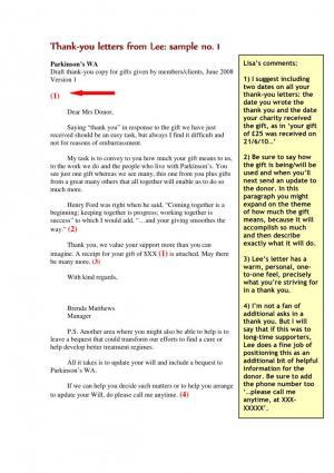
1. Include two dates on all thank-you letters: the date you wrote the letter and, if your database permits, the date your charity received the gift – as in, ‘Your gift of £25 was received on 21/6/10…’
2. Say how the gift will be used, or how it’s presently being used. If it was for a specific appeal you should refer to that. Also say when you’ll next send an update to the donor.
3. Establish a one-to-one tone: the thank you is a letter from one person to another; Lee’s tone in these letters does a great job of getting that point across.
4. If you must ask again, make it relevant – for example, you could include information on bequests in letters to long time supporters. For the record, I am not a fan of additional asks in thank-you letters but plenty of fundraisers use them. For more, see SOFII’s ask/no-ask debates.
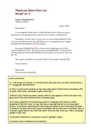
5. Aim for an engaging lead: Lee’s second sample letter handles the opening of the letter exceptionally well by drawing the reader into the remaining copy.
6. Beware of false impressions: watch how you talk about the amount of money received, as well as the number of donors, etc. (see sample two) It may lead readers to infer that you don’t need their help all that much and weaken your case for support.
7. Guide readers through extra pieces in the package: if you include receipts, brochures, or other enclosures in your thank-you packet refer to them if you can. In this way you ‘guide’ the reader through your packet.
8. Carefully choose your signatory: an executive-level signatory, such as the CEO, is usually your best choice for a thank-you letter. But if, for example, your appeal came from someone working in the field then your thank you would come directly from that person.
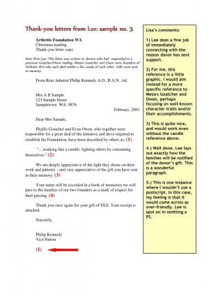
9. Watch similes and metaphors: Lee uses a simile in sample three that may, in fact, be entirely appropriate for Australian readers. I would have chosen a different, more positive image for a US version of an in-memoriam thank you. The lessons learned here are twofold: pay close attention to cultural differences if you have international donors and always consider the context in which donors will read your letter.
10. Know when to break the rules: nine times out of ten I advise using a postscript, or PS, in both appeals and thank-you letters and, for a very good reason, they get read. But Lee’s third sample is an in-memoriam thank you and, in this case, I think he’s spot on for omitting a postscript. To me a PS would detract from the respectful tone he’s established. Nicely done.
11. One last comment: in each of Lee’s samples note how successfully he makes use of white space: tabbed paragraphs, short paragraphs, nice wide margins and a short overall letter. Easy to read and never daunting to the eye. Kudos.
© Lisa Sargent's article was first published on SOFII in 2010.


