Nothing is stupid about this
Fundraising for a food bank during a recession is only marginally more difficult than falling off a log – when you do it right.
- Written by
- Jeff Brooks
- Added
- May 14, 2013

I guess that’s just too boring for some people, like the creative agency that sunk its claws into the Rhode Island Community Food Bank
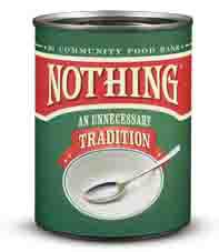
These guys came up with a way to brand hunger by pointing out that the hungry have nothing to eat. The centrepiece of the campaign is empty cans, labelled ‘Nothing’, that people can buy for $2.99. So far, so good, and if they’d stopped there they might have had an interesting alternative fundraising and awareness effort. But we’re talking about an ad agency so the approach quickly went off the rails. Here’s how the Nothing.org website explains it:
Each day, thousands of hungry Rhode Islanders eat nothing. By turning nothing into a product you can buy, we're going to change that.
If you’re noticing a heavy odour of self-reference in the above sentence you’ve found the problem. These guys were so impressed with their clever packaging of hunger they couldn’t stop talking about it. Here’s how a spokesperson from the agency explained the work:
‘[People in their thirties] can afford to donate, but they prefer to make donations to solve finite problems: to build a wing for a hospital, a playground for a school. Things like a cure for cancer or an end to hunger are intangible.’
Good point. That’s not just people in their thirties, that’s everyone. But the real question somebody should have asked was: if you realise people prefer to give to tangible causes, why did you create an abstraction about hunger? Because that’s exactly what this campaign is. Rather than talk about people who are hungry and the food they need – which is a very powerful and proven way to motivate people to give to food banks – they created a ‘product’ that symbolises the issue of hunger.

And then, in typical ad agency fashion, they fumbled in several other key ways that nobody who does fundraising would ever do. The ‘give’ link on the Nothing.org website is hard to find, the giving form has some kind of programming error that renders it unusable and, as if they’re allergic to actually asking for a gift, check out what the ask itself looks like, opposite. There are more design and writing problems with this ask alone than we have room to uncover here, so I won’t even get started.
And to top it all, there’s this goofy use of outdoor advertising for the campaign. The billboards say:
Nothing can end hunger in Rhode Island.
Okay, a well-built double meaning can sometimes add resonance and memorability to a slogan or call to action. But when the second meaning is the exact opposite of what you’re saying it isn’t working.
There are some cool things about the campaign. Selling the empty cans of ‘Nothing’ at grocery stores may generate revenue. And if the cans themselves include compelling copy and response options they may even bring in donors (but I have a sneaking suspicion that this was neglected). And some of the videos are very touching.
In what I’m sure is the campaign’s greatest triumph, it was written up in the New York Times: ‘Campaign Offer Plenty of Nothing’. I’ll leave that for you to decide…


