Chapter Mental Health: Conversational trust funding application
- Exhibited by
- David Burgess
- Added
- April 26, 2023
- Medium of Communication
- Trust application
- Target Audience
- Trust funders
- Type of Charity
- Mental health
- Country of Origin
- United Kingdom
- Date of first appearance
- To be confirmed...
SOFII’s view
It’s not often you see a funding application featured on SOFII. However, in this inspiring case study, David Burgess shares how one trust fundraiser tried out an innovative approach that was visually impactful and compelling too. Some simple but well thought out changes saw their organisation’s application jump straight to the top of the pile and ensured it secured that all-important funding.
So, could you use any of the tips below in your next trust proposal?
Background
Right now, it’s tough out there in trusts and foundations.
One UK funder recently said they were seeing a 65 per cent increase in applications year on year. So, if a mid-size funder was getting 200 applications at this time last year (2021) then that equates to receiving over 300 applications now (2022).
But what can a charity do to be sure that their application stands out from a stack of 300 applications? Keep reading to discover an exceptional example that I received when reviewing trust proposals.
Creator / originator
This application was written by an amazing fundraiser, Matt Zeqiri. Matt was a manager at Chapter Mental Health, a charity in Chester. Now, at the time of writing, Matt works at Chance for Childhood.
Summary / objectives
This is the most memorable application that I’ve seen in a long time.
First, let’s set the scene. Picture me, sitting in my office. A pile of trust applications on my desk. Mostly, each application looked the same. All were created in the usual Microsoft Word template – ah I see you’re writing a fundraising proposal...
But then I came across something different. It was Matt’s proposal for Chapter Mental Health. It was NOT in Microsoft Word, and it instantly looked a lot more interesting.
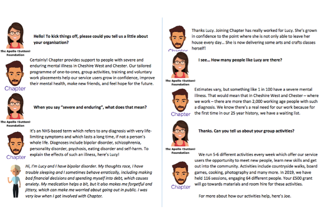
His application was two pages, like the others. But it was set out as a conversation.
There were little pictures of people representing those of us in the conversation. Matt was the writer – see the person with the beard. And the other was supposed to be me, the reviewer – see the person with a red tank top, flowing brown hair and glasses.
I asked Matt why he took this approach, and he said he was looking for something that would make Chapter Mental Health’s proposals stand out.
Special characteristics
You can see from the pictures at left that this application had visual impact and stood out from the pile. But there were other things that made Chapter Mental Health’s proposal memorable – and incredibly clever too.
In a nutshell, it was easy to read, easy to understand and therefore easy to fund. And here’s how Matt (utilising skills from his past career as a script writer) delivered a stand out proposal:
1) This unique approach forced Matt to write short answers to key questions. It allowed him to keep it succinct. Just two or three sentences are all that were needed to explain who the organisation is and what they do.
2) He also protected the white space on his two pages. One of the things that makes reviewing applications dull, is that you’re presented with just words on a page. And whenever someone says, ‘fit it to two pages’, our default is often to simply make the font as tiny as possible and shrink the margins. But the white space here made it easy to read and reduced the pressure on me, the reviewer.
3) Matt’s conversational approach gave the application a nice tone. We talk a lot about the idea that ‘people give to people’ – and sometimes we forget this when it comes to writing funding proposals. With Matt’s application, I felt like I was really having a conversation with someone on the other side of the proposal. And even more than that, it gave me an understanding of what the organisation might be like to work with.
4) Matt framed the questions in a different way. This format allowed Matt to think through the questions that someone reviewing the application was likely to have – and plot them out in that conversational style. He clearly thought ‘if I were the person reading it, what might I want to know?’ – so rather than saying ‘why should we fund you?’ he said, ‘why have you chosen to ask us?’. Matt could then respond to the question of why Chapter Mental Health is right for the funder.
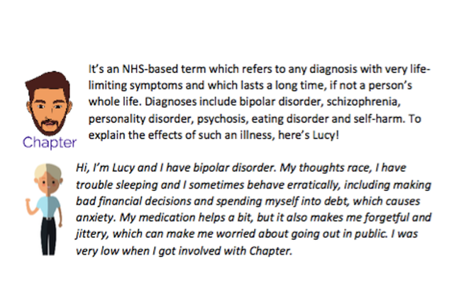
5) And finally, he brought in other voices. It meant he could refer to other people who might be better placed to answer specific questions. So in the two page application there were two short case studies where another person talked about their experience and what the organisation means to them.
Merits
This trust application was all about ‘show don’t tell’. Matt could easily have said ‘we’re a warm and welcoming organisation’ – but he demonstrated that through this proposal. You could feel that sense of warmth coming through, it leapt off the page.
And Matt’s conversational style was so much easier to read. I ran all of the applications we received for this round through the Hemingway App – which if you don’t know it, is a really great way to gauge the readability of something that you’re writing.
The average readability grade for the proposals we received was 10.2 – and the app recommends at keeping the grade under nine. Matt’s proposal came in at a readability grade of six. That’s fantastic.
And in the context of trusts, with grant managers having to read quickly or read alongside doing other things, it’s important to make it easy to get from start to finish and understand everything that’s written.
Results
Does it work? Well, it did in this case! Matt’s application received the biggest ever grant we awarded in that funding round.
I spoke to Matt to see what success he’d had in applying with a similar application style to other places. He was quick to point out that you can’t do this for every funder. Matt had to be quite selective about who he chose to use this approach with.
But as a baseline, when Matt used a more traditional ‘Microsoft Word’ approach, his success rate was about one in six. When using this approach, his success rate was one in every two applications sent. That’s a massive increase, just by making his applications stand out from the crowd – and making them nice and easy to read, of course.
Influence / impact
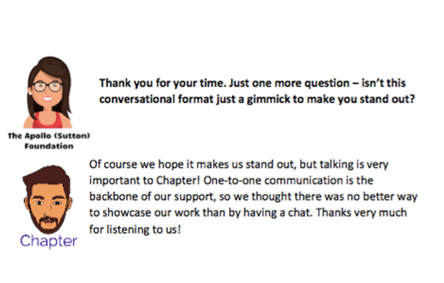
But is this a gimmick? Matt included the answer to that question in the application himself:
‘Of course we hope it makes us stand out, but talking is very important to Chapter! One-to-one communication is the backbone of our support, so we thought there was no better way to showcase our work than by having a chat. Thanks very much for listening to us!’
This ability to link the application to the style used, and also reinforce a key point about what Matt was trying to get across – was an act of genius.
Editor’s note: This exhibit was presented at IWITOT10 on November 10th, 2022. You can watch David’s full seven-minute presentation below.

 View original image
 View original image
 View original image


