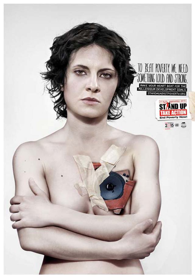
This ad imag­ines donors look like dead bodies

Written by
Jeff Brooks
Added
February 27, 2012

You probably made the same mistake I did, thinking this was some kind of macabre statement about breast cancer. It‘s not; this isn’t a cadaver with a missing breast, even though that‘s exactly what it looks like. It’s actually from a series produced for the UN‘s millennium development goals campaign.

The dumb-founding copy doesn‘t really make it any clearer:

To beat poverty, we need something loud and strong.

Make your heart beat for the millennium development goals.

StandAgainstPoverty.org

Speaking now to writers: can you imagine writing a sentence like, ’make your heart beat for the millennium development goals’ – and then not immediately deleting it? And looking furtively around to make sure nobody was looking over your shoulder and saw your momentary lapse of sanity?

If you dig around (which I did, so you don't have to), it seems they want people to participate in events during the millennium development goals review summit in September (sorry; we missed it). Though I'm not sure. They never actually come right out and say that. They just hint at it.

I know I keep saying the same thing about these stupid nonprofit ads, but that’s because they all seem to be stupid in the same way: they substitute abstraction for clarity.

I think that some people at ad agencies are so thoroughly flummoxed by the fact that the ’customers’ of nonprofits just give away their money for ’nothing’ in return that they go into a conceptual tailspin.

Thanks for the tip to Osocio.

About the author: Jeff Brooks

Jeff Brooks has served the nonprofit community for more than 30 years, working as a writer and creative director on behalf of a variety of organisations including CARE, World Vision, Feeding America, St. Jude Children’s Research Hospital, National Wildlife Federation, and many more. He blogs at Future Fundraising Now and Moceanic. In previous careers, he’s been an English teacher and a classical musician. He lives in Seattle in the USA.

Recent Articles

Six essential steps to improving your supporter experience

Creating an excellent supporter experience is a marathon, not a sprint. In this article, you will find some useful top tips for giving supporters the best experience possible.

Read more

The key to a successful corporate partnership – finding the ‘sweet spot’

What can you do to connect with corporate partners and ensure a long and healthy relationship? In this article, Keith Kibirango celebrates a partnership he admires, and explains why it took a bit of time (and a lot of careful collaboration) to get it just right.  

Read more

How to write for your most generous eyes and hands

Want to make sure your best givers can physically read what you write? Need to defend why you make some of the copy and design choices you do? Then don’t miss Lisa Sargent’s latest tips on making your fundraising communications accessible to older donors. 

Read more

SolarAid: Lighting the way

Richard Turner, director of fundraising at SolarAid, highlights how the charity took a strategic phased approach to raising £1 million over three years. He also includes useful top tips to help you secure funding for your next new idea.

Read more

Five key findings from Blackbaud’s 2024 ‘The Status of UK Fundraising’ report

Are you looking for views on the current state of charity fundraising in the UK? Well, look no further. Over 850 fundraisers shared their recent fundraising performance and experience with Blackbaud to help generate this useful benchmarking report. 

Read more

Also in Categories


Tags