A bad ad at a bad time

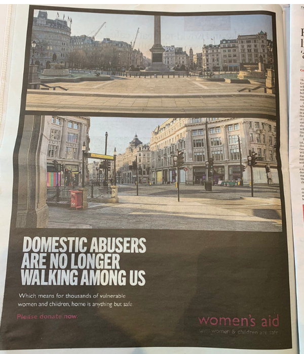
Despite try­ing to address a vital and alarm­ing issue, this Women’s Aid advert makes a series of crit­i­cal mis­takes that under­mine the charity’s good intentions.

Written by
SOFII
Added
November 26, 2020

Editor’s note

While we at SOFII are not fans of this advert, we do wholeheartedly support the aims and mission of Women’s Aid. In a time of rising domestic violence cases, we urge you to show your support for Women’s Aid by donating to them here. You can also find a great Women's Aid campaign here

A terrible side effect of the coronavirus crisis has been the rise of domestic violence across the world, including in the UK. Around the country campaigners, individual victims and charities have been highlighting this urgent and important issue – putting pressure on the government to do more to help vulnerable women and children.

Yet this advert, which appeared during the UK’s lockdown and was intended to highlight the plight of victims locked indoors with their abusers, makes some crucial mistakes. This is such a shame as it could have done so much more. Taking a critical look at this ad can help us all learn from what is clearly an unfortunate misstep – urgency to go to print should not trump smart campaigning or effective fundraising.

A ‘clever’ ad, with shortcomings

  • There are no humans in the poster. Whilst we understand why in terms of the message, this means there’s no eye contact. Therefore, it’s unlikely to attract people’s attention.
  • There is no proposition, direct or otherwise, so no case for support is put forward to the potential donor.
  • It therefore follows that there is no indication of what a gift to the organisation will achieve. Donors like to know what their money will do.
  • There is no call to action, nothing to tell potential donors what action or steps to take next if they wish to help urgently.
  • This is a big one: there are no contact details. No website link, no phone number.
  • There is no coupon, no address to send a donation, nor a shopping list. There are no credit card options or suggested giving amounts. How are donors supposed to act on the message ‘donate now’? 
  • On an aesthetic and practical level, the reversed-out type is hard to read.
  • Essentially, this is just a bald ask for cash but with no real options to donate and no clear ask beyond the money. Given the urgency of the problem, this feels like a real missed opportunity.

About the author: SOFII

The SOFII collection aims to be the most comprehensive, best organised, and most inspiring collection of fundraising related content from around the world.

Related case studies or articles

If you want their money, best not to insult them

A goof by the UK Conservative Party in a fundraising letter shows just how careful you need to be with the data you're working from.

Note: this article contains language that some may find offensive

Read more

This ad accuses repressive governments of absent-mindedness

As with other bad nonprofit ads, the question is this: why resort to abstraction when the truth itself is so powerful?

Read more

What makes a nonprofit ad stupid?

Pointing out stupid nonprofit ads tends to generate a lot of controversy. So, I am going out on a limb when I call these things stupid. And I could be wrong.

Read more

The ad that trivialises tragedy

Jeff Brooks has some more severe words for ad agencies and their questionable campaign creations for charities.

Read more

Be womankind?

SOFII is all about celebrating and sharing great fundraising ideas so that we can all become a little more successful ourselves. But here Andrew Papworth, author of fundraising newsletter, Harvest, suggests that an Oxfam advert unveiled for International Women’s Day isn’t exactly top of the list to take fundraising notes from. What do you think?

Read more

Spot the elementary mistake in this advertisement

Embracing the Internet is of course crucial for modern charities. Andrew Papworth, however, argues that this World Food Programme ad makes the mistake of ignoring an important section of society by focusing so heavily on online users.

Read more

‘No sale’ video from Oxfam

I’m a sucker for online videos to deliver important messages and sell causes and charities. But this one from Oxfam is a ‘no sale’ as far as I’m concerned.

Read more

Also in Categories


Tags