CDE project 6: The use and misuse of emotion. Section 5.5b: empathy-based design.
This summary is edited from Adam’s final dissertation. The full document is also included as part of CDE project 6.
- Written by
- SOFII
- Added
- September 06, 2018

Empathy-based design.
By Adam Willis.
‘If your cause can draw on such legitimate emotion it will successfully raise funds’ (Burnett, Relationship Fundraising, 2002, p.113).
Much of the charity sector’s graphic design is based around empathy, which means it uses text and image in a way to create an emotional connection with the viewer. The technique’s effectiveness is supported by Small and Verrochi’s research, which, as we’ve explored, shows that using ‘sad’ facial expressions in advertising almost doubles donation amounts compared to other expressions.
 View original image
Case study: Red Cross Society poster (1915)
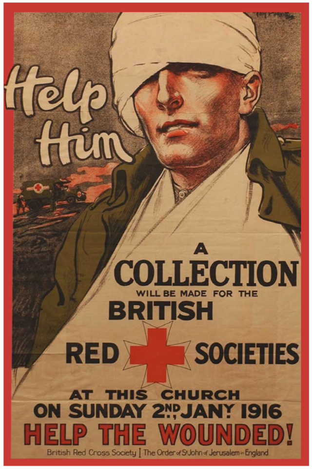
In order to raise money for wounded soldiers in World War I, Tom Purvis designed a poster for the Red Cross Society, which asked churches of all denominations to donate one day’s collection money (figure 15).
The poster’s red border is a simple tactic to draw attention and evoke urgency. The soldier, who is dominant in size — is softly illustrated, evoking a fragility that reflects his physical condition. Unlike some modern adverts where subjects are represented as needy victims, this soldier actually looks past the viewer — he’s not begging.
Purvis understood the poster's audience, which consisted mainly of families and friends of soldiers, who would most likely be worried about their loved ones. Purvis therefore attempts to create a soldier many could recognise; by covering his hair with a bandage this soldier could resemble most men. This strategy generates maximum potential empathy, and alongside the cursively written call to action ‘Help Him’, it's no wonder church members donated £85,000.
Empathy-based design: analysis
The connection between the stimulation of empathy, and the chance of a donation being made, has been understood for some time by charities (Griffin et al, 1993). Sargeant and Jay wrote that
‘to be truly effective the arousal of empathy must be powerful enough to overcome indifference and stimulate giving, but not so powerful that it becomes personally distressing to the donor’ (2004, p.101).
As we shall briefly explore, this balance can be difficult to find.
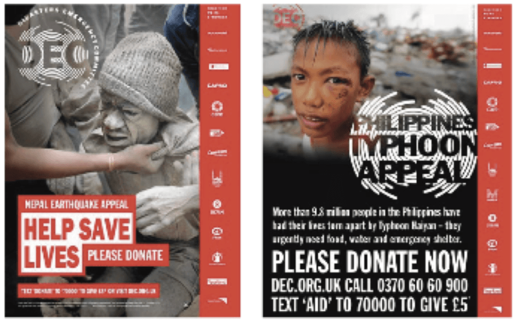
One hundred years on from Tom Purvis’s poster for the Red Cross Society, many charities use a similar strategy of empathy-based design. Figures 16 and 17 show Disaster Emergency Committee (DEC) posters, which habitually feature a subject in distress juxtaposed by bold text reading ‘PLEASE DONATE’. In analysis of DEC's Nepal earthquake appeal poster (figure 16), Burnett said,
‘[The subject does not] have eye contact with you, so he's reduced in context to being a passive participant. He's not looking out at you, saying, "do something''. A younger, more vulnerable person would work better in appeals’.
When looked at in comparison with the Philippines poster (figure 17), one might agree.
As previously explored, too much information in a design can confuse viewers, leading to an emotional disconnection. However with empathy-based design, the opposite can be true: that too much emotion and not enough information can look untrustworthy.
Go too far into this latter category and some may deem an advert to be ‘poverty porn' . As defined by Nonprofit Quarterly, poverty porn (or development porn) is ‘[...] using false or exaggerated images in donor appeals as a fundraising tactic’ (2015).

A formulaic example of poverty porn would feature photos of starving, skeletal children covered in flies (figure 18). The repetition of such adverts means some of the public instinctively look away (Larson, 1973, p.106). Yau writes,
‘we owe it to those we serve to avoid sensationalising their pain. Bad enough that they had to face trauma and obstacles without us using them or their situation as case studies to leverage public guilt’ (2012).
Conversely, however, a research study by Breeze and Dean illustrated that some individuals a charity ‘served’ didn’t mind how they were represented. In the study, which was principally a discussion with participants who had been helped by a homeless charity, the following opinion was shared:
‘If the organisations haven’t got their money in the first place to help you then the whole system breaks down, really and truly. Just get the money, hook or crook, y’know?’ (Breeze and Dean, 2012, p.20).
Somewhat in agreement, Burnett writes in Relationship Fundraising,
‘It is not the images or the use of emotion that are obscene [...] What is obscene, I believe, is switching off or turning over in the hope that by doing so the problem, as well as the emotive images, will go away’ (2002, p.112)
In this argument, Burnett defends empathy-based design, because although it has the potential to make someone uncomfortable, he believes it’s right to illustrate the reality of world issues and challenge the public to action.
A responding point might be that consistently ‘sad’ imagery could give the impression that donations have no effect. Making adverts happier, however, could evoke the opposite: that all the problems have been solved. Burnett believes there is a balance to be found, charities must:
‘[ ... ] balance emotional impact with honesty and integrity’ (2002, p.124).
Similarly, Christian Aid’s visual identity guidelines read,
‘We shouldn't compromise the dignity of our subjects but equally we shouldn't sanitise reality' (2013, p.30).
Ken Burnett once overheard employees from a cancer research organisation complaining about the difficulty in marketing their cause: it’s so complex, it’s long term, it’s not guaranteed to work, etc. He replied with the following:
‘Cancer research is about all those things. But, it's also not really about any of those things. What is it about? It's about me getting more time to spend with the people that matter to me. It’s about my mother, or my father, or any of my friends’ (2015).
Empathy-based design can empower both the donor and the recipient, through use of accurate information, alongside emotive, yet genuine imagery (figure 19). Through telling the stories of those in need, instead of victimising them, and balancing progress with the action that’s still needed, charities can move collectively toward a more authentic standard of advertising.


